Hills Bros. Coffee Reassesses Packaging Strategy, Receives ROI

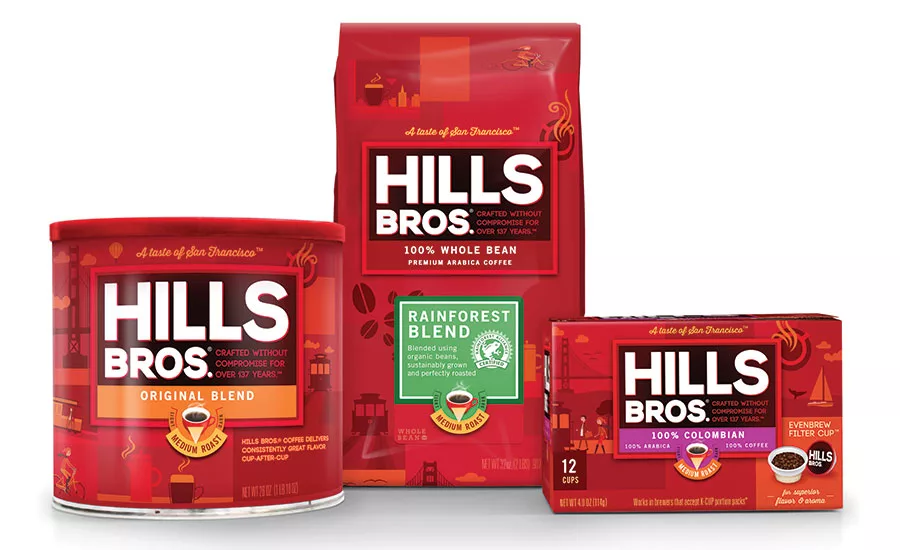
A new approach in positioning and design has unified the Hills Bros. line, helped consumers with shopability and brought huge returns to the brand. Images and proprietary illustrations courtesy of The Goldstein Group.
The roast selection dial TGG added on the new package proved very appealing to customers.
The “Taster” had become misunderstood and was now brand baggage. Because he held no equity, he was not included in the new design.
The camps of craftsmanship (right), origins (left) and Americana were strategically created, with the first two winning as the most engaging.
What does a brand do when its identity and strategy no longer work for retailers and customers? Despite packaging and marketing updates over the long history of Hills Bros. coffee, sales of the brand had stagnated or declined, and in some cases, distribution had been dropped altogether.
Brand owner Massimo Zanetti Beverage USA called in NYC-based brand identity and design firm The Goldstein Group (tggsmart.com) to reassess the brand’s strategy and redesign its identity.
“Brand strategy must be cultivated from a variety of inputs,” says Terri Goldstein, CEO and founder of The Goldstein Group. “In the case of a restage: The historical perspective, the unaided brand equities, an understanding of the current brand target, and both a demographic and physiographic understanding of the current consumer must contribute to the mix. This is coupled with where you want to grow the brand — into new targets or reclaiming former targets, plus forever retaining the core enthusiast that you currently have.”
Over the course of several months, TGG used its expertise at restaging some of America’s most beloved heritage brands to create a new identity for Hills Bros. — one that resulted in a massive return on investment and increased loyalty for the brand.
“Our discovery led us to reclaim Hills Bros.’ origin of creation, the San Francisco marketplace, where the brand was no longer being retailed,” says Goldstein. “In this instance, we also had a trade strategy in place so we could effectively migrate back to the West Coast roots, and as a result, increase our reach and market share.”
The case study that follows is a brief glimpse into the steps that went into creating the new brand image. From visual positioning to research and package design to brand standards, TGG pulled out all the stops to ensure each step got the treatment it deserved.
1. ATTITUDES & USAGE/CATEGORY SWOT
The first steps taken by the TGG team were to dissect MZB USA’s current A&U research data and analyze various consumer insights on the state of the Hills Bros. brand. During this process, a retail SWOT was performed on the coffee category so as to better understand the leading competitors. When viewed under the lens of the Shelf Sight Sequence™, TGG’s guiding principal of how consumers see packaging, certain opportunities came to light that began to give the project shape and direction.
2. HISTORICAL REVIEW
Next, TGG visited the brand’s historical archives at the MZB North American headquarters in Virginia. Even for a brand that has been around almost 140 years, the TGG staff was blown away with the sheer volume of assets that had been created and saved over the years. Materials developed by Norman Rockwell, Ansel Adams, Disney and a plethora of other marketing items, printing plates, proofs and comps lined the shelves of the climate-controlled warehouse where the archives are kept. Finding images and messages from the past that might potentially resonate with current consumers began as a very daunting task.
3. POSITIONING DEVELOPMENT
After the historical review, TGG presented the brand team with several different camps, or entry points, that could be used to give Hills Bros. its unique voice. There was a wide variety of approaches to choose from, but ultimately, three separate directions were selected: Coffee Craftsmanship, San Francisco Origins and America’s Coffee Purveyor since 1878. Each direction came from observations made during the first two steps of the project.
The second of the three entry points developed was San Francisco Origins, which was the favored concept in the end. For decades, the Hills Bros. brand was based in San Francisco, and many local landmarks still bear the Hills Bros. name. The innovative nature of San Francisco spoke to the progressive history of the Hills Bros. brand. Just like Silicon Valley, the Hills Bros. brand has brought about many advancements in both quality and processing/manufacturing. The first vacuum pack, controlled roasting, high yield extraction and many other technologies still used to this day came from Hills Bros.
4. QUALITATIVE RESEARCH
Once the entry points had been chosen and refined, the MZB USA and TGG teams developed a variety of materials to probe consumers with during research sessions in Chicago and Milwaukee.
Important to heritage brands are equities: One quick and accurate way The Goldstein Group finds these out is to have participants draw the current package from memory.
“We utilized my favorite method for Hills Bros., which is color crayon research,” says Goldstein. “This is where all focus group participants have a fresh box of crayons in front of them (so they cannot see what colors the participant in a former group selected) and a clean piece of white paper. The moderator asks, ‘Please draw the coffee category at retail, as you can recall it from your mind.’ They are given only three to five minutes, and they are not expected to be fine artists whatsoever! If they did not draw Hills Bros., the moderator asks them to do so.
“This will quickly reveal the unaided color equities of the brand to be restaged as well as those of the competitive set, and this is how we knew for sure that Hills Bros. was to remain the ‘red brand.’ Very often, we see participants also draw symbols that are strongly attached to the brand and at times, key words. It is a powerful exercise that reveals the images and associations embedded in the forefront of their minds. The moderator then moves into emotional probing to ensure the brand equity colors, shapes and symbols are still warranted, relevant and do not have brand baggage.”
At the sessions, TGG also learned what consumers thought of the current graphic language as well as the new camps that had been developed. After quickly determining that the current graphics appeared outdated and difficult to shop, consumers were asked which of the three new camps meant the most to them, and how that applied to their perceptions of the brand.
Existing Hills Bros. users and consumers who primarily bought another one of the major U.S. coffee brands perceived the San Francisco Origins and Craftsmanship camps to be the most authentic and engaging entry points. Their feedback was then collected and analyzed to help develop the next steps of the project.
“It is fundamental each and every time to understand the core enthusiasts’ visual world and their values,” says Goldstein. “This may be achieved via customized research — such as collage building, online participant panels complete with filming of specific areas of their home environments, focus groups coupled with seeing other brands they consume both in and out of the category, all the way to fashion, the cars they drive or seek to drive, the computer they prefer and so on.
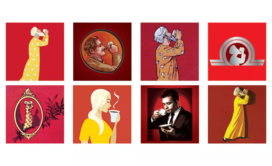
“In the case of Hills Bros., research uncovered, via a series of associative emotive exercises, that Hills Bros. brand users valued family, hard work and social interaction when it came to consuming coffee. This proved to resonate with competitive brand users as well. This is why we created the proprietary series of illustrations of people working, walking and interacting at historical San Francisco landmarks to speak to consumer values, so they would know in five seconds or less at shelf that Hills Bros. mirrored their principles while also firmly placing the brand back into its San Francisco heritage.”
It is at this stage that brands can explore leaving behind what have been major parts of their identity, and Hills Bros. is the perfect example of a company that chose to do this.
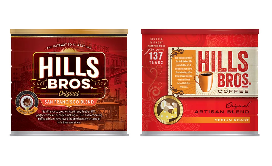
“The iconic ‘Taster’ had been part of its heritage for over 100 years, but he became misunderstood by previous brand owners prior to Massimo Zanetti acquiring the brand,” says Goldstein. “As a result, he had been diluted.”
“In research, we created some designs that brought the Taster back to his former glory, in his long yellow robe and turban (perceived by consumers to be his pajamas), along with other visual representations of the Taster. Because that the core enthusiast for the Hills Bros. brand is a 40-year-old woman, her response was, ‘What is that man doing on the package?’ It turned out that the Taster had no equity and, furthermore, was polarizing to the female audience. You can only leave behind major equities of a brand if they turn out to be brand baggage. In the case of Hills Bros., nothing was retained beyond the color red and a large brandmark impression. Even in the case of the color red, we added brighter reds and oranges in the illustrations to add a large dose of vibrancy into the brand design, to help it stand up in the sea of red of other coffee competitors.”
5. COPY AND MYTHOS DEVELOPMENT
Each of the two winning camps became a fully developed concept with unique messages and distinct brand mythos. Elements that tested strongly in research were used, as well as a variety of new ideas that came about from the information the teams received during these sessions.
Companies in low-involvement categories may feel they have the short end of the stick when it comes to creating an iconic or idolized brand. But any company, no matter the product or level of involvement, can connect with customers on a deeper level.
“Low involvement simply means less time to make the brand choice,” says Goldstein. “This means the shorthand to decision making must cut through the clutter in a manner that can deeply resonate in a few blinks of the eye. This may be achieved in many ways, but knowing what the consumer is about and understanding their preferences is the key to creating a visual positioning and a shelf strategy that may be seen, felt and quickly understood.
“To achieve this, we employ our proprietary Shelf Sight Sequence™ principles, which are designed in the same cognitive sequence that the brain retains visual information. Color is forever first, shapes are second, symbols are third and words are last. A powerful statement such as Hills Bros.’ ‘A Taste of San Francisco’ may now be seen, felt and quickly understood in less than five seconds!”
6. QUANTITATIVE RESEARCH
TGG’s concepts, along with the current on shelf package, were taken to this next research session. Biometrics, eye tracking software and multiple choice answers allowed the team to reach a wide range of consumers in several different cities. After the program was complete, a detailed report was sent along to every member of the team. Almost immediately it became clear that there was one design that presented a huge opportunity for the brand: The San Francisco Origins. With a few minor revisions, the team finalized the concept that is seen on shelf today and has been snapped up by retailers and customers.
“Research is forever a brander’s best friend,” says Goldstein. “If you have an idea for a category-buster, you better back it up with both qualitative research, to inform the creative development, and quantitative research executed in online simulated shelf-sets or at a facility with a mock retail environment, to ensure your design solution is truly warranted by consumers. Once armed with the numbers, this is all that a retailer needs to know. I often go to trade appointments with my clients and clarify what every square inch of the package is designed to do from a subconscious color, shape and symbol point of view. Having a visual vocabulary is the goal; however, this needs to be ‘spoken’ to the retailer so they understand the visceral qualities of the design. Backed up by research numbers, this is a winning strategy. I also find that retail management greatly appreciates this diligence to ensure that they, too, will move your product off their shelves.”
7. EXTENSION OF WINNING CONCEPT, WITH UNIQUE ILLUSTRATIONS
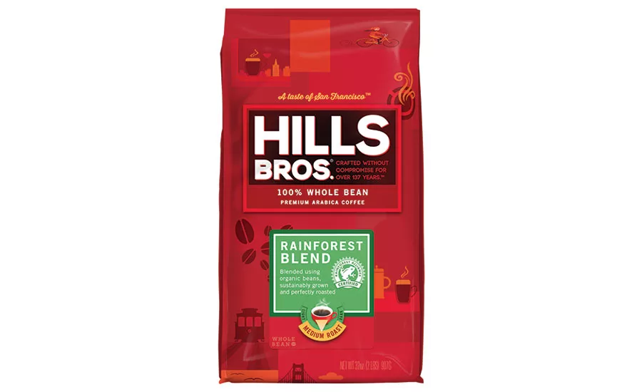
With a clear direction of where the brand was moving, all the heavy lifting could begin. Extending the winning design to single-serve cartons, whole-bean bags and the line of cans was a difficult job. But within a few weeks, the entire line had been addressed and the final stages of the project were drawing near.
Developing the graphic architecture for a whole line of products wasn’t all hard work: TGG created unique San Francisco-centric illustrations and had a little bit of fun in the process. These illustrations reflected the new modern, contemporary nature of the brand. A geometric style coupled with flat, simple elements proved to be a winning combo that allowed the brand to tell the story of its past, present and future.
8. CREATION OF BRAND GUIDELINES
Also known as brand standards, TGG has created documents for some of its biggest brands that creatives across a variety of mediums can use to maintain consistency. Web designers, marketers, members of the sales team and brand managers each have difficult decisions to make almost daily. Having one document that they can refer back to ensures a consistent look and feel for each brand touchpoint.
IN CONCULSION
The restaging of Hills Bros.’ coffee brought impressive numbers back to the brand:
- Distribution after the rebrand is on track to increase to Chicago, St. Louis, Minneapolis, Milwaukee, Green Bay, Madison, Seattle, Portland and San Francisco.
- At Walmart, distribution on can coffee grew by 23 percent, and bag coffee grew 15 percent as a result of the new packaging.
- In Canada, Giant Tiger is on track to double distribution on Hills Bros. in four months’ time.
- Total brand sales at Hills Bros.’ top retailer in Chicago increased by 20 percent in the four months of the new branding versus the same period in previous year.
- Sales of “flanker items” grew, most impressive of which: Dark Satin and French Roast sales doubled.
- The sales of 10oz cans, which had been a declining item over the past year, grew 37 percent during the launch period.
“Interface with your top retailers, gain the buyer’s perspective and team build with them every step of the way,” Goldstein advises brands looking to increase retail presence. “Know that you can never please all your channels at the same time, so go for your largest and most communicative.”
The new identity for Hills Bros.’ has now won several awards including the Global PAC Silver and one from GDUSA, but the brand and TGG are the most excited about seeing a heritage brand regain its footing and, once again, be so well received by customers.
“The repositioning of Hills Bros. gave not only gave the brand new energy but also brought new inspiration to the entire MZB USA organization,” finishes Sarah Cunningham, senior brand manager, MZB USA.
Looking for a reprint of this article?
From high-res PDFs to custom plaques, order your copy today!


