Body Glide Gets Smooth Redesign, Wins Award
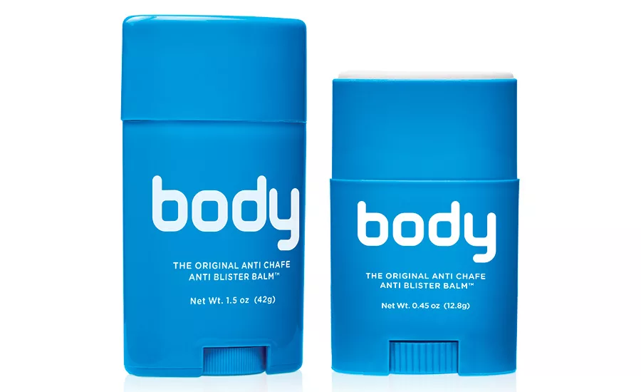
After
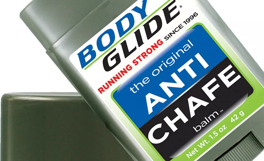
Before
The story
Since 1996, leading lifestyle brand Body Glide’s protective skincare solutions have been popular in the categories of sports, fitness, outdoors and beyond. The non-greasy anti-chafing, anti-blister balms are designed to help consumers prevent painful skin conditions so they can stay active. Body Glide uses natural, plant-derived ingredients that help hydrate dry or cracked skin and provide comfort and confidence against rubbing that leads to irritation, burning, chafing and blisters. Each product is intended for daily use by anyone who is active — or just rubbed the wrong way by footwear, clothing or skin against skin.
The challenge
“Research by packaging consultants showed the brand has been dominant for almost two decades,” says Bill Sternoff, CEO of Body Glide — a position where the company intends to stay.
Body Glide opted to undergo a rebrand, in which both messaging and packaging were streamlined, to help it remain on top.
“We saw an opportunity to rebrand and expand our reach and reputation as a category leader,” says Sternoff. “We knew our target audience wanted something attractive they can see at retail from twenty feet away — simple, effective, functional and memorable. That’s exactly what Body Glide is, so we thought, ‘Why not package it that way too?’”
The brand wanted the redesigned packaging to be instantly recognizable from a distance; plus, the new look had to quickly and simply tell the purpose of each product. Also important to both the company and vendors: Body Glide’s structure had to work in all retail settings and allow for local languages in distribution around the world.
The solution:
Body Glide opted for a crisp, minimalistic approach, to reach more consumers.
“The new design seeks to maximize the brand name, giving it prominence on the packaging,” says Sternoff. “Bold, vibrant colors help customers easily distinguish each formula, and clear text calls out the features and benefits.”
Body Glide’s new packaging breaks from the traditional gray casing of the past and features solid backgrounds of striking magenta, purple, yellow, red, orange, blue and green.
Seven different products display simplified labeling with distinct, contrasting lettering that instantly gives the purpose for each product: Body, Foot, Skin, For Her, Cycle, Relief and Sun.
The redesign was recently awarded a 2015 American Graphic Design Award in Branding and Packaging by Graphic Design USA. A handful of winners were selected from approximately 9,000 entries, and the protective skincare brand joins icons such as Nike, HBO, Ford, Buick, Starwood Hotels, Mattel, Coke, Pepsi and more.
“The performance is, in a nutshell, exceptional,” says GDUSA, in recognition of Body Glide’s effectiveness in the revamping of its identity and design.
“It’s a privilege to receive this high recognition of our branding and packaging, and to be in the company of some of the best known brands in the world,” says Sternoff.
1. The product comes in several sizes and types, and the packaging is perfect for on the go. Vivid colors easily stand out in gym bags, lockers and medicine cabinets. Each product formula features a different hue on the primary packaging, which consists of sticks and tubes.
2. The brand uses plant-derived waxes instead of petroleum, lanolin or mineral oils. Consumers have come to equate the brand with quality and comfort because of the feel of the products, which are not greasy or messy. The secondary packaging highlights these attributes.
3. Body Glide opted for a minimal design to attract a broad range of customers to the brand: people who want or need to avoid a skin injury from rubbing, whether they are chasing their children at the park or training hard on the field.
Looking for a reprint of this article?
From high-res PDFs to custom plaques, order your copy today!


