Natural Sins Gets a Redesign for Its U.S. Debut
The packaging for the healthy line of fruit and vegetable chips is already a success with retailers.
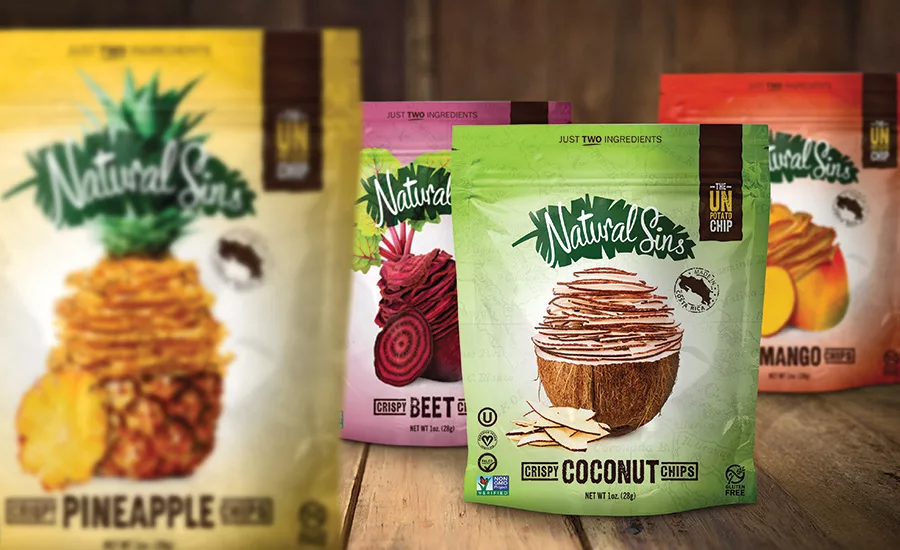
After
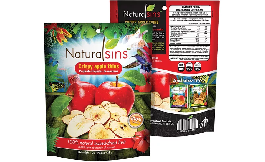
Before
The story
Natural Sins is a healthy line of crispy mango, pineapple, coconut and beet chips with a sprinkling of cane sugar that recently entered the North American market. The Costa Rican brand was founded in 2010, and the chips are crafted in the country from start to finish. Ingredient sourcing is important to both the company and its customers, so Natural Sins aims for the freshest and best: Pineapples, mangos, beets and coconuts are grown in Costa Rica, and apples and oranges are seasonally picked from Spain, Peru, Chile or the U.S.
The challenge
To expand across the United States, the brand needed a package redesign to convey its products are more than a chip off the old block. Packaging would help convince retail customers and health-conscious consumers that the dried fruits and vegetables are craveable, natural and wholesome. The new design would also have to work globally: The same package is used in Peru, Canada and the U.S.
The packaging design directive for Denver agency LRXD was to create eye-catching bags for Natural Sins, but to do so by using restraint rather than a cacophony of clutter. The idea was to capture the uncomplicated nature of these all-natural, preservative-free snacks with no artificial colorings or flavors, and the simplicity is announced in the first message one encounters at the top of each bag: “Just Two Ingredients.”
“The new design needed to show that the product is a delicious, healthy alternative to the conventional potato chip,” says Kelly Reedy, CEO and chief creative officer at LRXD.
This was achieved with the primary image. The centerpiece of each of the one-ounce resealable bags is a whole piece of fruit (or vegetable, in the beet’s case) with the upper portion cut into wafer-thin slices. One slice is extracted, enlarged and rotated to show the chip’s cross section.
The brand uses opaque packaging to protect the products from light and humidity. For easy identification within the unified design scheme, the background of each package is color-coordinated to each product SKU. A halo draws the eye to the center, and a radial effect saturates each package’s coordinating color at the edges. This formula of bold color and a single visual tells the story of the product and keeps it simple in a competitor shelf set. However, more information needed to be conveyed.
The solution
With the key visuals in place, LRXD set about adding visual cues to support Natural Sins’ healthy alternative positioning. Since a minimalist approach was desired, a cargo look was chosen, and bags are “stamped” with the name of the fruits they bear in a utilitarian font below the central image. A faint map of Costa Rica, the product’s exotic origin, is screened in the background. The map, stamp and font choices are used to drive home the idea that this is a natural product produced and imported from Costa Rica.
To the left of the primary image, a series of small icons verify Natural Sins’ gluten-free, non-GMO, certified vegan, Paleo-friendly and Kosher status. And just in case the art and color cues don’t convince shoppers that this product is special, a dark brown color block text strip at the top right of the bag reinforces this message by declaring Natural Sins “The Un-Potato Chip.”
When products have a good number of certifications and statuses, prioritizing placement can be a balancing act.
“‘The Un-Potato Chip’ was contained in the color block to stand out for the consumer,” says Reedy. “The decision on the placement of the other health icons was made to be front facing, but not to interfere with the larger visual and messaging.”
Natural Sins’ updated packaging is just hitting stores, but due to its success at the trade show level, retailers are already biting.
If the vibrant background and vivid ingredient colors haven’t already caught customers’ eyes, the bold declaration of “The Un-Potato Chip” in the top right corner will — and alert them that this product is something different and special.
The star of the package is the image of a fruit or vegetable, artfully sliced and surrounded by a halo. Because the brand can’t use clear packaging or one with a window, the photography does the heavy lifting in appetite appeal.
A map of Costa Rica is screened on the pack, adding depth to the design. The banana leaf in the brandmark and the utilitarian font of the flavor variety all lend an exotic feel to point customers back to the product origin.
Looking for a reprint of this article?
From high-res PDFs to custom plaques, order your copy today!


