Redesigned Packaging Helps Consumers Identify Happy Family
The baby food brand needed new packaging to stand out and create better sub-brand organization.
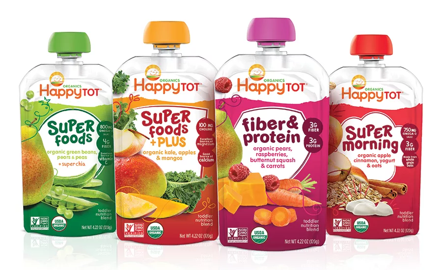
After
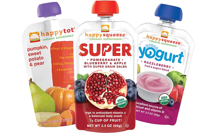
Before
The Story
In 2006, Shazi Visram founded the Happy Family group with the launch of Happy Baby, a company focused on providing parents with healthy, organic baby food for their children. The brand has since expanded to include the Happy Mama, Squeeze and Tot product lines so the whole family can benefit from wholesome ingredients and interesting flavor combinations.
The Challenge
Happy Family brands once stood out in the baby food aisle thanks to the brand’s unique, squeezable pouches. Now, squeezable pouches pack the baby food aisle, making brand standout difficult and shopping choices hard for customers. Happy Family needed another way to distinguish itself from the crowd and decided to update its packaging and identity. The company turned to packaging design and brand strategy firm Beardwood & Co., whom it had partnered with before, for its new look.
“Happy Family is a brand that revolutionized the baby and toddler food aisle,” says Sarah Williams, partner and creative director, Beardwood & Co. “The brand has grown exponentially since it began ten years ago, adding new product lines that provide ‘enlightened nutrition’ and continuing to expand its shelf presence. As Happy Family grew over time, so did the competition.”
The Solution
Making Happy Family once again stand out from the competition was a process. “First, we needed to streamline the logo and its iterations on pack,” says Williams. “It was critical for the brand to have a system that could work across product lines and raise the prominence of ‘organic.’”
The subtle but impactful changes to the brand included a cleaned-up font and the focus on “organics” mentioned earlier. Together, they presented a refreshed look without causing confusion for current customers.
“For the logo refresh, we shifted to a circular holding shape to reinforce enlightenment and balance, and to better highlight the sunshine rays,” says Williams. “To help busy moms easily navigate options, we used color blocking and ownable shapes for each sub-line, which creates greater shelf impact and makes meal and nutrition planning quick and simple. Simplification was key. We found that the more we could simplify the packaging communication and design, the more likely we were to retain existing consumers and engage new ones.”
A “lens flare,” reversing of the baby’s facing plus the addition of rosy cheeks, and gradients in the illustration give the redesigned logo depth and convey the brand’s bright personality, says Williams.
“We infused the new brand logo with more glowing ‘enlightenment’ and modernity, while retaining what moms love and recognize about Happy Family—the smiling baby and sunshine rays.”
The rest of the packaging redesign works to improve shopability, organize the Happy Tot sub-brands and show moms the line is a graduation from Happy Baby.
“For the Happy Tot packaging, we created an easy-to-navigate, bullseye effect at shelf, while celebrating the fresh organic ingredients with new photography,” says Williams. “The new packaging included an in-depth look at the brand’s architecture and communication hierarchy. Our goal was to get Mom to quickly find the ingredients and flavors she loves, while building recognition around the newly organized sub-lines of Super Foods, Super Foods Plus, Fiber & Protein and Super Morning.”
“It was also important for the Happy Tot packaging to feel like a ‘step up’ from Happy Baby—toddlers have growing nutritional needs and are expanding their palettes of tastes and textures,” Williams continues. “Our hand-drawn illustration style was intentionally bolder and more energetic than Happy Baby, to reinforce the ‘superness’ of the ingredients inside.”
The packaging was tested with a panel of Happy Family Moms prior to launch, says Williams, where it got a positive response. The new design has only been in the market for a short period of time and has been well received. The increased visibility of the brand is once again helping Happy Family brands to make a bigger impact on happy families.
- The Happy Tot lineup now appears much more unified, and customers will have an easier time at shelf understanding the difference between products in the range.
- Important callouts, such as the USDA-certified organic seal and non-GMO status, stand out on the new package design. Nutritional information highlights pop in boldly colored circles.
- Whimsical illustrations add excitement to the ingredient photography, accomplishing the agency’s goal of differentiating this line from the Happy Baby products.
Looking for a reprint of this article?
From high-res PDFs to custom plaques, order your copy today!


