NEW BRAND IDENTITY
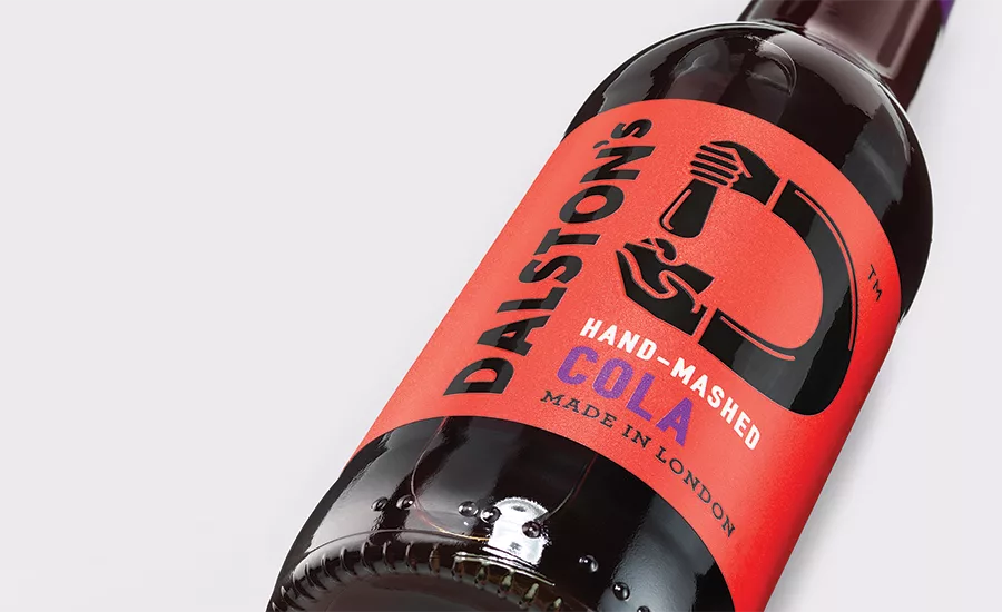
The Dalston Cola Company has unveiled a new visual identity by design firm B&B studio to move it from niche, craft drinks company to established brand. Handmade in East London from 100 percent natural and locally sourced ingredients, Dalston’s wanted to retain some of the rawness of the original branding. By elevating the “hand mashed” story, the agency was able to express what is special about the soft drinks and make the ingredients the hero without using tired craft clichés. Shaun Bowen, creative partner at B&B, says: “We highlighted the brand’s hands-on process through the logo rather than layering on overly reassuring handmade messages. The color palette was equally important as we wanted vibrant, modern, eye- catching colors, but we also wanted to ensure we didn’t lose any of the naturalness of the product.” Six tactile labels that curve around the bottle in a D shape were created for the range, each with its own twist on the Dalston’s logo and its own cheerful colorway. On Dalston’s lemonade, the hand squeezes a lemon, whereas on the ginger beer, the hand grates ginger. Dalston’s founder Duncan O’Brien adds: “B&B’s approach has made Dalston’s feel more like a matured, established brand while retaining its handmade, edgy feel. The design, which ignores the obvious craft messages, will really help it stand out from its competitors.” www.bandb-studio.co.uk
Looking for a reprint of this article?
From high-res PDFs to custom plaques, order your copy today!


