Is Flexible Packaging Falling Down on the Job?
Flexible packaging has become a more standard form of packaging, and in the appropriate application offers a myriad of advantages and applications to the consumer. However, it also poses real and recognizable challenges in the retail environment that you should carefully consider and incorporate into your creative mandate before you embark on a packaging solution. Whether issues of convenience, sustainability, storage or end use, flexible packaging has to deliver the same degree of shelf presence and impact as conventional packaging, not only in the surface design you create for the package but also in considering how it exists and works on shelf.
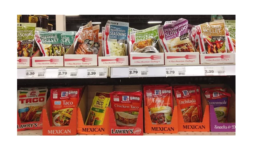
This was sharply brought home to me as I was looking for a packaged mix recently. Coming across what appeared to be the sauce/mix area off the store, I couldn’t help but be stunned by the visual disasters present on shelf. As I looked at the melee, my mind kept screaming that the most important thing packaging does is to visually connect with consumers quickly and easily as they move through the store. That ability to connect and engage has to be instantaneous, and it needs to be so riveting that consumers no longer “see” competitive products.
For example, as I glanced up at the sauce and seasoning mixes and saw the Red Fork brand, I was overwhelmed by how jumbled and unfortunately crumpled the pouches looked within their display. There wasn’t one package where you could clearly see the face panel, or where the investment in packaging met its marketing objective. While the Red Fork logo and a tagline repeated across the front of the display, they lacked connection back to the product.
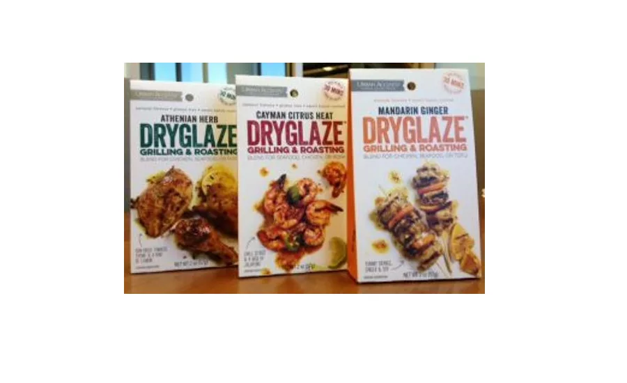
What stood out better than most was the Urban Accents DRYGLAZE package. They have created a hybrid package – a product that fills a small reclosable bag, which is then packed inside a three-sided carton that provides the structural stability to sit upright on shelf – within or outside of a display unit. In its environment, it was one of the few products that stood totally upright, face forward, telling its story to the consumer.
The DRYGLAZE packages sat on the top shelf directly next to the Red Fork display, making the comparison so much more glaring. I couldn’t help but feel the impact and organization of information DRYGLAZE presented within limited space. Their bright white package effectively balanced the use of controlled negative space to surround and emphasize the messaging. it was also interesting to observe how little emphasis was placed on the Urban Accent branding in order to maximize focus on the DRYGLAZE™ trademark, and photography delineating the various flavor blends. The back panels contained the required nutrition facts and ingredient copy, simple instructions for use, and high-resolution images of the spice combinations within each kit.
If you elect to use a flexible packaging solution for your next product, I recommend that you give appropriate consideration to how you will want the product to exist once you lose contact with it. Great package design alone cannot overcome the laws of physics, and if a package cannot be seen or is compromised because it is obscured at all, your packaging investment has been wasted. Be sure your package captures the attention of consumers in the most favorable way possible so that it will foster the greatest degree of brand loyalty, and be sure that whether flexible or rigid packaging – the consumer connects with your brand presence on shelf.
Looking for a reprint of this article?
From high-res PDFs to custom plaques, order your copy today!


