Cereal Redesign Amplifies Americana Image
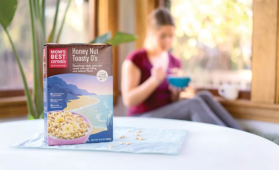
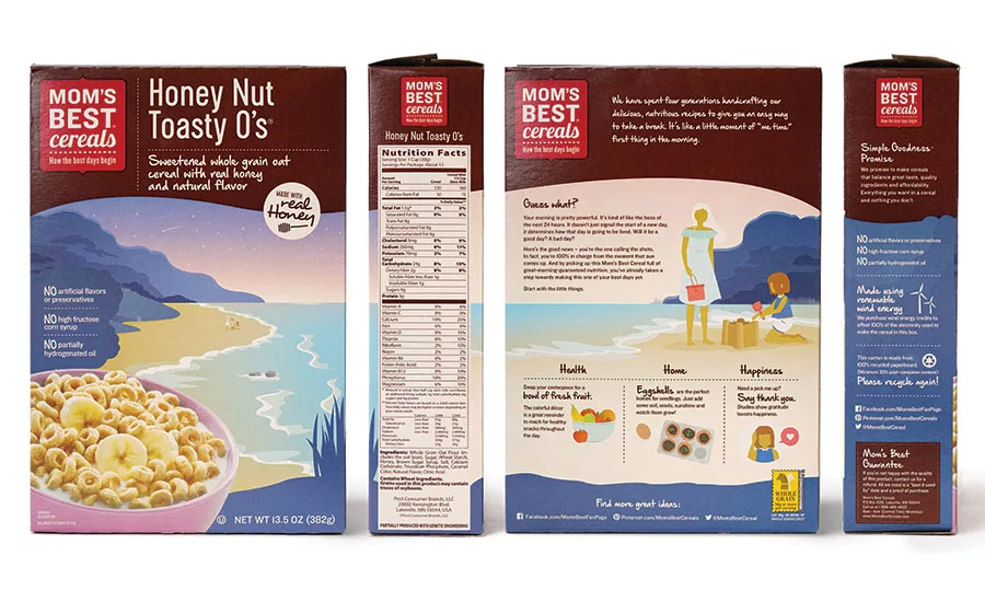
A realistic image of the cereal product is combined with a stylized , colorful landscape in the most recent package redesign for MOM’s Best Cereals. The logo shield at the top left and brown wave across the front top of the carton create a billboard effect on the shelves, while the back panel emphasizes life hacks that contribute to health, home and happiness.
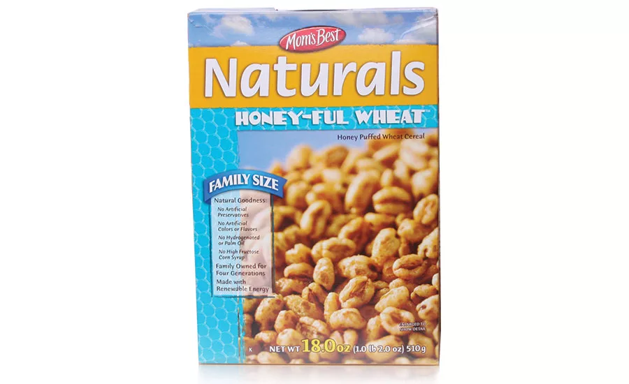
Before redesign
The Story
MOM Brands Co. (formerly Malt-O-Meal Co. and Campbell Cereal Co.) is a producer of hot and cold breakfast cereals, headquartered in Northfield, Minn. Now owned by Post Consumer Foods, MOM markets its products under a variety of brands, including MOM’s Best Naturals.
MOM’s Best Cereals originally were sold in co-op stores in the better-for-you category. However, about six years ago the company decided to expand the market for the cereals so they could be sold en masse in larger grocery and big-box stores.
The MOM’s Best product used healthy, natural ingredients, but also was known as a value brand. The original package had a more generic look that made it difficult to distinguish from other better-known brands in the cereal aisles, such as Kashi and Cascadian Farms. This situation created the need to redesign the packaging to perform well in several retail channels.
The Challenge
Shoppers often look down the cereal aisle of a store into a sea of sameness. Cereals are based on a limited number of grains usually sold as commodities. These grains are processed, packaged and marketed by a very limited number of consumer packaged goods companies (CPGs). These factors make it difficult to differentiate the products.
Changing consumption patterns have also been a threat to the cereal market as busy consumers find less time to eat breakfast at home. U.S. sales of cold and hot cereals combined are expected to total $10.6 billion this year, down 17 percent from $12.7 billion in 2009, the research firm IBISWorld estimates. And cereal sales are not likely to grow overall in the coming years.
Many consumers want tastier and healthier choices for breakfast, such as fresh fruit, yogurt and breakfast bars. They want portable foods they can carry out the door instead of taking the time to pour cereal into a bowl at the breakfast table. Cereals also are being attacked as less than nutritious and too high in calories due to sugar content.
To help counter these trends, MOM’s Best recently launched a packaging refresh spearheaded by Ideas that Kick, a Minneapolis-based branding and design agency. The latest refresh is a continuing evolution of a design launched nearly six years ago.
The Solution
When the rebrand first launched, it was based on a “craft, natural feel,” according to Mary Kemp, president and co-founder of Ideas That Kick, that employed an “Americana” feel with contemporary graphics that amplify the playfulness and simple goodness of the brand. Each of the new boxes showcases a beautiful landscape that instantly communicates the cereal’s wholesome focus. The line also was extended to include cereals oriented toward children.
“Two years ago, our launch of the brand’s kids’ cereals brought more color and a fun storytelling vibe to the MOM’s Best Cereals product line,” explains Kick co-founder and executive creative director Stefan Hartung. “Our goal with the adult refresh was to bring continuity across the brand’s entire offering while making the box and its elements more relevant to the moms of today.”
New typefaces, updated color palettes and an updated landscape design incorporating active lifestyle imagery reflects the evolution of MOM’s Best Cereals, overall look and feel, while reflecting the familiar elements customers recognize. Building on the success of the kids’ line redesign, the packages also feature modern storytelling elements, such as life hacks focused on moms’ health, home and happiness, and a more realistic photo representation of the cereal product.
The new packaging is designed to especially appeal to mothers who do most of the grocery shopping. Kemp points out that many moms may take the time to eat their breakfast after the rest of the family has departed for the day. This gives them time to read the content on the carton and follow the life hacks, which are tied to online social media sites such as Pinterest.
The design refresh touches all MOM’s Best Cereal products — six different flavors of breakfast cereals targeted to adults. The new designs are hitting shelves now.
“The new, fresh take on this iconic design really helps to modernize the brand, without sacrificing any of the personality,” says Jennifer Sail, creative director at Post Consumer Brands. “Ideas that Kick did a great job helping us to give this beautiful brand a facelift that makes it feel more relevant and contemporary. It will help to build on the success we have already had with this brand on shelf.”
PACKAGE DESIGN
Ideas That Kick
Looking for a reprint of this article?
From high-res PDFs to custom plaques, order your copy today!


