Getting a Leg Up: Top Beverage Packaging Design Trends for 2018
Eye-catching design elements adding style to the beverage aisle
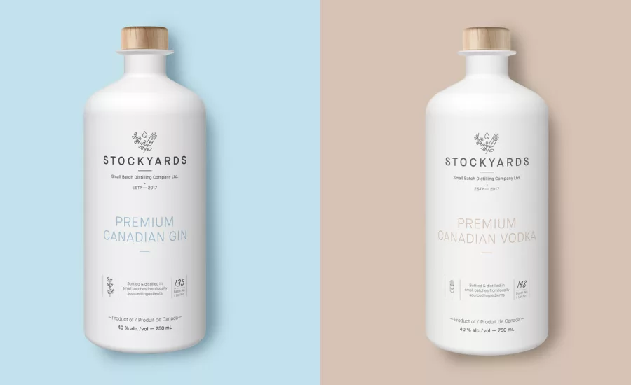
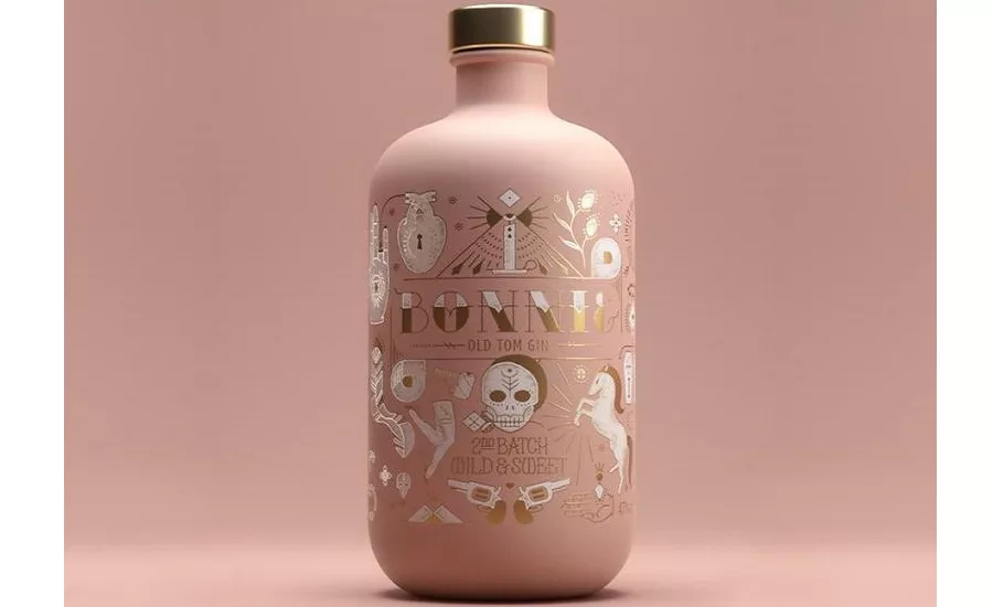
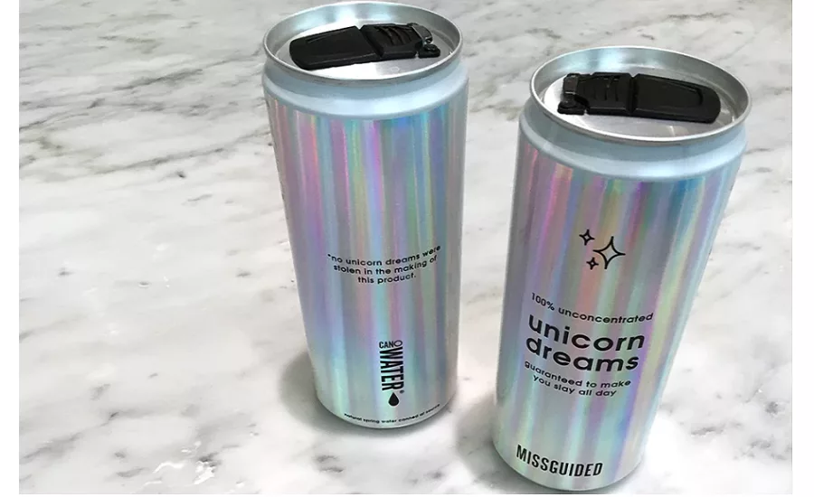
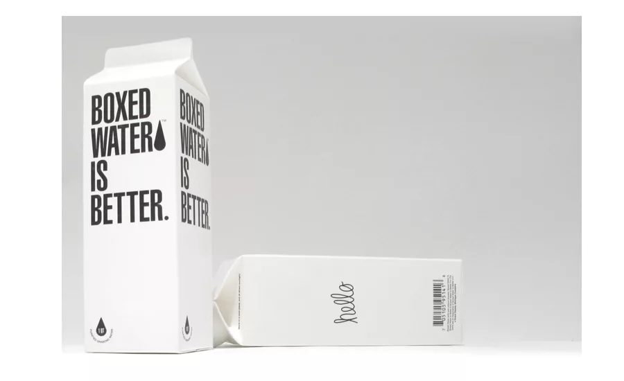
Image courtesy of Boxed Water
Competition in the booming beverage industry is fierce. Incorporating on-trend design is one way brands can improve their packaging and stand out on store shelves.
1. Minimalism
In 2018, expect to see beverage design continue to move in a more simple and straightforward direction. Incorporating this style into your own branding is all about prioritizing the basics: Successful minimalist designs showcase the most important details the consumer looks for in a product front and center—typically the product name, a clear explanation of the product, or a symbol that customers can quickly recognize.
Symbolism is an important aspect of minimal design because it allows companies to convey so much with so few words. By using symbolism in this way, brands can establish quality assurance within their customer base over time. You like Heineken, so you remember the red star. You like Guinness, so you remember the harp. The longer a successful company uses successful symbolism, the more iconic both become. There’s no way you’ll ever forget the Jägermeister deer, whether you like the drink or not.
2. Millennial Pink
This newly named color has rapidly gained popularity over the past year, and we expect to see this trend continue in the coming year. We’re seeing this playful trend show up everywhere from apparel to hair dye, and, of course, product packaging.
As the name suggests, using “millennial pink” is a fantastic way to connect your brand to young people. This color suggests a playfulness and lightheartedness that consumers haven’t traditionally expected from bottle brands, but this seemingly counterintuitive option can set you apart from your competitors in a visually striking way.
3. Pastels
Pink isn’t the only shade trending, pastels in general are also going to enjoy some time in the sun in 2018. These lighter colors offer relief for consumers from the customary bold and striking tones that have dominated the bottle market for years, and not just for the change of direction they represent.
Pastel shades in general are very soothing and calming, because of their vibrant yet soft tones. They can offer a sense of comfortability and charm that doesn’t feel disingenuous or tacky.
4. Holography
On a more futuristic note, holographic finishes are likely to take off in 2018. In an industry that has traditionally prioritized logos as the main focus of their branding, this style instead highlights the bottle itself, making the entire product distinct. The holographic finish adds an interesting visual stimulus that grabs and holds the eye, and on a store shelf that is often packed from floor to ceiling with options, those few seconds make a huge difference.
5. Modern Calligraphy
Calligraphy has been a mainstay in beverage package design for some time, but a contemporary renovation of the concept is already making a big splash in the industry. Brands are starting to adopt modern calligraphy into their beverage packaging designs. Expect to see this trend continue in 2018.
This new school concept takes hand-lettering, which already comes across as elegant and stylish, to a new level by allowing designers to add a new twist or motif that makes it perfect for things like wine bottles. Peter Wetzer craft wines provides the perfect example of this concept in action.
6. Sustainability
Sustainability is a buzzword in the industry these days as consumers have become increasingly interested in eco-friendly and sustainable packaging. More and more brands are starting to realize that not only can they tap into the minds of their customers by going sustainable, but they can save on their bottom line as well.
Boxed Water is one of several brands who offer a convenient, environmentally friendly alternative to plastic. The 100 percent recyclable packaging ships flat to regional filling locations, which reduces their carbon footprint.
The Takeaway
Trends only work when they truly align with the brand, the product and the direction of the company. There’s no point in being on-trend if there’s an obvious stylistic gap between the brand packaging and the product.
Looking for a reprint of this article?
From high-res PDFs to custom plaques, order your copy today!


