R/613 Brand Packaging Targets Millennial Market
Memory Sciences LLC, manufacturers of Invia, a product designed to enhance brain function and brain health in older adults, introduced a companion product in 2017, this time targeted at millennials—those born in the 1980s and ’90s—to deliver energy support during ”down” periods of their day and to provide overall enhanced brain function.
“These are such completely different markets,” says Brian Wargula, president of Memory Sciences. “Where Invia addresses seniors’ concerns about diminished brain capability, this new product would target millennials’ concerns about maintaining their energy level and mental performance throughout their typically long and active days.”
Wargula and his team began the marketing strategy for this new product by focusing on creating a brand image that would appeal to this challenging market segment: young, active, communication—and social media-savvy individuals typically not reached through traditional marketing.
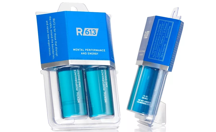
The first task was to choose a product name that would resonate with millennials. To capture attention, it would have to be unique, memorable and reflect the serious mental performance and energy benefits the product offered. After considerable research and debate, the final choice was R/613. The R/ suggests the Rx of a prescription, underscoring the product’s serious benefits; the 613 numerals add a scientific formulaic feel and reflect the simplicity of the product, which has only three ingredients.
The next step was to create a dynamic package for the product that would project that brand image. To reinforce the serious science behind the product, Memory Sciences chose for its primary package a clear 1 fluid oz. glass vial topped with a metal cap embossed with the R/613 logo. This gives it the look and feel of a medication.
Now it had to create a secondary package—the millennials’ first contact with the product–that would project the serious benefits of the product, yet enable it to be merchandised in a variety of ways to reach the target audience. To accomplish this, the company worked closely with Transparent Container Company, a leading designer and manufacturer of blister packaging and clamshells.
“This required more effort,” says Wargula. “Because the secondary package is the first interface the buyer has with R/613, it has to make an immediate impact. Yet it is more complex and has more elements to be integrated to produce that impact. ”
Wargula’s team and Transparent Container designers worked closely together to create and refine the final package. Several options, including a carded blister, had many of the desired elements: showing the primary package, providing some of the display features needed, etc. But all lacked the sleek look both teams felt would appeal to millennials.
Through a number of revisions incorporating input from both teams, the final package emerged: a 17.5-mL clear PVC (polyvinyl chloride) clamshell package holding two of the vials. The clamshell design incorporates tabs that hold the vials securely so that their printed front sides always face forward. A 16-point SBS paperboard sleeve holds the clamshell closed and provides a billboard for the brand image and information. The sleeve is printed in 8001 metallic silver ink on a 2195 blue ground, and that is further accented with foil stamping. The final element is a soft touch coating finish.
“The collaboration between our team and TCC created a package that had every feature we felt it needed to succeed,” says Wargula. “It has a 21st-century brand look, yet incorporates a subtle hang tag at the top and an integrated foot on the bottom to give it multiple ways to be displayed, whether hanging on a shelf or in a vending machine, standing on a counter or in a tray.
“TCC designers’ expertise also added some elements to the package that we would never have thought of, like the soft touch finish. Picking up a package is often the final step in a purchase decision, and this soft touch adds a subtle, tangible quality feel that can make the difference between Yes and No.”
Looking for a reprint of this article?
From high-res PDFs to custom plaques, order your copy today!


