SkinnyDipped Unveils Brand Redesign with New Packaging
Courtesy of SkinnyDipped
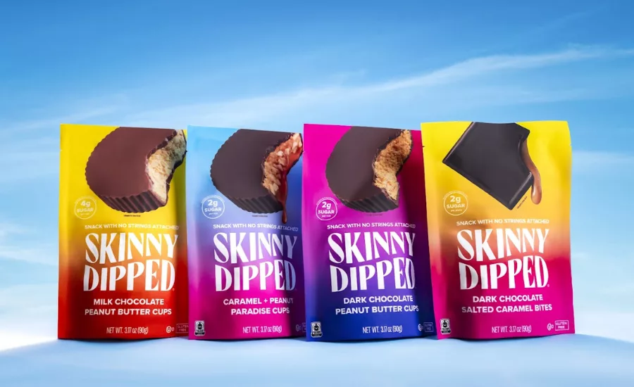
SkinnyDipped, the maker of best-in-class and better-for-you snacks, today announced the unveiling its new design refresh.
SkinnyDipped has become a brand synonymous with delicious, better-for-you snacks since its launch in 2016 and the next chapter in the brand’s identity is here. SkinnyDipped’s design refresh embodies everything the brand stands for - freedom, fun, healthy living, and empowered snacking.
The refreshed logo takes inspiration from the spirit of ‘skinnydipping’, featuring subtle water references like the wave within the title text and bolder flavor cues that underscore its delicious taste. The updated design also reinforces SkinnyDipped’s usage of premium, real ingredients on the front-of-pack through hard-earned certifications, such as FairTrade, Kosher, and Non-GMO Project Verified. The brand is also debuting a new, informed tagline, ‘Snack with No Strings Attached,’ which stems from the consumer’s desire for guilt-free snacking!
“After nearly a decade of growth, and on the heels of closing our Series A, we decided it was time for a SkinnyDipped glow up, said Breezy Griffith, CEO and Founder of SkinnyDipped. “Our logo now features a new signature wavy font, and our packaging maintains our iconic colors while giving them a bit of elevated gloss. All of this said, our product itself is not changing. We’re still offering the same beloved flavors, just with a bold new look.”
To learn more about SkinnyDipped, please visit https://skinnydipped.com/.
Looking for a reprint of this article?
From high-res PDFs to custom plaques, order your copy today!


