All-Nutrient relaunches look for organic hair care line
All-Nutrient® commissioned TricorBraun (tricorbraun.com), who partnered with Chuckles Inc. to rebrand and relaunch one of its extensive organic lines in the professional hair care market. The result was no less than award-winning graphic design, brand differentiation and beautiful, eye-catching color.
Chelsea Zomberg, operations manager at Chuckles Inc. described the task at hand this way, "Our goal was to convey an organic feel in an elegant way. It's a very visual and heavily saturated industry so it's tough to compete for the attention of stylist and ultimately the consumer."
Founded in the '80s, Chuckles was one of the first to introduce sulfate-free formulas in the nineties. Organic hair care is a niche market in professional salons. "For us, it is not just about marketing, or being compliant with industry regulations. Organic is who we are! We set the standard for naturally-derived products in the beauty industry," explains Zomberg.The ingredients are 100% vegan and cruelty-free (certified through PETA). "We control every raw material that we use in our formulas in order to develop the safest and healthiest options for our end user. But, we weren't conveying this prestige through our existing packaging. A brand refresh was in order."
"TricorBraun works with notable customers and we wanted a partner that would provide the most innovative options. We didn't want to be behind the curve but at the same time, we didn't want customers to think that the integrity of our products had changed," says Zomberg. "The packaging needed to communicate a deeper message about the value of our brand and it needed to speak to our customers."
Customer insight revealed that the company's packaging was out of touch with their core customer base. Consumers didn't realize the integrity that lied within the products unless they read the ingredient panel. Chuckles further enhanced their formulas with additional antioxidants, amino acids, lipids and peptides to transform hair so it seemed like the ideal time to reinforce an emotional connection with the brand.
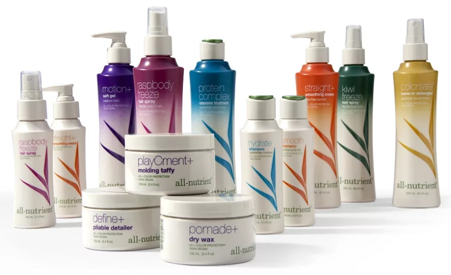
For continuity, the leaf from the original logo and six colors were retained from the original bottles and the color purple was added. The colors have the following designations: Hydrate (blue), Volumize (magenta), Restore (green), Colorsafe® (yellow), ClarpHx®, a clarifying shampoo and treatment, (turquoise), Hold (purple) and Smooth (orange). The color scheme is intended for consumers to easily and quickly identify product categories. Creating an appearance to mirror the sophistication of each ingredient across the entire line including more than eight families of products and more than 60 SKUs.
Michaela Velasco, graphic designer at TricorBraun, designed a stunning spray gradient with color designation that has the look of a bamboo plant. A silk screen process was used to differentiate styling products from shampoos and conditioners. "The color of each spray corresponds to the color of the hair care "family" that the styling products belong to. For example, the Volumize family includes all the products that add volume and their primary color is magenta so all of the products within that family have a magenta leaf graphic regardless of size, a styling product or shampoo. For further differentiation within the family, styling products have the magenta spray gradient coming down from the neck," says Velasco.
The biggest challenge in bringing the products to market according to Velasco were "color matching, determining how far down the bottle to go with the gradient, orientation and retaining text readability." The inks used for the color of the spray and the color of the leaf graphics on the face of the bottles are not the same type so some of the colors were harder to replicate. The text closer to the neck of the bottles had to be thicker and printed in white to be legible over the gradient of color. Velasco goes on to say, "Because the gradients are not exactly the same from bottle to bottle, adjustments also had to be made for readability on an as needed basis. In addition, there is a limited window of time after the bottles are sprayed that they have to be silkscreened or the ink will not adhere correctly."
Only a small number of other hair care product companies use a spray gradient and they seem to have done so with label printing and not silk-screening. Decorative technique and interesting bottle shapes differentiate the All-Nutrient products from the competition. The new bottle shape and graphics now have an overall organic, natural feel as a result of the synergy between package design, graphic design and design engineering. TricorBraun's Package Designer, Eva Foo, remained in particularly close contact with Velasco to ensure a harmonious and holistic visual solution.
Initially, TricorBraun's custom package design included bottle sizes in 3.4-, 8- and 12-ounce but recently, All-Nutrient has recently added a custom 1L salon-only bottle and a 750ml bottle. All 8- and 12-ounce bottles are HDPE because it was important to Chuckles that they be recyclable. According to Gerald Christian, design engineer at TricorBraun, "Retaining the integrity of the design with the changing capacities and closure types was definitely a challenge." All molds were qualified and bottles/closures were leak tested by TricorBraun.
Previous to working with TricorBraun, Chuckles did their own silkscreen plus hot stamp process. Zomberg says, "Having a turnkey process made life easier and enjoyable. We are a great team! They extend help to us in every way and make sure that the quality of the bottle and the deco process matched the excellence of our products."
The owner of the company, Charles Frank, has more than 40 years of experience in the industry including the role of a hairdresser. His understanding of the stylist gave him the insight needed to identify package objectives around grip-ability, invertible, more height and a low profile closure. A great deal of time went into selecting the shape of each bottle but extensive amounts of time went into the graphic design. Since the relaunch, "We are getting in more salon doors than we ever have," according to Frank.
In 2016, the All-Nutrient package and graphic design has earned both an NACD Cosmetics & Personal Care Bronze and a Graphic Design USA In-house Design Award.
Looking for a reprint of this article?
From high-res PDFs to custom plaques, order your copy today!


