All that Glitters
What’s new at the cosmetics counter?
 Jeffrey Spear provides strategic and creative direction for Studio Spear, a national marketing consultancy specializing in consumer products. Studio Spear approaches consumer products and brands, from research and planning to packaging, point-of-sale display and promotions, in ways that generate undeniable interest. Contact Jeff at 410.486.8822 or jeff@studiospear.com
With the successful release of Sex and the City: The Movie, it seems appropriate to venture into the world of beauty-specifically what’s been going on in the realm of cosmetics packaging. While Carrie, Charlotte, Samantha and Miranda were unavailable for comment, I am sure they’d agree there are plenty of cosmetics products and packaging that dazzle the senses.
It’s interesting to note that, while there are plenty of new and exciting packaging solutions that stand out from the pack, create cut-through and generate undeniable emotional appeal, the solutions tend to be matured, next-generation versions of tried and true packaging and marketing concepts.
For those of you who attended Luxe Pack New York recently, I’m sure you’ll agree. While there were plenty of provocative and exciting structural, material and graphic design solutions throughout the show, very little was entirely new or close to earth-shattering.
Green is beautiful. While chatting with various exhibitors, seeking their perspective on all things revolutionary and/or trendy in the realm of cosmetics packaging, I found their responses to be unanimous. In one form or another, respondents lost no time answering with terms such as “earth-friendly”, “sustainable”, “organic”, “all-natural” or “recyclable.”
For plastics manufacturers, reformulating or finding ways to recycle their products was top of mind. Others noted a shift from inorganic and man-made materials to glass, recycled paper and fiber-based materials. And the paper makers were thrilled-noting that their products were perfect for this realignment of material preferences and industry-wide paradigm shift.
Outside the show, where I was exploring retail environments to support this perspective, I found the best example of earth-friendly cosmetic packaging to be the Organic Wear line produced by Physicians Formula.
To start, the company believes that going green is not a trend, but, rather “a lifestyle that is here to stay”. When you consider the overall look and feel of the line’s packaging-from the “Organic Wear” name and associated soft colors to the matte finishes and leafy graphic pattern that adorns the surface of each product-there is no doubt that this brand is certainly nature-oriented. While not alone in its approach, Organic Wear is a far cry from the glitz and decadence that has been so heavily exploited by other beauty brands for so long.
Environmentalism is gaining momentum, and it does not mean that design has taken a back seat. I found evidence of that from mass-retailers such as Target and K-Mart to neighborhood supermarkets and pharmacies. These operations recognize and appreciate the influence that well-crafted and emotionally inspired packaging plays, and have lined their shelves accordingly.
Packaging as sculpture. One of the ways cosmetics marketers are making a splash is through exceptionally well-crafted and elegantly sculpted containers. While there are lovely solutions being created with traditional geometries, there are a large number of marketers who feel more distinctive, organic, curvilinear and abstract shapes are better suited to cosmetics.
This has been, and continues to be, the operational standard for fine fragrance brands like Gaultier, Issey Miyake and Donna Karan. A few of the more recent and eye-catching designs also include Bulgari’s Omnia, Calvin Klein’s Euphoria and Kenzo’s SummerbyKenzo.
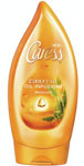
This approach, however, is not restricted to the parfumeries of the world. To varying degrees, and while not as overtly decadent as some of the higher end fragrances, mass-brands such as Giovanni, Caress and Joico are all embracing more organic, undulating and undeniably sensuous geometries for their containers.
Going one step further, functional embellishments like distinctive cords, ribbons, outer wrappings and closures are being used to increase the overall on-shelf impact and appeal of packaging and enhance brand impressions. Fragrance brands like Lolita Lempicka and Juicy Couture are excellent examples. In the personal care arena, Archipelago Botanicals, a brand that employs innovative closures and detailed outer wraps on many of its packaging solutions, is noteworthy.
Are you talking to me? The use of inspired, sensuous and emotionally appealing structural designs has been a mainstay within the cosmetics industry for years (after all, the foundation of the industry is in aesthetics), but the use of edgier copywriting is also helping to distinguish brands. In a crowded and competitive marketplace, where distinctions between brands are becoming increasingly hard to define, attitude is stepping in.
Marketing strategies that exploit clever brand names such as “Urban Decay”, “Soap & Glory”, and “Bed Head” as well as individual product names including “Dr. Feelgood”, “Sexy Mother Pucker”, “Dumb Blonde Smoothing Stuff” and “Control Freak” are gaining in popularity. It seems that, while some brands are founded in beauty, everlasting youth, elegance, luxury and/or decadence, others are founded in wit, comedy, spunk and sass.
Copywriting has also embraced the sensuality of food. While fruit fragrances have always been alluring, shopping for shampoos and body washes in the drug store now feels more like shopping for weekly groceries in the supermarket.
Appetite-inducing descriptions such as “Grapefruit and Lemongrass”, “Cucumber and Green Tea”, “Cherry Blossom and Almond”, “Fresh Pear and Apple Blossom” and “Pomegranate and Mango” are rapidly replacing botanical and herb nomenclatures. Consider that Bulgari describes its newest fragrance, Omnia, as “a sexy blend of mandarin, saffron, Masala tea, and white chocolate. This scent smells truly good enough to eat.”
We’re also seeing copywriting that exploits the exotic and mysterious nature of far-off destinations. It’s this approach that Caress has embraced when it suggests you “give your skin a rejuvenating vacation” with its Tahitian Renewal Body Wash. The brand also advises consumers to “discover the magic” in its Moroccan and/or Japanese Exotic Oil Infusions. Most recently, and with a more energized and daring tone, buyers are encouraged to “unleash their sensuous sides, vivacious charm and Brazilian spirits” by using Caress Brazilian Exotic Oil Infusion.
There’s little doubt that marketers are looking for new and different ways to distinguish their brands, reach their audiences and appeal to specific lifestyle preferences. By embracing clever wordsmithing, the sensory appeal of foods and the allure of exotic destinations, the language of cosmetics is rapidly changing.
Color is king. Eye-catching proprietary shapes, detailed embellishments and clever copywriting are not the only ways to create cut-through and make impactful brand impressions. In many cases, traditional packaging geometries are effectively enhanced with relatively simple, yet still artful, applications of distinctive colors and surface treatments. The end result is fiercely competitive-effectively dismissing rival brands.
While metallics have been around for a long time, Kenra’s line of hair care products makes excellent use of metallic silver through contrasts in finish, utilizing both high-gloss and matte finishes throughout its line of products. The result is an unmistakable on-shelf presentation that would be hard to confuse with any other brand.
Another example where metallics are put to excellent use is Joico. The brand’s metallic copper and gunmetal grey color schemes, while considerably more sedate than Kenra, are immediately recognizable. The fact that Joico’s approach to packaging also employs distinctive, proprietary geometries gives its products an obvious competitive advantage.
While not necessarily metallic, the same can be said for the brilliant green that adorns each of Garnier Fructis’ products as well as the signature purple that is employed by Aussie across its competing hair care line. In both cases, the use of a single, dominant color facilitates immediate brand recognition and designates shelf space as brand-owned territory.
What about graphics? Most of the packaging that’s been described so far can be categorized as contemporary-relying on more recent design trends and technological advances. There are, however, a significant number of marketers who feel their brands are better served by expressions of a more traditional heritage.
In some cases, designs embrace typefaces, patterns, color schemes and materials in a manner that takes obvious reference from history, and subsequently blends them with more traditional design configurations. In other cases, the references are seemingly unadulterated and historically accurate, approximating the serenity and simplicity of days gone by without contemporary artifice.
Companies such as Fresh, a brand that is “building on cultural foundations of the past,” along with Thymes, Philosophy and Gianna Rose, typify this first category of marketers. Their packaging solutions are elegant, decorative, inviting and compelling, frequently integrating old world graphics with contemporary manufacturing techniques.
Kiehl’s and C.O. Bigelo, however, are both prime examples of unadulterated, historically relevant packaging. They both celebrate and exploit their heritage as old-world apothecaries, each with more than 150 years of operation. Accordingly, their products rely on containers that are considered old-world standards-boston rounds, simple cylindrical cosmetic jars and tubes. Applied graphics come in the form of no-nonsense black and white labels crammed with informational text-a design approach that accentuates and reinforces the brands’ historical roots and operational longevity.
Good things come in small packages. Many buyers enjoy sampling, finding out how products make them feel or proving efficacy prior to purchase. Marketers are finding that sample-sized “gifts with purchase” as well as retail-oriented gift sets-SKUs that offer an assortment of smaller volume containers-represent a significant sales opportunity and are valuable additions to their product lines.
It’s not surprising to find that, as with the rest of the cosmetics industry, design is playing an important role in the look and feel of these single-dose and sample-sized packages. While samples have not always required tremendous attention to design, many of the very same marketing strategies, visual concepts and material considerations that are being applied to full-sized products are now deemed essential in the realm of sampling.
Looking good. With an industry built upon the pursuit of ultimate beauty, self-confidence, health, well-being and, of course, sex appeal, there can be no doubt about the volume of opportunity for creative inspiration and artful execution. From fine fragrances and facial products to shampoos and body washes, manufacturers are constantly pursuing new marketing strategies and creative executions to promote their brands.
The ever-increasing influence of environmental issues will certainly have an effect. To what degree depends upon advances in technology, how packaging materials are manufactured and regulated and what happens post-consumer. While notions of decadence and self-indulgence may be at the core of the cosmetics trade, taking steps to take care of our planet can no longer be ignored.
The wonderful thing about the cosmetics industry is that it has never been afraid to seek out new ideas or take risks. For the marketing and creative communities supporting these efforts, the bar is constantly being raised. It’s clear that, no matter where the influences come from, there will never be a shortage of emerging trends and innovative design solutions to keep things interesting. BP
Looking for a reprint of this article?
From high-res PDFs to custom plaques, order your copy today!


