Sublime Consumer Packaging
A run of industry shows reveal six design trends that are making a difference.
 Marketers are constantly scrambling for design solutions that stand out, communicate credibility, convey value, resonate with consumers, compel purchase and promote loyalty. Finding these solutions, however, is not easy.
One way to know what’s happening broadly with consumer brands and packaging is to attend industry-specific events and shows. In the United States, some of the most important consumer products shows include the Food Marketing Institute Show (FMI), Natural Products Expo, Fancy Food Show, Boston Seafood Show, Dairy-Deli-Bake, All Candy Expo, Toy Fair, International Home + Housewares Show, National Hardware Show, Atlanta International Gift & Home Furnishings Market, New York International Gift Fair, International Beauty Show (IBS) and Cosmoprof. While there are countless others, attending these will give you a good idea of what’s going on in U.S. retail marketing and packaging design.
Having attended many of these shows this year, and tracked the variety of marketing and brand solutions, it became apparent to me that the current crop of distinctive packaging designs can be segmented into one of six, clearly defined categories.
While some designs may be hybrids and derive benefits from more than one, these six categories envelop the universe of distinctive and heralded packaging solutions found on retailer’s shelves today.
When looking at the Target-owned Archer Farms brand of cereals, all of these issues have been taken into consideration and elegantly applied to one container. While the applied graphics are well conceived, the structural considerations for this line of products are considerably more advanced, and respond unequivocally to consumer preferences.
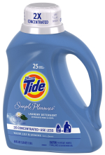
Similarly, Proctor and Gamble’s Tide, Tide Simple Pleasures and Tide Total Care liquid laundry detergents have recognized the value of fully conceived and functional packaging. With the addition of larger handles, oversized and ribbed closures and aesthetically appealing geometries, consumers are able to interact with, and enjoy this line of products from many perspectives.
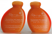
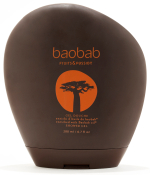
According to Scott Jost, director at Studio One Eleven, “Pursuing shapes and functionalities that simply do not yet exist in the marketplace gives products a distinctive marketing advantage.”
This was the philosophy that Jost and his organization applied to the newly developed Renpure line of hair care products. Of note is the considerable degree of engineering that had to be resolved (obtaining new patents along the way) before these designs could be realized as mass manufactured goods.
Similarly, the containers developed by Method for its home and personal care products have consistently taken advantage of structural form. Of particular note are the curvilinear bottles for Lil’ Bowl Blu toilet bowl cleaner as well as Method Icon Dish Soap. While each has its own distinctive shape and emotional appeal, these products are stand-outs on retailer shelves as well as in consumer’s homes. As is proclaimed on the company website “the unique design is yours to have and to hold...and not hide under your sink.”
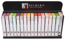
One such entry is Koh-shi’s Awaji Island incense. While the brand’s rectilinear paperboard boxes are industry standards, its clever use of typography and vivid, fragrance-linked color schemes applied against a simple white background makes a remarkable impression.
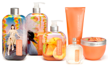 Another range of products that relies upon innovative surface treatments to incite brand recognition is the Imagine line of toiletries developed by Fruits & Passion. By employing shrink label technologies along with playful and imaginative graphics, a distinctive and appealing look and feel emerges.
In addition, the company has made significant investments toward a line of products that are truly eco-friendly.
“We have been able to develop our formulas and packaging while adhering to strict natural and environmental standards, without compromising the quality of the scents, the texture of the products or their unique look,” says Séverine Mathé, product development director for Fruits & Passion.
This became increasingly apparent at last year’s Luxe Pack show in New York. When asked about emerging trends and new developments in packaging, manufacturers consistently identified recycled and renewable materials as their top request.
Unfortunately, efficiencies in waste reduction, use of renewable resources and a strict adherence to environmentally sensitive manufacturing policies does not necessarily create cut-through on retailer’s shelves or become readily apparent in a design solution. While many companies do have environmentally friendly policies in place, and some discussion of these policies appears in their marketing communications, their packaging solutions have gained recognition for different reasons.
One such marketer is the French chocolate company Patrice Chapon, which couples the look and feel of European antiquity with luxurious styling throughout its product range. Of particular note are the Dome and Prestige boxes that blend antique-styled illustrations and typographic solutions with innovative and curiosity-provoking structural geometries. While the Dome is elegantly caped with braided cord, the Prestige box takes on the look and feel of an old-fashioned steamer trunk, complete with sliding drawers.
Russia’s A. Korkunov is another chocolate producer that exploits heritage and authenticity in its brand presentations. Of particular note is the brand’s artful integration of typography, various printing techniques including embossing, varnishes and foils, and unique folding details in its cartons, particularly the brand’s 150g hexagonal box and footed 200g box. While many producers of fine chocolates employ similar techniques, these are in a class of their own.
Additionally, many of the products that bear the Williams-Sonoma moniker rely on applied graphics that are pulled from the look and feel of another era. Two packaging solutions of note are the Williams-Sonoma Molten Chocolate Cake Mix and the Williams-Sonoma Homemade Collection Specialty Bread Mix. Both designs are elegantly crafted, the former rivaling some of the most luxurious confectionery packages.
In the realm of fine fragrances and perfumes, companies including Gaultier, Lolita Lempicka, Bulgari, Kenzo and Guerlain are just a few that have exploited design to its fullest.
Similarly, marketers including DL. & Co., Vie Luxe and MOR, all manufacturers of scented candles, soaps and other such aromatic products, benefit from luxurious design motifs. They make excellent use of foil stamping, specialty ribbons, metallic inks, die cutting, embossing, etched glass, dimensional seals, specialty closures and other such distinctive embellishments.
Many of these same embellishments are also embraced by food manufacturers. In the hotly contested tea category, luxurious and evocative design solutions help distinguish brands such as Harney & Sons, Revolution and Tréleela.
What is apparent, no matter what consumer products category you consider, is the enormous variety of design options marketers are embracing to attract and persuade buyers.
However, there are still plenty of product categories and individual brands that prefer the security of the status quo, breaking little ground when changes are implemented and, seemingly, ignoring the threats posed by more aggressive and innovative newcomers.
One such category is breakfast cereal. Aside from the advances being pioneered by Target, there are very few advances in packaging in the cereal aisle. From one rectangular paperboard box to the next, the only point of difference comes from brand-specific color schemes and highly crafted illustration techniques applied to trademark presentations.
While companies including Method, MOR, A. Korkunov and Target employ marketing philosophies that clearly embrace design, there are still plenty of opportunities to embrace.
Jeffrey Spear provides strategic and creative direction for Studio Spear, a leading national marketing consultancy specializing in consumer products. Contact Jeff at jeff@studiospear.com, 410.486.8822 or 866.787.8761.
One way to know what’s happening broadly with consumer brands and packaging is to attend industry-specific events and shows. In the United States, some of the most important consumer products shows include the Food Marketing Institute Show (FMI), Natural Products Expo, Fancy Food Show, Boston Seafood Show, Dairy-Deli-Bake, All Candy Expo, Toy Fair, International Home + Housewares Show, National Hardware Show, Atlanta International Gift & Home Furnishings Market, New York International Gift Fair, International Beauty Show (IBS) and Cosmoprof. While there are countless others, attending these will give you a good idea of what’s going on in U.S. retail marketing and packaging design.
Having attended many of these shows this year, and tracked the variety of marketing and brand solutions, it became apparent to me that the current crop of distinctive packaging designs can be segmented into one of six, clearly defined categories.
While some designs may be hybrids and derive benefits from more than one, these six categories envelop the universe of distinctive and heralded packaging solutions found on retailer’s shelves today.
Enhanced functionality and aesthetic appeal are simultaneously obtained through Tide's innovative and impactful bottle designs.
Ergonomic
In response to consumer frustrations, marketers have been developing ways to make their products, and their packaging, as convenient and user friendly as possible. Improved functionalities in terms of easy-to-handle geometries and resealable closures are all being developed and employed on a wide range of products.When looking at the Target-owned Archer Farms brand of cereals, all of these issues have been taken into consideration and elegantly applied to one container. While the applied graphics are well conceived, the structural considerations for this line of products are considerably more advanced, and respond unequivocally to consumer preferences.
Similarly, Proctor and Gamble’s Tide, Tide Simple Pleasures and Tide Total Care liquid laundry detergents have recognized the value of fully conceived and functional packaging. With the addition of larger handles, oversized and ribbed closures and aesthetically appealing geometries, consumers are able to interact with, and enjoy this line of products from many perspectives.
Pursuing shapes and functionalities that simply do not yet exist in the marketplace gives products a distinctive marketing advantage.
Structural
Offering new and unusual structures creates cut-through and brand differentiation that graphics alone cannot provide.According to Scott Jost, director at Studio One Eleven, “Pursuing shapes and functionalities that simply do not yet exist in the marketplace gives products a distinctive marketing advantage.”
This was the philosophy that Jost and his organization applied to the newly developed Renpure line of hair care products. Of note is the considerable degree of engineering that had to be resolved (obtaining new patents along the way) before these designs could be realized as mass manufactured goods.
Similarly, the containers developed by Method for its home and personal care products have consistently taken advantage of structural form. Of particular note are the curvilinear bottles for Lil’ Bowl Blu toilet bowl cleaner as well as Method Icon Dish Soap. While each has its own distinctive shape and emotional appeal, these products are stand-outs on retailer shelves as well as in consumer’s homes. As is proclaimed on the company website “the unique design is yours to have and to hold...and not hide under your sink.”
The clever use of typography and vivid, fragrance-linked color schemes against a simple white background creates undeniable cut-through.
Eye Candy
Proprietary structural innovation is not the only way to cut through retail clutter. With the right combination of colors, fonts, words and pictures, coupled with distinctive printing and manufacturing technologies, seemingly mundane containers can be transformed and made impossible to ignore.One such entry is Koh-shi’s Awaji Island incense. While the brand’s rectilinear paperboard boxes are industry standards, its clever use of typography and vivid, fragrance-linked color schemes applied against a simple white background makes a remarkable impression.
Playful and colorful graphics linked with shrink-label technologies generate undeniable cut-through and emotional appeal for Fruits & Passions toiletries.
In addition, the company has made significant investments toward a line of products that are truly eco-friendly.
“We have been able to develop our formulas and packaging while adhering to strict natural and environmental standards, without compromising the quality of the scents, the texture of the products or their unique look,” says Séverine Mathé, product development director for Fruits & Passion.
Green
While not necessarily contributing to product recognition or visual impact, marketers are eager to position their brands as environmentally sensitive. In this regard, finding ways to use renewable and/or recyclable resources, or being able to make claims of operational efficiencies in terms of carbon footprint or material consumption has become essential to marketing. Making use of recycled paperboards, soy-based inks and engineering strategies that minimize waste has become important in increasing brand value.This became increasingly apparent at last year’s Luxe Pack show in New York. When asked about emerging trends and new developments in packaging, manufacturers consistently identified recycled and renewable materials as their top request.
Unfortunately, efficiencies in waste reduction, use of renewable resources and a strict adherence to environmentally sensitive manufacturing policies does not necessarily create cut-through on retailer’s shelves or become readily apparent in a design solution. While many companies do have environmentally friendly policies in place, and some discussion of these policies appears in their marketing communications, their packaging solutions have gained recognition for different reasons.
Authentic
Another practice used to attract and reassure consumers about the integrity of their products is authenticity, or simplicity. This is where marketers or package designers use words and pictures that appear somewhat old-fashioned or derived from a time in history when life was deemed simpler. The assumption is, if it looks more authentic and steeped in history, the brand will be perceived as significantly more credible than its contemporaries.One such marketer is the French chocolate company Patrice Chapon, which couples the look and feel of European antiquity with luxurious styling throughout its product range. Of particular note are the Dome and Prestige boxes that blend antique-styled illustrations and typographic solutions with innovative and curiosity-provoking structural geometries. While the Dome is elegantly caped with braided cord, the Prestige box takes on the look and feel of an old-fashioned steamer trunk, complete with sliding drawers.
Russia’s A. Korkunov is another chocolate producer that exploits heritage and authenticity in its brand presentations. Of particular note is the brand’s artful integration of typography, various printing techniques including embossing, varnishes and foils, and unique folding details in its cartons, particularly the brand’s 150g hexagonal box and footed 200g box. While many producers of fine chocolates employ similar techniques, these are in a class of their own.
Additionally, many of the products that bear the Williams-Sonoma moniker rely on applied graphics that are pulled from the look and feel of another era. Two packaging solutions of note are the Williams-Sonoma Molten Chocolate Cake Mix and the Williams-Sonoma Homemade Collection Specialty Bread Mix. Both designs are elegantly crafted, the former rivaling some of the most luxurious confectionery packages.
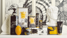
The Australia based MOR design team embraces a wide variety of packaging technologies and effectively communicates luxury across all of their products.
Luxury
When it comes to luxury items, packaging solutions typically embrace lavish materials such as cut crystal, leather, velvet, satin, gold and silver, and draw reference from the artifacts typically associated with a high standard of living. For many marketers, in spite of the fact that their products may not be terribly rare, unique or expensive, implying luxury in their packaging offers unmistakable benefits in terms of brand positioning, shelf appeal and validation of price.In the realm of fine fragrances and perfumes, companies including Gaultier, Lolita Lempicka, Bulgari, Kenzo and Guerlain are just a few that have exploited design to its fullest.
Similarly, marketers including DL. & Co., Vie Luxe and MOR, all manufacturers of scented candles, soaps and other such aromatic products, benefit from luxurious design motifs. They make excellent use of foil stamping, specialty ribbons, metallic inks, die cutting, embossing, etched glass, dimensional seals, specialty closures and other such distinctive embellishments.
Many of these same embellishments are also embraced by food manufacturers. In the hotly contested tea category, luxurious and evocative design solutions help distinguish brands such as Harney & Sons, Revolution and Tréleela.
What is apparent, no matter what consumer products category you consider, is the enormous variety of design options marketers are embracing to attract and persuade buyers.
However, there are still plenty of product categories and individual brands that prefer the security of the status quo, breaking little ground when changes are implemented and, seemingly, ignoring the threats posed by more aggressive and innovative newcomers.
One such category is breakfast cereal. Aside from the advances being pioneered by Target, there are very few advances in packaging in the cereal aisle. From one rectangular paperboard box to the next, the only point of difference comes from brand-specific color schemes and highly crafted illustration techniques applied to trademark presentations.
While companies including Method, MOR, A. Korkunov and Target employ marketing philosophies that clearly embrace design, there are still plenty of opportunities to embrace.
Jeffrey Spear provides strategic and creative direction for Studio Spear, a leading national marketing consultancy specializing in consumer products. Contact Jeff at jeff@studiospear.com, 410.486.8822 or 866.787.8761.
Looking for a reprint of this article?
From high-res PDFs to custom plaques, order your copy today!


