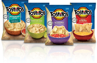
Tostitos redesigned its packaging to reflect a new all-natural positioning, using the window on the bag that reveals the chips as a key communication tool.
One of the largest food companies in the world, Frito-Lay has been incorporating healthy innovations into its snacks for years. From eliminating trans fats and reducing salt to cultivating potato varieties that absorb less oil, the company has made steady progress in updating its brands to be better for consumers without giving up the great taste people love and expect.
But Frito-Lay’s most significant change came at the end of 2010 when the company announced plans to make 50 percent of its product portfolio with all-natural ingredients. Beginning with Lay’s flavored potato chips, Frito-Lay turned to our team to reflect that shift on its packaging.
Listening to Consumers
The risk of alienating brand loyalists is high when considering any kind of transition, especially for an iconic brand like Lay’s. In these instances - more than any other - it’s critical to evaluate and listen to consumer input upfront.We began by using qualitative testing to understand both the core packaging brand equities and to explore a range of visual and verbal concepts that conveyed the idea of “all-natural.” Although previous qualitative research studies showed that all-natural translated as "not as tasty," our 2010 research showed that consumer perceptions of all-natural products have evolved greatly because of such factors as increasing nutrition awareness driven by government mandates, increasing transparency from the 24/7 feedback loop of social media and big retailers like Walmart jumping on the natural/organic bandwagon. Consumers now understand that all-natural can mean quality ingredients and good taste.
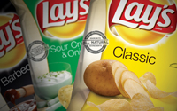
Our goal was to walk the fine line between communicating the innovation and over emphasizing the all-natural claim. We determined that the best approach for Lay’s was to maintain as much equity as possible but to evolve the brand’s natural cues through a more realistic treatment of photography, slightly altered bag colors and a simplified layout. We then quantitatively tested the final package designs using eye-tracking studies.
A New Way of Snacking
What first began as a Lay’s redesign project soon turned into a partnership to reflect the new all-natural positioning across much of Frito-Lay’s snack portfolio by the end of 2011. This involved more than six dozen varieties, including all flavors of Lay’s potato chips, Tostitos tortilla chips, SunChips multigrain snacks, Baked! snacks and Rold Gold pretzels.Frito-Lay recognized an opportunity to shift consumer perception of salty snacks and drive change in the category by using the scale of its portfolio. The scope of change was massive, but the implications were clear: With the visibility created by the largest integrated marketing campaign in Frito-Lay’s history, competitors would need to scramble to follow the company’s lead.
Several projects were rolled into one and we were soon updating brands and redesigning Lay’s, Tostitos, SunChips and Rold Gold packaging simultaneously to better reflect the all-natural messaging they would carry. We collaborated closely with the Frito-Lay brand teams to hold true to the differentiating character of each individual brand while working from some common tenants: simplicity, the iconic equity and positioning of each brand, clarity of messaging and evolving natural cues.

A stamp and band graphic prominently conveys the all-natural message but allows each brand to retain its equities.
Communicating the Experience
Over the years, packaging trends for natural products have evolved from stereotypical cues like tan papers and scratchboard illustrations to lots of white and, now, to more sophisticated color palettes and uncluttered designs. Today, “natural” is communicated through simple, honest design and open layouts. We kept true to this with the Frito-Lay portfolio - approaching each brand’s packaging a bit differently, respecting its strengths and identifying its challenges.While the Lay’s redesign remained similar to its original version, Tostitos benefited from an extensive redesign that used natural textures and colors to emphasize and reinforce the product experience. The window revealing the product - so critical to shopping in the tortilla chip category - became the key communication tool. On the classic line, the window evolved into the opening of a chip basket with a bowl of salsa next to it. On the proprietary shapes like Scoops!, the window became the chip itself, half immersed in a bowl of dip.

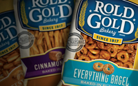
Packaging for the Rold Gold Bakery line extension features a “post-applied label” to dial up the natural story and product experience.
We got back to basics on Frito-Lay’s flagship natural brand, SunChips. The markedly simple design accentuated the strength of the brand and warmth of the glowing sun. We used a subtle, woven background to set off the chips and real food cues to emphasize both flavor and the whole grain attributes of these light multigrain snacks.
Transforming the Snack Aisle
While consumers are now willing to embrace the benefits of all-natural, the challenge was to shift their perceptions of how that fits into the snack aisle itself. To do so, we needed to create an all-natural message that could be communicated in a consistent, prominent and motivating way across the entire portfolio. One of the main goals was to create a sense of blocking on shelf, so we explored solutions at the top, sides and bottom of the bag that ranged from ingredients photography to bold graphics. We ultimately landed on a simple, but very prominent, graphic: an all-natural stamp and band, which could work across all the brands’ packaging without overwhelming communication of each product experience. Our new graphic could be placed on any of the packages consistently, in a way that’s as straightforward and easy to understand as it is quick to read.There was understandable apprehension about making such a strong and bold statement on the front of these iconic packages. Would consumers still recognize their favorite brands? Would they be able to find their flavors? Would the snacks still read as tasty and fun to eat?
Ultimately, we found that the new designs could do all of the above. In fact, the new designs resulted in significant increases in perceptions of taste and purchase intent compared to the previous packaging. All signs point to consumers seeking a wider range of products made with all-natural ingredients.
Frito-Lay has led the way for the category, defying convention to continue to update existing products and innovate new products, while giving all of us more ways to enjoy all-natural snacks.
Michael Connors is the vice president of design for Seattle-based design firm Hornall Anderson. Michael brings more than 25 years of extensive expertise collaborating with clients such as Frito-Lay, Quaker, Tropicana, Pedigree, T-Mobile, Janus, ConAgra, CitationAir, PayPal, California Closets, Amgen, and Getty Images; and introducing them to the world in emotionally compelling ways through branding, graphic design and advertising.
Hornall Anderson (part of Omnicom Group, Inc. – NYSE: OMC) specializes in the design and execution of "customer experiences" within built and virtual environments, as well as through print and packaged goods. From iconic buildings like Madison Square Garden, Sydney Opera House and the Empire State Building to Fortune 500 companies like Starbucks, Pepsi-Co. and Microsoft, some of the world's most remarkable brands have trusted Hornall Anderson to develop and capture a powerful narrative to help create an emotional connection with its customers. www.hornallanderson.com
