The making of Pinkberry
How a uniquely compelling brand identity spawned a global “froyo” movement
 Everything else would follow this visual look and feel-from the web design to the packaging, marketing materials and collateral. It was important for customers to fall in love with the product visually, even before they tasted their first bite; from here it’s marriage.
This artistic chord runs throughout the brand; the customer becomes the artist with the power to create her very own yogurt masterpiece. Rather than rolling out dozens of mediocre and unmemorable yogurt flavors as most competitors do, Pinkberry perfects just a handful of flavors, many of which are seasonal. And so the focus is on Pinkberry’s dozens of exquisite toppings, ranging from the freshest hand-cut fruits to Belgian chocolate, nuts, cereals to Italian caramel sauce. Pinkberry encourages artistic “pairings,” elevating the importance of quality and refined tastes, while also leaving room for the endless masterpiece possibilities for those artists who might be a bit more on the Jackson Pollock side.
Graduating from Art Center Pasadena, Yolanda 'Yo' Santosa began her career designing main titles for film and television projects like 300, Desperate Housewives and Ugly Betty. She loved storytelling and couldn't ignore a growing fascination for branding; so in 2006 she acquired the then infant Pinkberry account and founded Ferroconcrete. With her recent network redesign of TBS, Yo has come full circle, turning Ferroconcrete into a unique, full service branding and motion design firm. With her latest endeavor, she has ventured out to create her own retail brand - früute, a contemporary West Hollywood pastry shop serving handcrafted mini tarts. Yo has earned numerous accolades, including three Emmy nominations, and is sought out as a national guest speaker and branding expert.
By Yolanda Santosa
It would be hard not to notice the frozen yogurt resurgence that has taken place over the last five years. Once an 80’s fad, now a seemingly permanent cultural icon, frozen yogurt is spanning the country-and the world-with the allure of sweet, cold guilt-free indulgence. And while many frozen yogurt brands continue to pop up, one remains the frontrunner. And it just so happens to be the one that began the “froyo” movement.
Amidst droves of competitors, Pinkberry has been able to grow from one location to more than 100 stores internationally by creating and evolving a uniquely compelling brand identity to continually and directly engage the customer. Through its brand design, packaging and social media efforts, Pinkberry has become a global brand that not only sets standards, but reinvents them.
At the helm of Pinkberry is the small downtown-Los Angeles branding firm, Ferroconcrete. The relationship began shortly after Pinkberry opened its first store in West Hollywood, Calif. The brand design was conceived based on the architecture of this first store: its starkness, lightness, pebble floors, pastel color palette, ghost chairs and swirly Philippe Starck lamps.
The brand was to be something that reflected both the essence of modern design and the reminiscence of childhood summers. Pinkberry was to be sophisticated yet playful, stark yet eye-catching, sweet yet tangy; not a Penguins or a Baskin Robbins, but something altogether new.
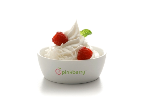
The portrayal of the product itself was key. In the beginning, Pinkberry offered just two flavors (original and green tea), so the product image concept had to convey a minimalist philosophy. A cup of Pinkberry would not look exactly the way it would look as served to the customer; instead, it would become a romanticized version of itself. Putting the paper cup aside, the Pinkberry was shot in a porcelain bowl with little else to distract us. The resulting image (what was soon to be the future of frozen treats) was inspired by the film 2001: A Space Odyssey. It depicts bright white yogurt against a bright white background; its starkness punctuated only by the vibrant (but sparse) colors of the toppings.
It was also important for the Pinkberry brand to have a more playful side with a captivating and distinct personality. The yogurt itself became an actual character, the Pinkberry, with chocolate chip eyes. She uses playfully direct language to talk. And, as the seasons change, she dresses accordingly. During winter she’s been known to put on shredded coconut earmuffs, and on Valentine’s Day she falls in love with another flavor, announcing a soon-to-be-swirled pairing for customers.
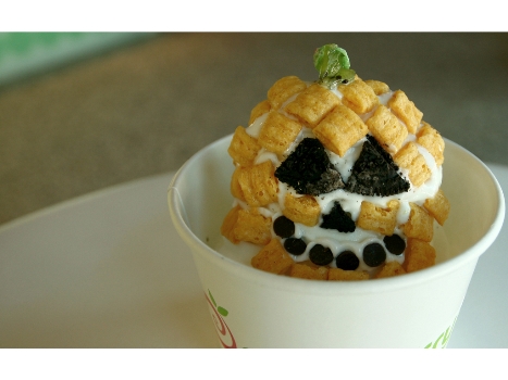
The brand encourages customers to have fun with their food, like they did when they were kids; Pinkberry even hosts special events where customers compete for the most cleverly decorated Pinkberry (and enjoy all they can eat in the process).
This artistic chord runs throughout the brand; the customer becomes the artist with the power to create her very own yogurt masterpiece. Rather than rolling out dozens of mediocre and unmemorable yogurt flavors as most competitors do, Pinkberry perfects just a handful of flavors, many of which are seasonal. And so the focus is on Pinkberry’s dozens of exquisite toppings, ranging from the freshest hand-cut fruits to Belgian chocolate, nuts, cereals to Italian caramel sauce. Pinkberry encourages artistic “pairings,” elevating the importance of quality and refined tastes, while also leaving room for the endless masterpiece possibilities for those artists who might be a bit more on the Jackson Pollock side.
To complete the makings of its brand image, Pinkberry would also need a fitting tagline, something that would capture the spirit of the product but also enforce brand distinction and uniqueness. Swirly Goodness became the language of Pinkberry. The first word is based on the visuals, referencing the shape of the product and the logo; the second word is more emotion-based, touching on the quality and taste of the product.
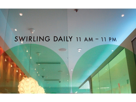
This language is used in many applications, throughout the brand and across marketing. So, for instance, instead of referring to the store’s hours of operations, Pinkberry is Swirling Daily from 11 to 11 and Pinkberry employees are Swirlers. During the holidays, marketing campaigns announce Let it Swirl, Let it Swirl, Let it Swirl.
The Pinkberry storefront, store environment and in-store design elements also work together in the overall customer experience, working together to create not just a look and feel but an experience-one that is interactive, social and, of course, memorable.
Store exteriors, interiors and wall graphics change with the seasons, creating new ambiance and striking conversation pieces for customers. Prior to new store openings, storefront designs and/or signage are always created to stir up anticipation for the launch, as the strength of neighborhood buzz is never underestimated.
In fact, Pinkberry has maintained a brand stronghold not just because of its successful identity, but also because of its belief in customer interaction, both with the brand and with one another.
The official name for Pinkberry fans is Groupies, a name befitting of a fan club of enthusiastic-often fanatical-members who are truly passionate about the brand. An interactive website has been created for Groupies to connect and share their photos and stories. And a strong focus was also placed on Facebook and Twitter, encouraging daily contact with Groupies. This direct communication helps generate and cement relationships between the brand and the customer, giving Pinkberry a very personal and emotional appeal.
Now approaching its seventh anniversary, Pinkberry continues to grow domestically with stores in 19 states, and globally with stores in Canada, the UK, Peru, Russia and Kuwait and more on the way. Swirl on, Pinkberry. Swirl on.
Graduating from Art Center Pasadena, Yolanda 'Yo' Santosa began her career designing main titles for film and television projects like 300, Desperate Housewives and Ugly Betty. She loved storytelling and couldn't ignore a growing fascination for branding; so in 2006 she acquired the then infant Pinkberry account and founded Ferroconcrete. With her recent network redesign of TBS, Yo has come full circle, turning Ferroconcrete into a unique, full service branding and motion design firm. With her latest endeavor, she has ventured out to create her own retail brand - früute, a contemporary West Hollywood pastry shop serving handcrafted mini tarts. Yo has earned numerous accolades, including three Emmy nominations, and is sought out as a national guest speaker and branding expert.
Looking for a reprint of this article?
From high-res PDFs to custom plaques, order your copy today!


