Recession Proof!
Packaging that gets you through the economic downpour.
Remember, many brands have thrived during past economic downturns. Perhaps the most famous example is that of Kellogg, which doubled its advertising spending during the Great Depression and, as a result, watched its sales soar. McDonald’s grew in the hard-hit 1970s, and Toyota expanded into the United States during the financial tumult of the early ’90s when the “Big Three” automakers began to flail. In the current downturn, economically priced Dunkin’ Donuts is pressing forward by opening new outlets and launching its “You Kin’ Do It” ad campaign-an effort, no doubt, to take market share from Starbucks.

Brands are in a bind. Marketing dollars are being slashed just as consumers are holding tight to their wallets, and no quick fixes are in the offing. But this doesn’t mean you can’t prosper in the current climate. You simply need to reach out to consumers with products and packaging that promise and deliver tangible benefits, from low price points to added value.
Remember, many brands have thrived during past economic downturns. Perhaps the most famous example is that of Kellogg, which doubled its advertising spending during the Great Depression and, as a result, watched its sales soar. McDonald’s grew in the hard-hit 1970s, and Toyota expanded into the United States during the financial tumult of the early ’90s when the “Big Three” automakers began to flail. In the current downturn, economically priced Dunkin’ Donuts is pressing forward by opening new outlets and launching its “You Kin’ Do It” ad campaign-an effort, no doubt, to take market share from Starbucks.
If these illustrations are any indication, it’s clear that investing in a brand in tough times can be the difference between success and stagnation. Consumers want to know you understand the state of the economy, that you feel their pain and that you want to help. And your packaging should communicate and reinforce your ability to do that-whether it’s showing them that they’re saving money or explaining how the product is good, and good for them.
Not all brands need to go back to the drawing board, though. Before making any decisions, you need to step back and review what’s working-and what’s not. For instance, while there are many reasons to have a broad portfolio, you might need to trim the number of brands that require management and promotion. For example, Kraft might benefit from taking a careful look at its many brands to ensure that each clearly conveys a specific purpose and benefit.
Of course, things are easier if you have the budget for a variety of marketing tools. General Mills, which has always used its iconic Helping Hand mascot on packaging, is now promoting the character through new TV ads reinforcing the value of Hamburger Helper as a “comfort food” during an economic slowdown.
In short, when times are tough you need to make your packaging work harder for you. And here are some ways to do just that.
BACK TO BASICS
In troubling times, people get nostalgic. They recall better, easier days, usually associated with their childhoods. Brands that leverage their personalities and connect with people on this emotional level will likely stand out.
General Mills is doing this trip back in time very well. In addition to recasting the Hamburger Helper mascot, it’s selling limited-edition vintage boxes of Trix, Cheerios, Lucky Charms, Cocoa Puffs and Honey Nut Cheerios cereals in Target stores. As memories of simpler times flood back to the consumer viewing these packages, an emotional bond is created, suggesting that “these are brands with staying power.”
Such tactics can also garner new customers. Parents who are attracted to the throwback visuals might buy these cereals for their kids, even if they normally purchase other brands.
Orville Redenbacher is a brand that has long leveraged the retro technique, successfully using the popcorn founder’s grey-haired image in its advertising and packaging. In fact, in 2007, 12 years after Redenbacher passed away–and 30 years after he starred in his first on-air spot–the company brought him “back” in a digitally manipulated, albeit controversial commercial (some were off put by the idea of “resurrecting” Redenbacher) that showcased the company’s rich history.
Starbucks also went back in time last year, temporarily replacing its current green brand mark with its original logo-a retro, basic brown-which placed the focus on the history of the brand as one of the country’s first premium coffee experts.
STAND OUT & SHOUT
Keep in mind, simple packaging doesn’t translate into staid, boring packaging. Today, with competition at a premium, it’s important to stand out and be noticed-to stop people in their tracks.
Keep in mind, simple packaging doesn’t translate into staid, boring packaging. Today, with competition at a premium, it’s important to stand out and be noticed-to stop people in their tracks.
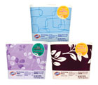
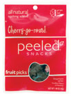
Target’s Archer Farms brand has a kids’ product line with a minimal design, but with eye-catching visuals that make the products stand out on the shelf. The Peeled Snacks brand also uses a minimal design strategy; single fields of bright color and strong, simple fonts differentiate it from other snack foods. Equally striking is Dorset Cereals’ shorter, fatter box; unusual, rich colors and windows designed to look like the leaves of a plant reinforce the brand’s “healthy” message and set it apart.
POM is another brand with stand-out packaging. Its unique pomegranate-shaped structure certainly helps burn the brand into consumer’s minds and communicates its focus on health in an intriguingly optimistic way.
Of course, when focusing on packaging’s look and style, you don’t want to forget the inherent value of a smart point-of-purchase display. Campbell’s does this extremely well by using a gravity-fed display for organizing, describing and dispensing its soups. This shelving system makes soup simple to stock, faster to shop and, ultimately, has been a driver of brand and category growth.
REDEFINE VALUE
Another thing to keep in mind is that, even in a recession, people are loath to sacrifice quality. Consumers’ desire for a bargain is hardly a desire for something cheap. Packaging can go a long way toward signaling “quality” for your brand and helping consumers feel better about their ability to make smart, informed choices.
In recent years, revamped private-label brands have been successfully using packaging design to redefine the idea of value. These brands may stress prudent pricing, but their recent entry into sophisticated packaging tells another story–one in which ingredients are the star and the attractive price is simply a bonus.
Safeway’s O Organics line is a great example. Its overall look is contemporary, sleek and flexible enough to create different narratives for products. Aiding sales are displays that reinforce the brand message of savings and quality.
Increasing value and differentiating your brand can also mean adding the idea of luxury where none was perceived to exist. This is, in part, what the next generation of private label brands is doing by “upping” the design stakes.
National brands are also going this route. Clorox now offers disinfecting wipes in sleek counter-worthy canisters. Presented in eight different designs, the packaging offers a single-sheet dispensing system with a graphic, modern feel that combines form, fashion and function. Such premium packaging can offer a positive halo effect for the brand. Even if consumers don’t want to spend the money for this innovation, they may be inspired to buy the brand’s less expensive, standard version instead.
PRICE TIERING
Of course, premium brands are faced with the same challenge as other brands during a recession. They’re just as pressed to demonstrate that ultimate value can be found in quality. And because they want to capture the broadest possible audience, they often hedge bets with price tiering-taking a good, better, best approach-so consumers can choose the price point where they find most comfort.
Of course, premium brands are faced with the same challenge as other brands during a recession. They’re just as pressed to demonstrate that ultimate value can be found in quality. And because they want to capture the broadest possible audience, they often hedge bets with price tiering-taking a good, better, best approach-so consumers can choose the price point where they find most comfort.
One way to accomplish this is to change the context-to connect a luxury brand with a value brand in a “hi-lo” partnership. For instance, Vera Wang, which offers some of the most expensive wedding dresses in the world, has partnered with Kohl’s department store to create a “Simply Vera” product line that offers consumers an inexpensive, accessible version of the aspirational brand. At the same time, the concept provides an image lift to Kohl’s (a discount store).
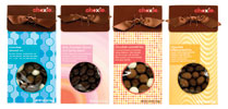
Package design can play an important role in these hi-lo promotions. Target has its Market Pantry store brand that, while not as premium as its other brands, is still packaged to look expensive. The retailer’s colorful Choxie chocolate brand is a value alternative to more expensive premium chocolate brands, but its package design is both unique and detail-oriented. The price point conveys the idea of “value,” leaving the product and the packaging to express the idea of “quality.”
EMPHASIZE THE BOTTOM LINE
It’s pretty clear that value brands like Choxie are best positioned in this recession. Now is their time to shine. And, if you fall in this category, communicating cost-per-use information on the package is an effective means of letting shoppers know they’re economizing by using your brand. For consumers bruised and battered by the economy, value brands are actually somewhat heroic, helping where other brands can’t.
It’s pretty clear that value brands like Choxie are best positioned in this recession. Now is their time to shine. And, if you fall in this category, communicating cost-per-use information on the package is an effective means of letting shoppers know they’re economizing by using your brand. For consumers bruised and battered by the economy, value brands are actually somewhat heroic, helping where other brands can’t.
Don’t be afraid to reinforce the message any way you can. There are all kinds of packaging innovations that allow manufacturers considerably more room for communication. For instance, neckers and peel-back labels provide space for extended text and graphics.
Gatorade is successfully using a shrink-wrap label to convey its message. Airborne uses a fifth-panel riser to present pertinent information. And Olay Pro-X Skin Care uses a box with a wraparound cover to provide important product use information.
Of course, the conventional “bonus” and “free” claims on packages can work well, too (e.g., Rold Gold’s one-pound value bag; Iams’ promise of “more than 10%” free proposition; ChapStick’s “bonus stick”; or Secret’s “Bonus Trail Size”).
What ever you do, don’t be one of those brands that only thinks of “tough times” in terms of a drop in sales. Remember, financial downturns create an opportunity to change the game. If a business is well-run and in solid financial shape, a recession could very well be the time to leapfrog the competition. While a product MUST be packaged, it does not have to advertise. So, kill two birds with one stone. Make the brand’s packaging work as its most effective advertising tool.
Yes, it takes time to create, test and retest innovative, effective and cost-efficient packaging. But what’s the alternative? If you sit back and do nothing, you’ll likely be in bigger trouble down the road. And what’s the downside to doing nothing during a recession? Well, it goes without saying: out of sight, out of mind. BP
Looking for a reprint of this article?
From high-res PDFs to custom plaques, order your copy today!


