Multinational > The Antiquary
To expand the brand globally, The Antiquary bottle was given a more modern, sophisticated look, reflecting its premium contents.
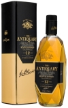
“We feel that in The Antiquary we have a brand with massive potential that has not been utilized properly,” says Robert Anderson, managing director of J&W Hardie Ltd., a subsidiary of The Tomatin Distillery Co. Ltd. To explore The Antiquary’s potential and expand it globally, J&W Hardie determined the premium whisky brand needed a new look. The redesigned bottle retains the brand’s iconic diamond cut shape, but updates the J&W Hardie logo, which is fired onto the glass with gold ink, creating a modern, sophisticated look.
LAUNCH DATE
March 2010
PACKAGE DESIGN
Breeze Creative
Looking for a reprint of this article?
From high-res PDFs to custom plaques, order your copy today!


