USA > Miller High Life
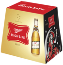
Miller High Life debuted a streamlined design for its primary and secondary packaging this month. The refresh maintains the brand’s red “soft cross” logo, but more prominently displays the “girl in the moon” imagery that has represented Miller High Life for 100 years, now featured on a side panel of the carton.
Soon after its release in 1903, Miller High Life was advertised with a drawing of a woman in what looked like a circus costume, standing on a crate of the beer. In 1907, a change was made to the illustration, setting her atop a crescent moon-and she’s been perched there ever since, appearing on everything from packaging to promotional items over the years.
Brand manager Joe Abegg makes a point to say that, while the refresh presents a higher quality, more contemporary look for the brand, the beer inside the packaging remains completely unchanged. “We're proud of our reputation as an authentic and unpretentious beer," says Joe Abegg. "We're simply bringing a consistent brand character to the entire Miller High Life family with a cleaner, crisper look we believe our consumers will appreciate."
LAUNCH DATE
May 2010
PACKAGE DESIGN
Landor
Looking for a reprint of this article?
From high-res PDFs to custom plaques, order your copy today!


