Global > Cutty Sark
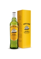
Packaging for Cutty Sark Blended Scotch Whisky has been redesigned with a focus on key equity elements: the Clipper ship icon, the vibrant yellow color and the Cutty Sark typestyle. The original Clipper ship, drawn in 1923 and updated only once in the last 88 years, has now been revised with a sense of “momentum” against the brand’s bold yellow, which has been brought onto the front label for high visibility. The green glass bottle has been embossed with key messages, including the call to action, “Our actions define who we are,” which will be the rallying cry for the brand into the next few years. “The future is looking bright,” says Jason Craig, global brand controller for Cutty Sark. Bottles will start to arrive on shelves around the world over the next two months.
Launch: Global rollout begins October 2011
Package design: Pearlfisher
[Creative director: Natalie Chung; creative partner: Jonathan Ford; design director: Ian Firth; senior strategist: Rory Fegan; head of words: Sylvie Saunders ]
Looking for a reprint of this article?
From high-res PDFs to custom plaques, order your copy today!


