A recipe for success
Fire & Flavor got its start selling cedar planks for grilling meats, seafood and vegetables on wood planks in the Native American tradition.
The story: Fire & Flavor got its start selling cedar planks for grilling meats, seafood and vegetables on wood planks in the Native American tradition. As the cooking trend grew in popularity, the brand gained distribution in stores like Whole Foods, Kroger and Lowe’s. Most recently, F&F expanded its product line to include gourmet brine mixes, rubs, salts, spices, cedar papers, and skewers to provide year-round sales opportunities.
The challenge: Although Fire & Flavor was experiencing growth, there was some inconsistency in the brand’s identity. The brines had a “homemade” look and feel, while the plank packaging had a Native American heritage appearance. Plus, the identity tended to skew toward males, which could potentially limit future product expansions. Most importantly, the packaging did not match the brand promise of simple-yet sophisticated-ways to make gourmet meals at home.
The goal: It was clearly time for the Fire & Flavor brand to evolve-and quickly. F&F turned to Baton Rouge, LA-based Object 9 for help in developing a new identity through package design, point-of-sale displays and web site design.
The solution: With only two months to roll out the new brand, the team set out to identify its target audience and understand what emotional triggers would motivate them to purchase. Through preliminary research, Fire & Flavor’s most promising market was identified as “foodie” women, ages 35-55, who tend to cook for their families an average of 4.7 nights per week. Because their daily routines can be hectic, these consumers need meal solutions that are simple to prepare, but are still great tasting and full of flavor.
Designers developed the new look to communicate the brand’s promise of “Gourmet. Made Simple”, a concept that appeals to consumers’ desire to cook delicious, gourmet meals at home, without complicated recipes.
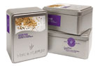
New packaging and a redesigned web site reinforce the brand messaging with clean, simple design elements and elegant food photography. The marketing materials further convey simplicity and outstanding food by providing easy-to-follow recipe inspirations and cooking tips for the customer.
The front of the packaging highlights and positions Gena Knox, founder of Fire & Flavor, as an approachable food resource for the modern cook. In addition, each package features a recipe photo on the front with the list of ingredients on the back, making it easier for shoppers to get what they need while they’re in the store.
The results: Fire and Flavor has enjoyed an increase of 22% in online sales following the redesign of the packaging and web site, and the company’s total sales were up 10% by the end of 2008. The new brand identity caught the attention of several buyers, which opened up new distribution channels, including stores like Super Target and Publix. This year, the Fire & Flavor products will be tested in 50 Sam’s Club stores across the U.S. BP
The author, Jennifer Acevedo, is the former Editor-in-Chief of BRANDPACKAGING magazine.
Where to go for more information…
Brand identity, packaging and web site design
Object 9 (225.368.9899, www.object9.com)
The story: Fire & Flavor got its start selling cedar planks for grilling meats, seafood and vegetables on wood planks in the Native American tradition. As the cooking trend grew in popularity, the brand gained distribution in stores like Whole Foods, Kroger and Lowe’s. Most recently, F&F expanded its product line to include gourmet brine mixes, rubs, salts, spices, cedar papers, and skewers to provide year-round sales opportunities.
The challenge: Although Fire & Flavor was experiencing growth, there was some inconsistency in the brand’s identity. The brines had a “homemade” look and feel, while the plank packaging had a Native American heritage appearance. Plus, the identity tended to skew toward males, which could potentially limit future product expansions. Most importantly, the packaging did not match the brand promise of simple-yet sophisticated-ways to make gourmet meals at home.
The goal: It was clearly time for the Fire & Flavor brand to evolve-and quickly. F&F turned to Baton Rouge, LA-based Object 9 for help in developing a new identity through package design, point-of-sale displays and web site design.
The solution: With only two months to roll out the new brand, the team set out to identify its target audience and understand what emotional triggers would motivate them to purchase. Through preliminary research, Fire & Flavor’s most promising market was identified as “foodie” women, ages 35-55, who tend to cook for their families an average of 4.7 nights per week. Because their daily routines can be hectic, these consumers need meal solutions that are simple to prepare, but are still great tasting and full of flavor.
Designers developed the new look to communicate the brand’s promise of “Gourmet. Made Simple”, a concept that appeals to consumers’ desire to cook delicious, gourmet meals at home, without complicated recipes.
New packaging and a redesigned web site reinforce the brand messaging with clean, simple design elements and elegant food photography. The marketing materials further convey simplicity and outstanding food by providing easy-to-follow recipe inspirations and cooking tips for the customer.
The front of the packaging highlights and positions Gena Knox, founder of Fire & Flavor, as an approachable food resource for the modern cook. In addition, each package features a recipe photo on the front with the list of ingredients on the back, making it easier for shoppers to get what they need while they’re in the store.
The results: Fire and Flavor has enjoyed an increase of 22% in online sales following the redesign of the packaging and web site, and the company’s total sales were up 10% by the end of 2008. The new brand identity caught the attention of several buyers, which opened up new distribution channels, including stores like Super Target and Publix. This year, the Fire & Flavor products will be tested in 50 Sam’s Club stores across the U.S. BP
The author, Jennifer Acevedo, is the former Editor-in-Chief of BRANDPACKAGING magazine.
Where to go for more information…
Brand identity, packaging and web site design
Object 9 (225.368.9899, www.object9.com)
Looking for a reprint of this article?
From high-res PDFs to custom plaques, order your copy today!


