Good Humor: Scooping Up Nostalgia
In existence since 1920, Good Humor wanted to bring back the magic behind the brand.
The story: Remember playing outside as a child and suddenly hearing music in the distance? Children from the neighborhood would run inside to grab their money and dash back out to catch the Good Humor ice cream truck. These are the sweet memories that reflect “the good old days,” and now, so does Good Humor’s packaging.
The challenge: For almost 90 years, the Good Humor brand has been bringing frozen treats to people of all ages in multipacks (in-home) and single serve (out-of-home) offerings. But somewhere along the way, the Good Humor brand lost its historical equity.
 The goal: With direction and support from the Unilever Visual Branding team, Anthem Worldwide aimed to refresh the Good Humor brand by returning the original essence of the brand. Because the brand’s core consumers are between the ages of 25 and 45, the packaging needed to reflect the positive childhood memories of these consumers. Moreover, it needed to convey a premium aspect while remaining consistent across all products, both in-home and out-of-home.
The solution: First, Anthem created a new identity for the brand. Previously, a red heart logo was used for all Unilever ice cream products across the globe. But after conducting consumer research, the team found a new logo for the brand’s US portfolio might better accomplish their goal.
“While the [original] logo is a nicely stylized mark, to touch the heartstrings of the American consumer it needed to go back to the iconic core equity that is Good Humor,” says Janice Jaworski, managing director of Anthem Worldwide’s New York office.
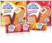
The result: The team brought back the color blue and a typeface that was similar to what appeared on the old Good Humor trucks. Research also found that an illustration of the trucks appealed to consumers. And to take the nostalgia one step further, each package carries an icon featuring a drawing of the Good Humor man that reads “The Taste You Love Since 1920.”
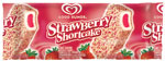
To display the magical, fun side of Good Humor, and to clearly showcase each flavor and develop appetite appeal, the packaging features graphics of swirling ingredients. For example, the Strawberry Shortcake ice cream bars display strawberries floating around the package, while the Toasted Almond bar features almonds. Bright, bold colors help to differentiate the varieties.
“Flavor and taste are key in this category. These packs had to clearly communicate what flavor they were ... If not successful, we might lose our consumer because they wouldn’t find their flavor,” Jaworski says.
Add to that the obstacles of the frozen foods section at retail, where glare and freezer fog may reduce visibility, and it becomes clear that, from bold graphics to clear brand identification, every design element counts. BP
Stephanie Hildebrandt is the associate editor of BRANDPACKAGING. Contact her at hildebrandts@bnpmedia.com.
PACKAGE DESIGN
Anthem Worldwide (646.344.4821, www.anthemww.com)
AFTER
The story: Remember playing outside as a child and suddenly hearing music in the distance? Children from the neighborhood would run inside to grab their money and dash back out to catch the Good Humor ice cream truck. These are the sweet memories that reflect “the good old days,” and now, so does Good Humor’s packaging.
The challenge: For almost 90 years, the Good Humor brand has been bringing frozen treats to people of all ages in multipacks (in-home) and single serve (out-of-home) offerings. But somewhere along the way, the Good Humor brand lost its historical equity.
BEFORE
The solution: First, Anthem created a new identity for the brand. Previously, a red heart logo was used for all Unilever ice cream products across the globe. But after conducting consumer research, the team found a new logo for the brand’s US portfolio might better accomplish their goal.
“While the [original] logo is a nicely stylized mark, to touch the heartstrings of the American consumer it needed to go back to the iconic core equity that is Good Humor,” says Janice Jaworski, managing director of Anthem Worldwide’s New York office.
The result: The team brought back the color blue and a typeface that was similar to what appeared on the old Good Humor trucks. Research also found that an illustration of the trucks appealed to consumers. And to take the nostalgia one step further, each package carries an icon featuring a drawing of the Good Humor man that reads “The Taste You Love Since 1920.”
To display the magical, fun side of Good Humor, and to clearly showcase each flavor and develop appetite appeal, the packaging features graphics of swirling ingredients. For example, the Strawberry Shortcake ice cream bars display strawberries floating around the package, while the Toasted Almond bar features almonds. Bright, bold colors help to differentiate the varieties.
“Flavor and taste are key in this category. These packs had to clearly communicate what flavor they were ... If not successful, we might lose our consumer because they wouldn’t find their flavor,” Jaworski says.
Add to that the obstacles of the frozen foods section at retail, where glare and freezer fog may reduce visibility, and it becomes clear that, from bold graphics to clear brand identification, every design element counts. BP
Stephanie Hildebrandt is the associate editor of BRANDPACKAGING. Contact her at hildebrandts@bnpmedia.com.
PACKAGE DESIGN
Anthem Worldwide (646.344.4821, www.anthemww.com)
Looking for a reprint of this article?
From high-res PDFs to custom plaques, order your copy today!


