Don't call it a comeback
Finesse, a dominant brand in its heyday in the 1980s, has introduced new packaging designed to create a stronger brand block on shelf and to enact cost-savings.
The goal: Lornamead partnered with Little Big Brands to evolve the design. “We were given the assignment to increase shelf impact for the brand while solving some substantial challenges the original design represented,” says John Nunziato, creative director, Little Big Brands. “The previous package was difficult and costly to print. Simplifying graphics and using techniques to enhance each substrate was key to giving Finesse a vibrant, upscale look.”
The solution: A new structure, which is larger at the shoulder and base, takes cues from the popular Finesse of the 80s. Unlike the original system, however, the conditioner is now flipped to nest with the shampoo. The move to a custom structure helped add character and personality to the brand, says Karen Murabito, group brand director, Lornamead.
The results: The new design has just hit shelves and has been enthusiastically received by retailers. Murabito reports that a major chain drug customer that reset its haircare shelves with the new Finesse design in January, has reported a 30 percent increase in unit movement. BP
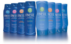
Finesse has redesigned graphic elements and typography to create a stronger brand block on shelf. The resulting line-up makes a greater impact and is easier for consumers to shop.
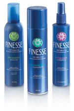
Finesse, before the redesign
A dominant 80s brand introduces new packaging
The story: Hairstyles have come and gone over the past 25 years-do we even need to talk about the mullet? But tried-and-true hair care brand Finesse has been there for its customers, adjusting to changing styles and needs. The brand offers a line of clean, oil-free hair care products and has gone to market with the familiar slogan, “Sometimes you need a little. Sometimes you need a lot”.
The challenge: In this highly competitive market, Finesse enjoyed its heyday in the 1980s, but its brand identity and packaging had lost relevance with the modern consumer. A makeover was in order.
The challenge: In this highly competitive market, Finesse enjoyed its heyday in the 1980s, but its brand identity and packaging had lost relevance with the modern consumer. A makeover was in order.
The goal: Lornamead partnered with Little Big Brands to evolve the design. “We were given the assignment to increase shelf impact for the brand while solving some substantial challenges the original design represented,” says John Nunziato, creative director, Little Big Brands. “The previous package was difficult and costly to print. Simplifying graphics and using techniques to enhance each substrate was key to giving Finesse a vibrant, upscale look.”
The solution: A new structure, which is larger at the shoulder and base, takes cues from the popular Finesse of the 80s. Unlike the original system, however, the conditioner is now flipped to nest with the shampoo. The move to a custom structure helped add character and personality to the brand, says Karen Murabito, group brand director, Lornamead.
The previous logo, being vertically stretched and condensed, was difficult to read. Little Big Brands redrew the mark, simplified the curves and letter-spaced the type more appropriately to give each character some breathing room. The logo, even though slightly smaller, now packs more of a punch, explains Nunziato. The “self-adjusting” icon, which represents the brand’s self-adjusting formula, was simplified to reproduce consistently across all substrates: pressure-sensitive labels and steel and aluminum cans.
Essential to the process was also a close working relationship with each printer in order to capitalize on the strengths and capabilities of each substrate, while achieving the greatest impact collectively across the product line.
Overall, the redesign has aligned all of the graphic elements and typography consistently to create a stronger brand block on shelf. Everything from the icon, the logo and the net weight, run horizontally on the same plane. The result, says Murabito, is a strong line-up of products that makes a greater impact and is easier for consumers to shop.
The results: The new design has just hit shelves and has been enthusiastically received by retailers. Murabito reports that a major chain drug customer that reset its haircare shelves with the new Finesse design in January, has reported a 30 percent increase in unit movement. BP
Jennifer Acevedo is the editor-in-chief of BRANDPACKAGING. Contact Jennifer at acevedoj@bnpmedia.com.
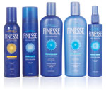
Finesse: Redesigned
Looking for a reprint of this article?
From high-res PDFs to custom plaques, order your copy today!


