Caribou Coffee redesign
By pumping personality into its packaging, Caribou Coffee aimed to appeal to a larger demographic and differentiate itself from the competition.
 The story: A hike through Alaska’s Denali National Park first inspired Caribou Coffee founders Kimberly and John Puckett to start their own company. Now the second-largest coffeehouse in the nation, Caribou Coffee has more than 400 stores in the United States.
The challenge: The company’s 17-year-old logo suggested a Northern lodge theme. However, people in other parts of the country aren’t necessarily familiar with northern climates, and therefore, may not relate to the brand.
The company’s color palette-black and teal-also was too similar to competitors’ colors, disabling clear brand differentiation.
The goal: Caribou Coffee teamed up with ad agency Colle+McVoy to give the brand a fresh, new interpretation and a “seize the day” attitude that would appeal to consumers nationwide and differentiate the brand from its competitors in a way that would, ultimately, set itself up for future success.
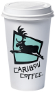
The solution: After hundreds of renditions, designers selected a simple, but modern, logo retaining the brand’s leaping caribou, its shield and company name-but in newer forms. And instead of keeping the black and teal color palette, the brand mark switched to brown and blue colors.
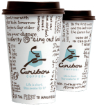
The updated caribou leaps right, or forward, while its antlers form the letter “c” and its body resembles a coffee bean. The new shield graphic resembles the shape of a traditional national park sign, a reference to the company’s origins. A different typeface for the logotype completes the updated logo. After discussing the possibility of dropping “Coffee” from the name, designers decided instead to emphasize “Caribou,” exemplifying the shorthand its customers use when referring to the coffeehouse.
“If you go to Caribou Coffee, more than likely you’re going to walk out with a cup in your hand,” says Ed Bennett, design director of Colle+McVoy. “It’s a 15 minute advertisement and brand experience, so we wanted to bring something more to the cups than just the logo.”
Thus, “bouisms” were created. Stemming from the company’s tagline, “Life is short. Stay awake for it,” bouisms are phrases that encourage customers to live life to the fullest. Hundreds of phrases were collected from Colle+McVoy designers and Caribou Coffee employees, all of which were rewritten to fit on cups and napkins. Some, however, retained the original handwriting of Caribou employees.
To bring this “carpe diem” approach full circle, the company placed sticky pads around its coffeehouses posing the question: “What do you stay awake for?”
“So now we have in a very creative and touching way, a two-way conversation with our fans and our guests that we can leverage into future communication pieces or even packaging pieces,” explains Alfredo Martel, senior vice president of marketing for Caribou Coffee.
Previously, the only distinct brand element on Caribou Coffee cups was the logo. And when that was covered up, it resembled every other coffee cup on the street. Post-redesign, bouisms written all over the cups make it obvious not only that the cup is different from others, but that it is specifically Caribou. Plus, making the switch from white to brown lids aided in brand recognition and differentiation. Brown lids also offer a functional benefit in that they don’t show coffee splashes or women’s lipstick, leaving the cup always looking clean.
The results: When the new design was tested in Minnesota, it received more than 70 percent favorable reactions.
“Clearly we know that, in these endeavors, you are never going to get a 100 percent satisfaction score,” Martel says. “But when you get a more than 70 percent favorable reading, you know that the majority of folks are moving forward with you.”
Where to go for more information…
PACKAGE DESIGN
Colle+McVoy, www.collemcvoy.com
Stephanie Hildebrandt is the associate editor of BRANDPACKAGING. Contact her at hildebrandts@bnpmedia.com.
AFTER
BEFORE
The challenge: The company’s 17-year-old logo suggested a Northern lodge theme. However, people in other parts of the country aren’t necessarily familiar with northern climates, and therefore, may not relate to the brand.
The company’s color palette-black and teal-also was too similar to competitors’ colors, disabling clear brand differentiation.
The goal: Caribou Coffee teamed up with ad agency Colle+McVoy to give the brand a fresh, new interpretation and a “seize the day” attitude that would appeal to consumers nationwide and differentiate the brand from its competitors in a way that would, ultimately, set itself up for future success.
The solution: After hundreds of renditions, designers selected a simple, but modern, logo retaining the brand’s leaping caribou, its shield and company name-but in newer forms. And instead of keeping the black and teal color palette, the brand mark switched to brown and blue colors.
The updated caribou leaps right, or forward, while its antlers form the letter “c” and its body resembles a coffee bean. The new shield graphic resembles the shape of a traditional national park sign, a reference to the company’s origins. A different typeface for the logotype completes the updated logo. After discussing the possibility of dropping “Coffee” from the name, designers decided instead to emphasize “Caribou,” exemplifying the shorthand its customers use when referring to the coffeehouse.
“If you go to Caribou Coffee, more than likely you’re going to walk out with a cup in your hand,” says Ed Bennett, design director of Colle+McVoy. “It’s a 15 minute advertisement and brand experience, so we wanted to bring something more to the cups than just the logo.”
Thus, “bouisms” were created. Stemming from the company’s tagline, “Life is short. Stay awake for it,” bouisms are phrases that encourage customers to live life to the fullest. Hundreds of phrases were collected from Colle+McVoy designers and Caribou Coffee employees, all of which were rewritten to fit on cups and napkins. Some, however, retained the original handwriting of Caribou employees.
To bring this “carpe diem” approach full circle, the company placed sticky pads around its coffeehouses posing the question: “What do you stay awake for?”
“So now we have in a very creative and touching way, a two-way conversation with our fans and our guests that we can leverage into future communication pieces or even packaging pieces,” explains Alfredo Martel, senior vice president of marketing for Caribou Coffee.
Previously, the only distinct brand element on Caribou Coffee cups was the logo. And when that was covered up, it resembled every other coffee cup on the street. Post-redesign, bouisms written all over the cups make it obvious not only that the cup is different from others, but that it is specifically Caribou. Plus, making the switch from white to brown lids aided in brand recognition and differentiation. Brown lids also offer a functional benefit in that they don’t show coffee splashes or women’s lipstick, leaving the cup always looking clean.
The results: When the new design was tested in Minnesota, it received more than 70 percent favorable reactions.
“Clearly we know that, in these endeavors, you are never going to get a 100 percent satisfaction score,” Martel says. “But when you get a more than 70 percent favorable reading, you know that the majority of folks are moving forward with you.”
Where to go for more information…
PACKAGE DESIGN
Colle+McVoy, www.collemcvoy.com
Stephanie Hildebrandt is the associate editor of BRANDPACKAGING. Contact her at hildebrandts@bnpmedia.com.
Looking for a reprint of this article?
From high-res PDFs to custom plaques, order your copy today!


