Strongbow is on Target
UK
 Launched: JUNE 2012
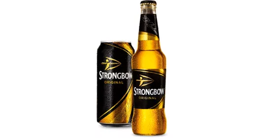
Looking to broaden its appeal and better reflect its status as the best-selling cider in the UK, Strongbow launches a new brand identity that includes a redesigned logo, packaging and visual identity. The updated logo is rooted in the brand’s heritage — Strongbrow is the nickname of a Norman knight famous for his longbow skills — and features a Strongbow archer and arrowhead set against a solid black background. “The duality of the brand marquee represents both the crisp cut-through product taste and brand heritage via the crafted arrowhead, confident archer and tension in the bow,” said Tony Connor, design director at Bulletproof. “Simple yet powerful; the archer stands with pride, creating impact through the strong black and gold colorways.” The refreshed design also carries over to secondary packaging where an embellished version of the arrow explosively cuts through a piece of golden fruit.
Brand identity and package design:
Bulletproof, www.wearebulletproof.com
Looking for a reprint of this article?
From high-res PDFs to custom plaques, order your copy today!


