A Replenishing Change for Gerber
The new design for Gerber Replenish combines the brand's heritage with a playful and friendly feel.
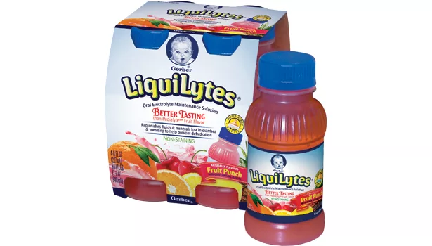
Previous Package Design
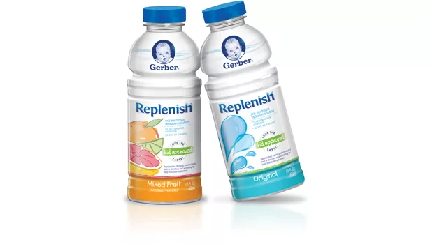
1.) The team chose a hand-drawn illustration style for the flavor cues to give the packs the warmth moms prefer.
2.) The Gerber identity at the top of the design reassures buyers that they are picking up a product from a trusted brand.
3.) Parents buy the product to combat dehydration, so they want to know if their children will actually drink it. The “kid approved” seal informs them that Replenish is a sure bet.
The story: Gerber Replenish, a new Oral Electrolyte Hydration Solutions product by Nestlé Nutrition, recently entered the market to replace the previously branded Gerber LiquiLytes. Zack Group, a partner of Nestlé and the Gerber Brand for many years, was responsible for developing the contemporary approach in the category.
The challenge: The previous brand design was dated and offered little appeal to new moms. In addition to the design, the LiquiLytes name was no longer a trademark option. Better taste and a different-sized container drove the new product advantages. It was important to create a distinct, improved personality and position for effective differentiation from key competitors in the category and to attract today’s moms looking for fresh choices in the marketplace.
The solution: Zack Group began by conducting an internal brainstorming session to generate a list of potential names. The team arranged the resulting names into seven strategic groups, with the Gerber Replenish name evolving from a functional/end-benefit approach.
“The design exploratory was wide open as Gerber allowed the design team to investigate a broad range of strategic options,” explains Steven Wright, VP, managing director at Zack Group.
The client focused on two separate angles from the initial design presentation — a scientific heritage positioning and a “friendlier” approach. Following a round of revisions, the client conducted consumer research to arrive at the optimal design. While consumers received both directions well, the friendlier position was clearly preferred. The stylized illustrations create an approachable visual focal point for the brand.
“Consumers are drawn to the warmth of the images, as opposed to the potential for a colder scientific position, which is important for a product geared toward children,” notes Wright.
Importantly, the Zack Group design team selected the flavor cue’s hand-drawn illustration style for a specific advantage: It provides separation from the competition and reinforces the preferred flavor of the Gerber Replenish product compared to others in the segment. The result is a fresh, proprietary brand identity for the new product.
Several art styles for conveying the product varieties were explored as the team worked to achieve the right balance for the brand. The simplicity of flat color and loose line work illustrating the flavor cues adds a comforting tone to the brand, and the less traditional look and vibrant colors resonate well with consumers. The new design carefully balances the authority of the Gerber identity with the playful illustration style, resulting in a trustworthy and approachable brand personality.
For a clean and streamlined look, a shrink-sleeve label provided by Hammer Packaging was used on the package structure. The structure challenged the team early on in the process: To achieve readability of the required information on the label, it became critical to design within the various contours of the bottle form. Consumers can easily identify the bottle shape on shelf, and the new brand design strongly conveys the heritage of Gerber by isolating the identity in the upper segment of the bottle shape.
The bottle design was next adapted to a two-pack u-card for convenience and good value. The twin packs have a strong presence at retail and provide a wide billboard on shelf. Impactful color-coded bands across the bottom of packs and larger graphics help with the shopper experience.
The seal of “kid approval” offers an added element of assurance. To leverage the message off pack, the team developed an alternative seal to be used in a variety of other materials, including collateral and advertising. The optimized seal presents a message with stronger impact than required for the hierarchy of information on the bottle and reinforces the product’s “official” good taste recognition.
> PACKAGE DESIGN
Zack Group LLC
Looking for a reprint of this article?
From high-res PDFs to custom plaques, order your copy today!


