Packaging for Sports and Outdoor Merchandise Needs to be Grand
Designs for active and outdoor products should pack a punch: what to do for a second wind.

Creative Direction: Jason Falk and Shannon McGarity. Image courtesy of TANKindustries (www.tankindustries.com), a design studio with a multi-disciplinary approach to the creation of visual solutions for print, motion and digital media.
The team at industrial design and branding firm fuseproject wanted the pack to be clever for environmental reasons. It designed the package to use 65% less cardboard than the standard shoebox and replace the plastic retail bag, among other benefits. Image courtesy of fuseproject (www.fuseproject.com).

You’d think that when it comes to sports and outdoor merchandise, packaging would pack a punch. But we’re just not feeling it, and we can’t even bear to look out at the sea of wimpy, tired-looking packaging examples trying to drown consumers with feature and benefit claims. So much packaging to refresh, so little time to get it done before the products they contain — and their brands — fail.
Rather than pointing to failures, we’d rather focus on packaging that’s gone from tired to inspired, hoping that brand managers might reconsider their own packaged products and take them from bland to grand. A caveat: Adopting the latest graphic design ideas and pretty imagery might give packaging a facelift, but we know that’s only skin deep. Refreshing a packaging system is about more than proving one’s design chops.
The brand has to be at the core of new or refreshed packaging for the change to be meaningful. It has to speak with an authentic voice, clearly illustrate why it’s unique, and engage consumers and hold them in thralldom. The right packaging has the power to do all of this. But first, it has to appeal to customer emotions quickly and convincingly, prompting purchase and loyalty. In the case of sports and outdoor gear, it’s crucial for the packaging to capture the emotive elements that tie the customer to the activities. As marketing researcher Martin Lindstrom points out, capturing fans’ emotions about their favorite sports and aligning those feelings with sports-related products triggers a response in the brain and cements their importance and desirability by association. Lindstrom daringly declares that this has the same effect as religious imagery for fans. Preach on, Brother Lindstrom!
Revitalization comes in different forms: repackaging the blasé and ineffective products that are already out there; rethinking the utilitarian, turning it into something more, and reimagining the way the entire category is packaged for better functionality. When it comes to sports and outdoor activities, it’s important to have the right gear to achieve performance goals. So why is it that the packaging selling the gear doesn’t perform?
Case in point: LIV Organic, the USDA-certified energy recovery drink for athletes, had a good product. But its original packaging didn’t do anything to sell the drink or brand. In fact, it worked against it. Since organic drinks don’t feature neon, artificial colors, they fade with light exposure. Even worse: A nondescript bottle structure and a generic-looking label did nothing to reinforce the brand, merely stating “Organic Sports Drink” under the brand identity, followed by the flavor. A package refresh was needed.
We love the new packaging. Shrink-wrapped sleeves over PET bottles are color-coded to flavors while protecting the integrity of the product. The sleeve literally has sports written all over it. Action verbs like “pedal,” “score,” “pump,” “swat” and “rappel” tell the story at a glance. The bottom of each label lists “re-fuel.” Enough said. Genius. The newly designed package structure is easy to hold and drink from, even in the midst of activities. Now consumers see all the good stuff about this branded product in a few seconds flat — all the time brands have to make an impact on retail shelves. How cool is that?
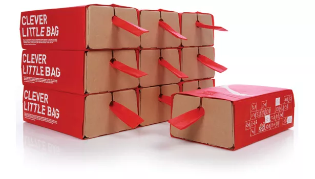
Speaking of cool, who saves the packaging after purchasing new athletic shoes? What happens to shoe boxes? They end up in the recycling bin. PUMA reimagined the utilitarian with more sustainable packaging that would prompt reuse. Now its athletic shoes come in box bottoms that get tucked inside of a reusable “clever little bag.” Lidless is beautiful, and so is the bag in brand-signature red with white lettering. This makes us wonder: Why hasn’t this solution been thought of before? Every time consumers reuse the bag they’re walking ads for PUMA. Nobody sees the packaging until they buy the product, but everybody sees it afterward. Think of the buzz this can generate. This works; we love it.
Athletic and outdoor gear brands ought to be champions of innovative packaging. After all, they’re all about innovating even the most basic products, so why should packaging lag behind? Perfect example: What’s exciting about fishing line? Pretty mundane, huh? Not to Pure Fishing Inc. of Iowa. Its Berkley brand NanoFil fishing line is inventive: Minimum diameter but maximum strength, it was awarded top new product overall at ICAST 2012, the world’s largest trade show for sports fishermen. Now for the best part: new and original packaging. A twist-off blister is caught between two paperboard halves with a flange. This allows fishermen to replenish line on a fishing reel and easily return the rest to the package for future use on additional reels. There are no impossible-to-open clamshells in sight. The package is easy-to-open, stores the product and allows consumers to recycle each portion of both the paperboard and the blister very easily. The graphics on pack separates the men from the boys, too. This is terrific translation of branding on the package.
Better functionality for basic, heavily purchased products? Yes! Creating brand preference among consumers and turning them into fans? Yes! Rocking an entire category and taking ownership of it? Priceless.
Looking for a reprint of this article?
From high-res PDFs to custom plaques, order your copy today!


