Delivering Brand Promises
Great packaging sells a brand’s promise, not the product — and consumers can relate to that.

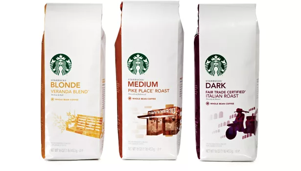
Starbucks is a brand that works to relay its identity and values through packaging. Credit: bit.ly/1bOlvqs.
There’s a lot of “good” packaging out there: packaging that might move some products but doesn’t build category-owning brands. In other words, it’s adequate, but it isn’t great. Great packaging doesn’t merely sell a product; it sells the brand, because it connects with the consumer. Well-executed package design not only appeals to consumers’ rational thought processes, but it also tugs at their emotions. Brand packaging that excites the consumer’s subconscious mind on an emotional level is powerful, because it stimulates the decision-making region of the brain.
Decision to buy made, the consumer’s choice is reaffirmed when the packaged product delivers on the brand promise. The process begins to build trust and loyalty as the consumer consciously looks for the brand when repurchasing products in the original category and in other divisions.
Great packaging isn’t status quo. It does not blend into the appropriate product category; it transcends it, often in a highly disruptive way. Translation: It makes the brand stand out in an immensely differentiated manner and makes it tangible to the customer. Standing out from the competition creates category leaders. Not only that, it makes the competition irrelevant to brand devotees. The behemoths of the CPG industry like Procter & Gamble, Nestlé, Johnson & Johnson and Unilever have understood this for a long time.
Before package design is developed, a strong brand, well-positioned and offering articulated value, must be in place. A go-to-market strategy with a clear focus of the targeted customer is the next order of business. Research uncovers the key drivers of both the brand and its customers. A package design system can then be developed in full alignment with the brand, its core values and the consumer. In this way, future product launches can easily accommodate new category extensions with the cohesiveness of belonging to a brand family. A hierarchy of visual cues and communication is developed to support the brand and tip off targeted consumers that this is a fit with their lifestyles. The correct imagery and key words make the point quickly and efficiently.
Every component of packaging — substrates, structure, color, imagery and texture — should work synergistically; these elements should come together to tell the brand story. Storytelling is executed using verbal and visual design elements that refer back to the brand and show the consumer why this is the only brand for them. Remember, packaged products are the most tangible representation of the brand for most consumers, so it is crucial to get this right.
>Brand packaging that isn’t good — it’s great
Method presents great brand packaging. Unique structures, minimal materials and pared-down brand communication deliver the brand’s core assets: The products are lean, clean and green. As cool as its brand packaging has been from the start, method hardly rests on its laurels. The company mission of sustainability moves forward with one of the brand’s latest packaging coups. Its new ocean plastic dish and hand soap is housed in post-consumer recycled plastic recovered from the sea. Environmentally sound products pioneering environmental packaging: great storytelling, or what? Consumers, passionate about the company’s values, have flocked to this brand’s products in the past and continue to do so now.
Brand values and stories don’t hinge solely on a core of sustainability. If you make your food product with only a few simple ingredients, tell your audience. Deliver the message through clean packaging that demonstrates the lack of impossible-to-pronounce chemicals to buyers who are ever-more conscious about what they’re consuming. The Häagen-Dazs “Five” line is a perfect example of using great visuals and selective brand communication to tell the brand story. Post Shredded Wheat and Nutella are others.
Luxe and high-end brands? It’s tough to beat Godiva chocolates in those beribboned gold-foil ballotin boxes. Luxurious packaging opens up to reveal equally luxurious inner wrappings. Unfolding them leads to a great deal of anticipatory pleasure for the brand’s fans. The same is true of Apple. Sleek black or white packaging relays “cutting edge tech.” Unwrapping the packaging to get to that new iPhone or iPad is part of the experience. Minimalist packaging isn’t the focus of these kinds of brands. In both cases, the packaging tells the brand story and aligns with the core of each very well. It’s no accident that these brands have such powerful fan bases. The people who love these brands are true zealots; these brands align with their lifestyles.
Starbucks’ packaged coffees also deliver the brand effectively. Pared-down white packaging intimates the purity of the product and features the mermaid cartouche more prominently than the Starbucks name. At this point, everybody on the planet knows that the iconic mermaid stands for Starbucks and Starbucks alone. The name of each coffee variety, a short descriptor and the words “whole bean coffee” keep brand messaging short and sweet. Imagery does the rest. Veranda Blend displays a lovely porch swing. Pike Place highlights the shop from that historic location. Italian Roast features a motorcycle in front of the Coliseum. Brand and product messaging is accurately delivered.
Retailers are catching up, marketing and packaging their store brands in a meaningful manner. Aligning private label packaging with core brand values and customers’ lifestyles is the goal. Think about Zara: The high-fashion Spanish retailer’s clean fragrances appeal in uncomplicated, contemporary packaging with beautiful fashion illustrations. Perfume descriptors state the scent in one or two simple words: Iris, Black Peony and Rose. As an international brand, Zara’s straightforward package designs are elegant and break language barriers.
Brands of the street? H&M is terrific for its urban chic and the way it incorporates that arty edge when it comes to packaging. What else would you expect from the European retailer that specializes in quick-change fashion apparel, accessories and fashion for the home? There’s nothing snobbish about H&M. Responsiveness to new fashion trends at price points that the street can bear gives the brand plenty of cred among the hip youth of the world. The retailer’s packaged items reflect the brand’s arty attitude.
Speaking of teens, young adults and urban packaging: Many brand owners are tempted to crowdsource design, which is not a bad idea if done well. After all, kids know how to appeal to other kids. Kraft’s new Stride ID gum took it a step further. The brand is über-cool and clearly not for moms and dads. An innovative magnetic closure opens to reveal teen-inspired graphics. Young artists created designs for each stick of gum, adding a strong appeal to individualism and a rebel spirit into the urban kidscape.
It’s crucial for brand owners to get it now: Packaging isn’t about selling products. It’s about selling the brand as the one and only. Part of turning consumers into brand fans, and then zealots, is the ability to align core brand values with buyers’ values and lifestyles. The brand becomes indispensable to them in the process.
What is your packaging saying? Is it selling the brand? If it isn’t delivering its core values or telling the story, it’s time to repackage.
Looking for a reprint of this article?
From high-res PDFs to custom plaques, order your copy today!


