2014 People’s Choice and Editor’s Award Winners Announced
We asked you to vote, and you voted hard!
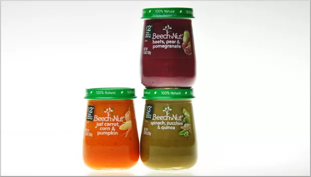
Glass: Beech-Nut Baby Food
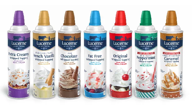
Metal: Lucerne Dairy Farms
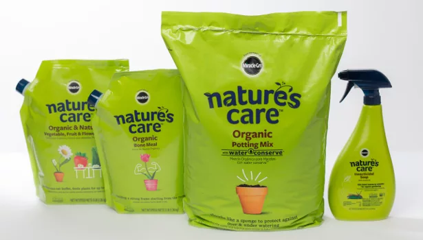
Flexible: Nature’s Care
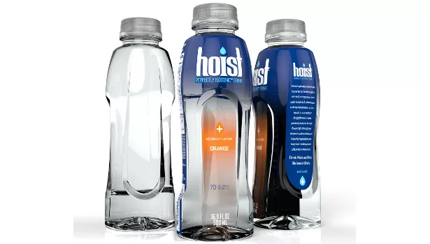
Rigid: Hoist
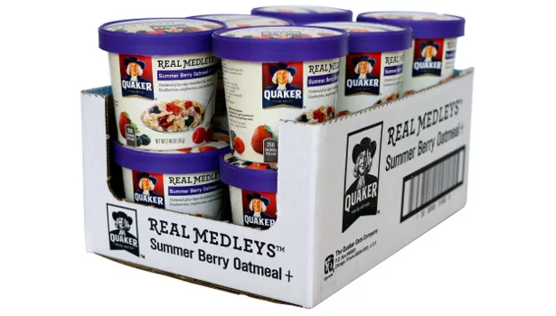
Paperboard: Quaker Oats Real Medleys
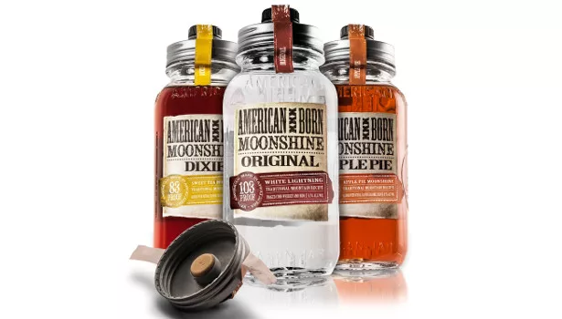
American Born Moonshine
We asked you to vote, and you voted hard! Here are your chosen packages, plus the Editor’s Award winner.
People’s Choice Winners
Glass
Beech-Nut Baby Food
submitted by O-I
brand owner: Beech-Nut
The new line of baby food offers a natural purity for parents who want to feed their babies simple and nutritious ingredients. Beech-Nut wanted to create an impression at point of sale and focused on ergonomics, spoonability and graphics. The honey-pot shape makes the jar easier to hold and reach the food at the bottom of the package, while the use of glass aids in sustainability and food safety. www.o-i.com
Metal
Lucerne Dairy Farms
submitted by Trinity Brand Group
brand owner: Safeway
The new packaging for the line of dairy products replaces dated and disconnected designs, and captures the wholesome, simple freshness of dairy. Consumers are momentarily taken to a place where life is unhurried, uncomplicated, and unpretentious — where the simple things matter the most. www.trinitybrandgroup.com
Flexible
Nature’s Care
submitted by CBX
brand owner: Scotts
Nature’s Care exists to make caring for your lawn and gardening simple and intuitive. The simple ingredients and quirky instructions are directed at Millennial “Mainstream Greens” who have grown up caring about the environment and understand how their choices can make a difference. The design elements bring a whimsical note to the line and remove the intimidation factor from gardening: The hero of the bag is the mascot in the center coupled with a funny and witty product descriptor below. www.cbx.com
Rigid
Hoist
submitted by ScorCreative at Amcor
brand owner: Kelly Heekin
Hoist is a true isotonic beverage, which means that it rehydrates faster and more effectively. The previous package was short, stout and easily overlooked, so the brand decided to redesign. A gender-neutral package that conveys fitness and positive, proactive attributes was created. The 16oz package with ergonomic grips is designed to the height of competitors' 20oz packages, allowing for a leaner offering that exudes a similar size impression. www.amcor.com
Paperboard
Quaker Oats Real Medleys
submitted by H.B. Fuller
brand owner: PepsiCo
The redesignd packaging for the Quaker Real Medleys single-serve oatmeal replaces a two-piece tray and cover, which had to be packed manually, with a standard one-piece RSC case that uses a fully-integrated H.B. Fuller Open-Sesame tear tape system. The easy-open capabilities of the tape system are designed to create a clean edge without using perforations, which can weaken packaging. It enabled the design team to reduce material used by 35 percent while maintaining the compression strength provided by the previous two-piece design. This lighter case performs well under extreme conditions and meets retailers’ needs for an attractive, shelf-ready display. www.hbfuller.com/north-america
Editor’s Award Winner
American Born Moonshine
submitted by Flowdesign
brand owner: Windy Hill Spirits
American Born Moonshine wants to be a brand that embodies the essence of the American rebel spirit: one that challenges what is possible to define the ever-evolving American Dream. Everything about the design, packaging and product is built in the USA. The traditional mason jar looks and feels like it was taken out of a wooden crate filled with straw in Appalachia during prohibition. The lid allows bartenders to remove the cork and use a regulated pour spout, or it can be screwed off entirely. www.flow-design.com
Looking for a reprint of this article?
From high-res PDFs to custom plaques, order your copy today!


