Tricks of the Treats Trade: Giving Candy and Gum Sweet New Looks
The trick? Speak to audiences with relevance.
This Halloween, if the Goodwin Design Group (Wallingford, Pa.) handed out only candy whose packaging it helped design, little trick-or-treaters would not be disappointed with the variety in their bags. From classics like Bazooka to tasty new alternatives like YummySnack brands, Goodwin has helped brand and design packaging for countless sweets to ensure that they look as good as they taste.
The trick is to ensure that the brands speak to their audiences in a way that is relevant and in a manner they can relate to. Goodwin believes that the best way to find this balance is to go right to the source — kids and their parents. What better way to gain insights than to simply ask? They already know what they like and what they want and more often than not are happy (even excited) to talk about it with someone; all one has to do is ask.
Mix these consumer insights with educated design decisions (what will pop on shelf, what visual cues will work hardest, what visual and social currency does the brand possess), and you’ve got a recipe for success, as evidenced by some of the following examples.
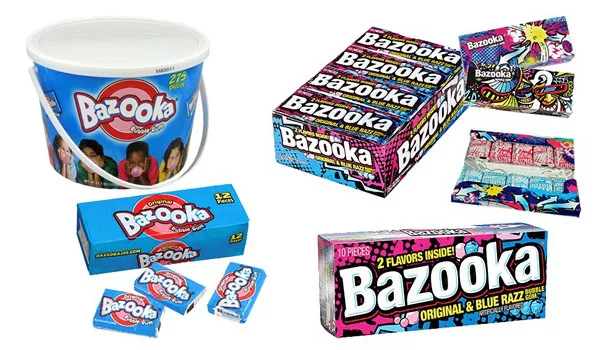
Bazooka Bubble Gum
Bazooka once defined an entire category, but had lost relevance, falling into obscurity among a quickly evolving sea of new gum flavors and unique packaging. Quickly realizing that nothing was truly sacred, Goodwin reevaluated the Bazooka brand on all fronts. The team developed new brand packaging for shelf impact, and staged a series of “reveals” that appeal to kids’ curiosity and interests.
The first impression is big, bold branding on an outer cello wrap that, when removed, reveals a series of on-trend deco designs adorning an innovative wallet pack. The wallet pack is branded Bazooka, though subtly. In turn, the series of graphics allow for badge value among kids and their friends, piquing interest and curiosity.
Unlocking the clasp hook and opening the wallet pack reveals another series of dynamic interior graphics, as well as the individually wrapped gum pieces. Unwrapping the individual pieces has a twofold reveal of the gum itself, and a series of “power papers” that have fun, games and codes to unlock which take the experience online at BazookaJoe.com. With the new packaging Bazooka became more than a brand, it is now an experience.
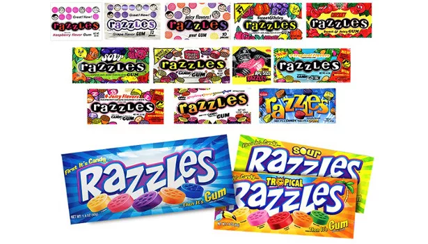
Razzles
“First it’s candy, then it’s gum,” but foremost, it has to look like fun.
A unique product with a long history, Razzles was in serious need of contemporization. The logo was energized with fun, hand-drawn letterforms with just enough rendering to give it some taste appeal and make it pop. Clean product illustrations bring the flavors to the forefront, backed by a rich radial burst and rays with a white-hot center that make this package scream at retail. The architecture easily lends itself to flavor extensions with the clear color-blocked background and room for flavor descriptors. This revamp ensures that Razzles will have a place on shelf for years to come.
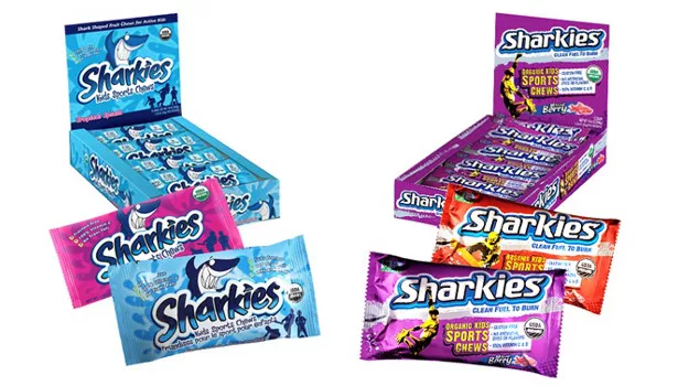
Sharkies
Sharkies Organic Kids Sport Chews originally featured a cartoon shark, which skewed the packaging too young and safe, making it just another fruit snack and confusing the “performance” aspect of the product. Goodwin gave Sharkies an entire rebrand to get it back on track at retail.
With a nod given to the shark form in the redesigned logotype and the new, clearly intentioned tagline, “Clean Fuel to Burn,” everything from the letterforms to textures and typography was reinterpreted with attitude, giving the packaging an edgy, sporty, performance-driven feel that aged the brand up to the intended tween market. Benefits statements prominently call out Sharkies’ point of difference, bolstered by stylized photo-illustrative action sport representations, which round out the redesign.
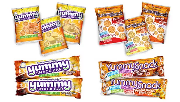
YummySnack
YummySnack had developed a line of high-fiber, gluten-free products made from real ingredients for real nutrition. With offerings of “better-than-candy” bars and chips, Yummy Health Brand products is poised to help the “family snack right without a fight,” but they needed assistance getting over the look and stigma of standard “better for you” offerings.
Goodwin took a fresh look and gave Yummy just what it needed — personality. Freeform color blocking and a hand-drawn logotype hint at wholesome while unique background elements and a variety of active silhouettes help it stand apart from an expected solution. Color-cued flavor descriptors lock up in equally energized areas while bold claim bars showcase each product’s unique benefits. Who says healthy can’t be fun?
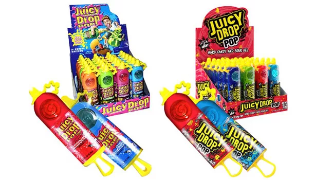
Juicy Drop Pop
Juicy Drop Pop oozed with mid-‘90s “extreme” clichés, giving it a dated look and making it passé. Evaluating the brand and determining that the allure of Juicy Drop was about intensity and control, Goodwin redesigned the brand under the “Dare to Drop” tagline and ethos.
Considering that kids are aware of how the product works, skateboarder old illustration was dropped. Updating “extreme” cues (like tribal tattoo inspired lock-ups and an entire library of scrawled graffiti illustrations) keep the daring edginess that the brand reflects. This ensures the visuals are as unique as the flavor experience itself.
The jagged logotype was updated to bold, black and yellow letterforms that boast confidence and individuality and scream off pack. Tonal background swirls add depth and motion to the elements and help define and differentiate individual flavors and various Juicy Drop SKUs at shelf.
So this Halloween, when you are trolling the candy aisle in preparation, or reviewing the contents of someone’s trick-or-treat haul, take notice of the packaging and its nuances to see which brands did their homework and which ones will be around next October.
Looking for a reprint of this article?
From high-res PDFs to custom plaques, order your copy today!


