Code-Breaking Design
Differentiation. It’s not an uncommon theme when discussing brand design. How do you stand out among the myriad of brands competing for attention on shelf? For many brands within the spirits category, the goal of achieving differentiation is a top priority. Yet, at the same time, there are very clear visual codes that help consumers navigate the shelves of vodka, tequila, rum and whiskey. Brands must weigh the need for code-breaking design that delivers differentiation against the benefit of the highly telegraphic category vernacular.
In 2014, 46 new tequila brands were launched in the U.S., according to global market research provider Mintel. In this highly competitive landscape, the need for a “stand out” design is paramount, and it is especially poignant for small, start-up brands, where the package is often the only form of consumer communication for the brand. Nikhil Bahadur, co-founder of Blue Nectar Tequila is keenly aware of the need for new spirits brands to enter the market with not only great liquid and a differentiated package design but also a genuine brand story that succinctly communicates a relevant point of difference. In 2011, Nikhil, along with his father BN, started Blue Nectar Tequila with a simple desire to create something different within the tequila category.
BN and Nikhil gained a passion for tequila after celebrating several birthdays with a ritual of gifting exceptional tequilas to each other. This passion led them to Mexico, where they sought to stretch the perception of what could be done with tequila. The first stop on their journey was the lowlands of Jalisco, the heartland of tequila country. They wanted to ensure that their tequilas would be true to the terroir of the region’s volcanic soils, so they used only estate-grown agave from fields adjacent to the distillery with which they partnered. After much tinkering and tasting, working closely with master blender Guillermo Garcia-Lay, they developed the profiles of unaged and aged tequilas.
The result was a range of agave-forward tequilas with a sophisticated and distinctive taste. The brand launched in 2011 with limited distribution in the U.S. and Mexico and has since begun to plant roots in the spirits category as a brand that is genuine, innovative, independent and, of course, fun.
By 2013, the brand had achieved its initial launch goals and set its sights on moving Blue Nectar to the next level with a strategy aimed at expanding the brand into the top U.S. tequila markets. Central to this strategy was the need to tighten the brand’s image through its packaging design to establish one consistent and impactful brand identity. New York-based brand consultancy, Spring Design Partners, was enlisted to help define the new brand identity for Blue Nectar Tequila.
The primary objective of the initiative was to communicate the Blue Nectar point of difference within the tequila segment and help the brand stand apart on shelf in the same way that the liquid stood apart from other competitive brands. The Bahadurs felt it was vitally important that the package design help people connect to Blue Nectar.
An initial assessment of the tequila category conducted by Spring Design Partners yielded a clear opportunity for Blue Nectar to visually move beyond the category vernacular. According to Spring Design Partners Executive Creative Director Ron Wong, “Tequila traditionally fell into two visual camps, one which sought to leverage Mexican heritage and stereotypical cues, and another that looked to appeal to drinkers from other segments by borrowing cues from vodka.” While both of these approaches were valid and well-established visual strategies within the tequila segment, neither truly satisfied Blue Nectar’s unique needs.
The code of tequila was ready to be broken. The segment had been dominated by residual visual codes that painted a picture of Mexican heritage and authenticity, which, in some cases, was a fabrication. Blue Nectar Tequila was more about the experience it delivered versus its obvious Mexican roots. That storyline was irrelevant to Blue Nectar. A new story was needed, and the opportunity to create a new visual code to represent not only Blue Nectar but also super premium tequila as a whole presented itself.
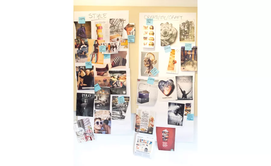
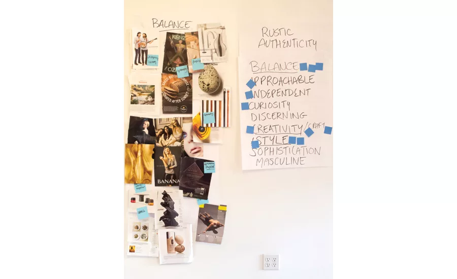
Spring began the process of redefining Blue Nectar with a Collab-create Workshop held with Nikhil and his team. Collab-create is an intensive ideation session led by Spring Design Partners’ strategy and insights team, where agency and client work together to identify viable creative platforms and opportunities. Meg Asaro, director of Strategic Services, describes Collab-create as “an opportunity to force ourselves to step away from the conventional views of an idea. We (Spring Design Partners) introduce insights we have uncovered in our investigation of the opportunity and then work with our client to connect those insights to our brand through brand stories. It is our chance to challenge and question everything about the brand as a means of reconstructing.”
The work session helped the Blue Nectar team better understand the brand and its place within the category. It also helped direct the team toward potential opportunities to redefine the visual code of tequila. Through a pictorial deconstruction of the product attributes — balance, agave-forward, crafted — Spring uncovered a new visual territory to reflect the product proposition and differentiate the brand.
The design solution ultimately presented itself when the team began to internalize the importance of the Blue Nectar name. As an existing asset for the brand, “Blue Nectar” is a powerful reflection of its product proposition and taste experience. The word “nectar” has both natural and mystical connotations. It is both a life-giving liquid that comes from the earth and the drink of the gods. The important place “nectar” holds in the human consciousness supports the care Blue Nectar takes in making, blending and infusing its liquids to produce thoughtful and quality tequilas. A telegraphic depiction of the meaning behind Blue Nectar became the visual strategy that led the creative exploratory.
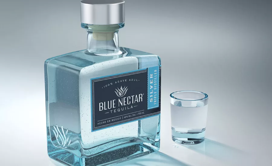
The final design solution married the existing bottle structure with the telegraphic approach to brand identity and a new label concept. The existing bottle, in and of itself, stood apart from tequila tradition with its square shape and angular lines. Typography and iconography became primary tools of reinvention and the focal point of the label design. The design built off established telegraphic power of agave imagery within the segment while creating a new expression that was more refined and sophisticated.
The initial reaction to the new design has been extremely positive. “The new design is more sophisticated, premium and truly ties into our core essence and our goal to make unique and thoughtful tequilas,” says Nikhil Bahadur. “Our distribution and trade partners love the new look and feel of the label. The new design has become an anchor to all of Blue Nectar’s communication touch points, informing the execution of the website and point of sale, which have taken on the look and feel of the package.”
The collaboration between Blue Nectar Tequila and Spring Design Partners resulted in a new beacon for the super premium tequila segment that begins to shift the paradigm of consumer expectations. This new “code” of tequila represents one brand’s desire to take a risk in order to tell a truly genuine story. For some, this type of risk may be daunting. However, when backed by insight, strategy and a brand story that is true to the DNA of the brand, the risk becomes the opportunity. Nikhil Bahadur notes that chemistry between client and agency was a key component in seeing the opportunity. “Working with Spring Design Partners was a pleasure, because they understood from the very beginning what we were trying to accomplish. They just ‘got it.’”
The new design for Blue Nectar Tequila has been extended to Blue Nectar’s range of three offerings — Silver, Reposado Extra Blend and Reposado Special Craft — and will be rolled out to retail shelves throughout March, April and June 2015.
Meghan Labot is managing director, Spring Design Partners (springdesignpartners.com). Spring Design Partners believes smart design makes a difference. Spring is a creatively driven brand design consultancy blending insight, imagination and smart design into transformative brand experiences for CPG brands. Over the past 19 years, Spring has established a proven track record of translating consumer insights into successful brand design solutions that generate results.
Looking for a reprint of this article?
From high-res PDFs to custom plaques, order your copy today!


