Licensed Packaging: Is It Worth It?
Carefully consider the options before associating your brand with on-trend characters.
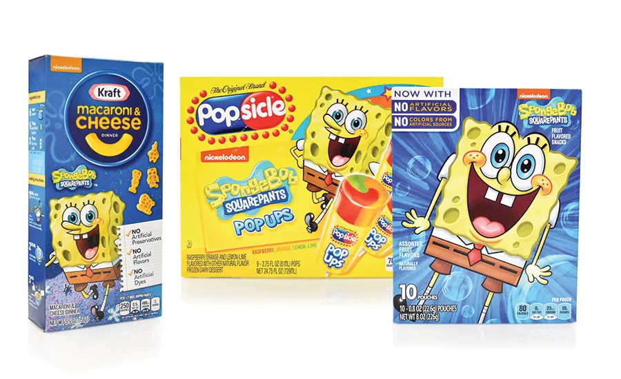
Never let licensing get in the way of good design or allow it take over your brand identity. On the fruit snacks, the Betty Crocker brand—a strong, trusted equity—has been overpowered by an eager attempt to attract kids.
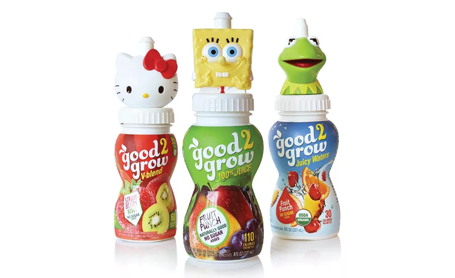
The new design for Good2Grow is a strategic mix of “party on the top, business on the bottom,” making it appealing to both kids and parents
For brands that don’t want to enter the world of licensing, custom characters can be effective in creating standout.
Using licensed properties on packaging is a popular move for a reason—licensing can bring brands exposure, access to new categories or regions, revenue increases and more. But it also can come with minor to major downsides.
To help brands understand what direction they should take with licensing, BRANDPACKAGING sat down with Renée Whitworth, strategic partner at design agency Flood Creative, NY (www.floodcreativeny.com). Flood is about to celebrate 15 years of using design as a strategic weapon, and has had its share of creating licensed packaging for companies. Whitworth shares her insight into the pros and cons of licensed packaging as well as how to execute it with savvy.
Watch out for trouble spots
“There are two pitfalls with licensing: strategy and design,” says Whitworth. “And that is true for us as brand consultants as well as parents.”
“For consultants, it is seen very much as a necessary evil for our clients,” she continues. “The licensed properties are doing everything in their arsenal to attract kids. They tempt marketers who consequently sign up so as to not be outshined by the competition. In a way, it smacks of the saying ‘don’t hate the player, hate the game.’”
Further, licensing could have no effect on the customer’s buying decision—an expensive disappointment for brands—or it could even have the opposite effect of the company’s intention and cause shoppers to view the company in a negative light.
“Brands get diminished in many ways, as it can be seen as a lack of reason to purchase the brand on its own merits or actually tarnish the good image one already has of it,” says Whitworth. “One exception in my mind is Band-Aid brand. Licensing seems to be so far intertwined with this category leader that is does not denigrate its reputation. At the end of the day however, consultants much prefer the pursuit of unique ideas and the quest to uncover them.”
Even for the most skilled designers, licensing may put a damper on their ability to make your product stand out as much as the characters and be appealing to parents, who do the actual purchasing.
“As designers, licensing comes with its own set of handcuffs. At a minimum, there is a list of design rules to follow as long as your arm. At worst, it can be a case of total invisibility, as in the case of Betty Crocker’s SpongeBob fruit snacks. And the middle ground is a look that is counterintuitive to the visual style we expect from healthier alternatives for kids,” says Whitworth. “Cartoon characters, bright colors and silly typefaces are associated in many parents’ minds with empty calories and junk food. In my opinion, the cereal aisle started this association: Packages with characters equals a sugared frenzy!”
Maintain brand independence
So how can you overcome the pitfalls and make licensing work in your brand’s favor?
“How does a brand participate in what might be a very lucrative opportunity,” asks Whitworth, “and still maintain its status of being the catch in the relationship? After all, consumers are eating/drinking/using the physical product—not just viewing the graphics.”
Here are two examples of how Flood Creative has used strategy and design combined to remain trend relevant yet independent.
Good2grow: work your offense
Before the name change from Good2Grow, the brand was known as Belly Washers, and that, combined with the character-focused packaging, was proving a detriment to the brand.
“From A to Z there was nothing about this brand that communicated 100 percent juice,” says Whitworth. “In an age where even McDonald’s was swapping out fries and a soda for milk and apple slices, Belly Washers was being dismissed by name and graphics alone. Yet as many parents will testify, there is that moment on a four-hour car trip where you see this at a convenience store or gas station and think that it is worth the moral sacrifice for 15 minutes of peace! Our goal was to make the decision to buy Good2Grow an offensive purchase due to the juice content versus a defensive one to appease the kids.”
The firm recommended the brand let the entire bottle be dedicated to what moms are shopping for and have the cap alone appeal to kids.
“Of the three nutritional negatives associated with licensed packaging design listed above—cartoon characters, bright colors and silly typefaces—the only visual cues we retained were bright colors. We felt colorful (versus a white or natural/neutral tone) was a visual equity of the predecessor. Results so far have been extremely positive, and now the line has grown into veggie blends and flavored waters.”
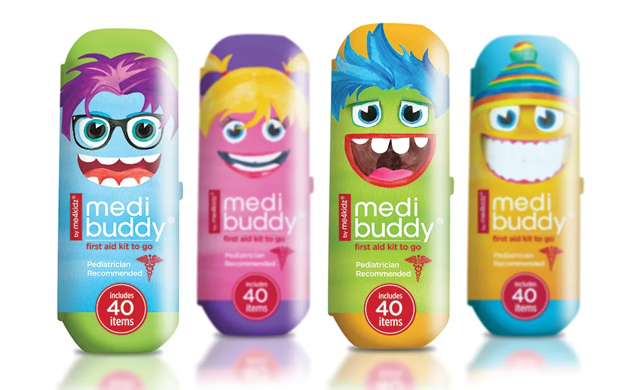
Me4kidz: consider original alternatives
Me4Kidz makes easily organized and portable first-aid kits with cool, modern designs that help parents stay prepared in case children are injured.
“This brand was considering taking the plunge into licensing, but the founders and owners Pete and Richelle Nassos had some nagging thoughts,” says Whitworth. “On our initial call we spoke about their professional doubts: ‘Aren’t these properties fleeting trends? Can we invest in the inventory? Will it look like we sold out to our loyal fans? Will new moms understand our values as an American, family-owned company if our designs behave like all the rest?’ The Nassos also had parental doubt—to paraphrase: ‘If another thing with a cartoon character comes into this house, I’m going to lose it.’ No personal offense to animated movies or cartoons, they are just the scapegoat for what we later termed ‘licensing fatigue.’”
“As design consultants, we understood that there was a certain amount of fun needed to sit in the family wound care section,” says Whitworth. “Me4Kidz did not want to exist in the no- man’s land between over-licensing and private label. Both sides of the team wanted to bridge the gap. And as parents, we also knew that friendly faces are a great distraction for an inconsolable toddler with a boo-boo. So onward we went in search of a concept that was colorful and fun with a sense of family-owned innocence. The characters created are all sketched and then ultimately hand-painted by the Flood designers. It was a win-win outcome. We saved money on the characters, and we reflected the design aesthetic of younger/modern moms.”
The choice to steer away from licensing proved to be the correct one for this brand.
“As a result of following our collective intuition—which is something any startup has to be willing to do to avoid spending six weeks and six figures on market research—the results have been phenomenal. The original two flagship products spawned many innovative others, all from the ROI of the original design.”
Using licensing strategically
Brands considering adding a licensed character to their packaging should work through Whitworth’s following steps:
- Make sure there is no better/alternative fit for your brand than licensing.
- If you really have to do it, don’t sell out on design just to sell more product.
Entering into a licensed agreement may be a wonderful move for your brand if you weigh the options as well as the real and perceived costs. And if you feel licensing is not the way to go with your brand, don’t sweat it: There’s a unique design and brand marketing option through packaging right for you.
Looking for a reprint of this article?
From high-res PDFs to custom plaques, order your copy today!


