New KIND Snacks Gets Boost of Simplicity and Goodness in Design
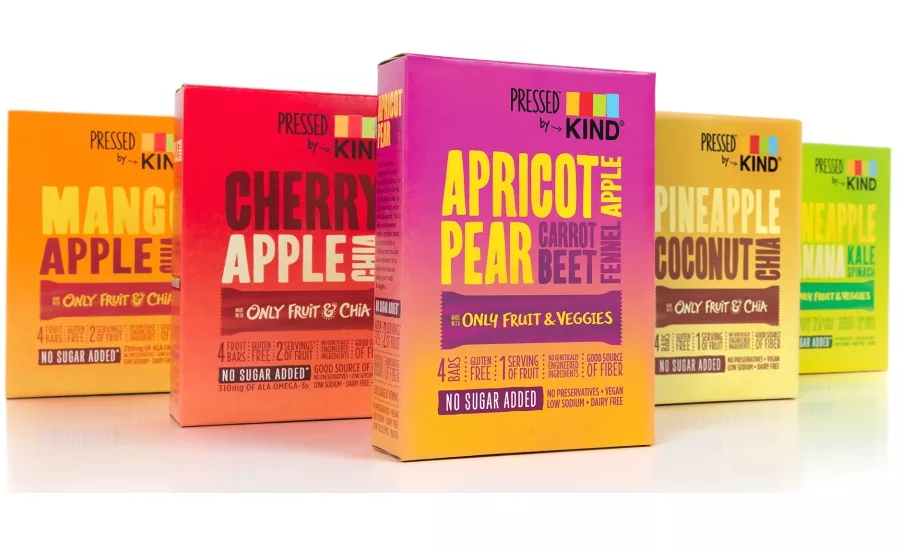
Squeezing more fruits and vegetables into a daily diet has become easier with the roll out of Pressed by KIND from healthy snack brand KIND. Pressed by KIND bars are made with only five ingredients or less, through a process that requires no preservatives or fillers – just nutrient-dense ingredients, like fruit, veggies, and chia pressed together into a delicious bar. To communicate the unique attributes of the products, KIND turned to Chase Design Group, the brand design agency, to leverage cues from the juicing category and create the image of simplicity, healthfulness and freshness.
For a brand known for products with ingredients that you can recognize and pronounce, transparency has been a core component of KIND’s packaging. However, maintaining shelf stability and the need to differentiate the product from the core product line made the design team rethink their approach.
“The big challenge that Chase Design Group addressed was communicating the ingredient story through packaging while preserving our brand recognition," says Jon Lesser, senior director of marketing, KIND,
According to Clark Goolsby, VP, creative director, Chase Design Group, “The packaging features hand-drawn type, vibrant natural colors and soft textures that are true to the lead ingredients in order to tell the story without showing the product.” The design strikes a balance between bold confidence and healthy snacking. The logo contains an interpretation of KIND’s master logo and serves to create a sub brand that can stand on its own while visually relating to the parent brand.
The five different flavors of the Pressed by KIND bars include: mango apple chia, pineapple coconut chia, banana kale spinach, apricot pear carrot beet, and cherry apple chia. They are sold individually and in four-count cartons in conventional, natural and mass retail channels, as well as at convenience stores and online retailers.
Looking for a reprint of this article?
From high-res PDFs to custom plaques, order your copy today!


