Chase Design Group Helps Barebottle Brewing Stick to Its Mission
After many years of entering and judging beer competitions, three friends and former classmates at Cornell Business School in Ithaca, NY noticed one thing: the best, most daring beers in America are being developed by homebrewers. That insight, along with an enduring passion for the craft of beer making, led them to start Barebottle, a brewery devoted to beers inspired by the San Francisco Bay Area. By sourcing local ingredients wherever possible and employing a community-inspired homebrewers competition, their mission is to create the most innovative brewery in the Bay Area.
The main challenge for Barebottle was how to bring the brand to life and tell a unique flavor story on every bottle. That’s where Chase Design Group, the brand design agency, was called upon to create a visual approach and design language for the brewery that could be applied across all touchpoints including packaging, taps, handles, coasters, clothing/gear, delivery vans, website, and even the brewery design elements. According to Michael Seitz, Co-Founder of Barebottle, “Chase Design Group helped us create an iconic brand.” His partner, Lester Koga, Co-Founder, adds, “Marrying an edgy design with a slick, professional, clean look was critical to the design mission.”
Chase created a visual foundation that allows for brand growth and a system for adapting flavor-to-flavor while maintaining core brand elements. “The Barebottle mark expresses the essence and simplicity of the brand, allowing us to use really compelling imagery to communicate the unique flavors of each beer. Bold, playful copy explains what the beer will taste like, making it less intimidating for consumers to try something new,” says Executive Creative Director, Chase, Paula Hansanugrum.
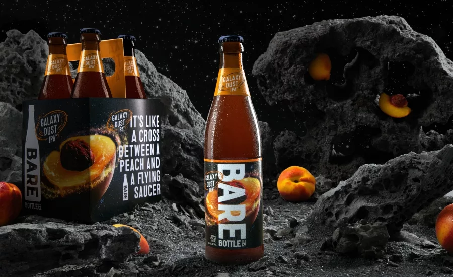
Each beer is brought to life with a unique flavor story. “Our goal was to create a visual metaphor that is both beautiful and appetizing. For Muir Woods IPA, we created a juicy pinecone to capture the earthy notes of citrus and pine. For Galaxy Dust IPA, since the flavor is derived from yeast and hop, we stylized a peach to look and feel like a galaxy playing on the flavor of the peach but also the name of the hop and ultimately the name of the beer,” says Senior Art Director, Jon Arriaza. Seitz expressed a desire for the bottle to have the brewing recipe on the back, so Chase designed a removable recipe label that allows consumers to reference it for their own home brews.
Inside the San Francisco brewery, the decor is best described as a marriage between the industrial and the great outdoors. Metalwork, burned wood, locally salvaged materials and rustic creations are all sourced through community collaboration.
According to Seitz, “The brand, logo and packaging work has helped us get off to a really fast start. We’re 50% ahead of our volume goals through the first year and a half. We have a lot of competition in the brewing world, and I think we stand apart, specifically because of the work Chase did. We get lots of comments from our patrons about how good the design work is, and I think that will only continue.”
Looking for a reprint of this article?
From high-res PDFs to custom plaques, order your copy today!


