Behind the Scenes with Sloat Design Group
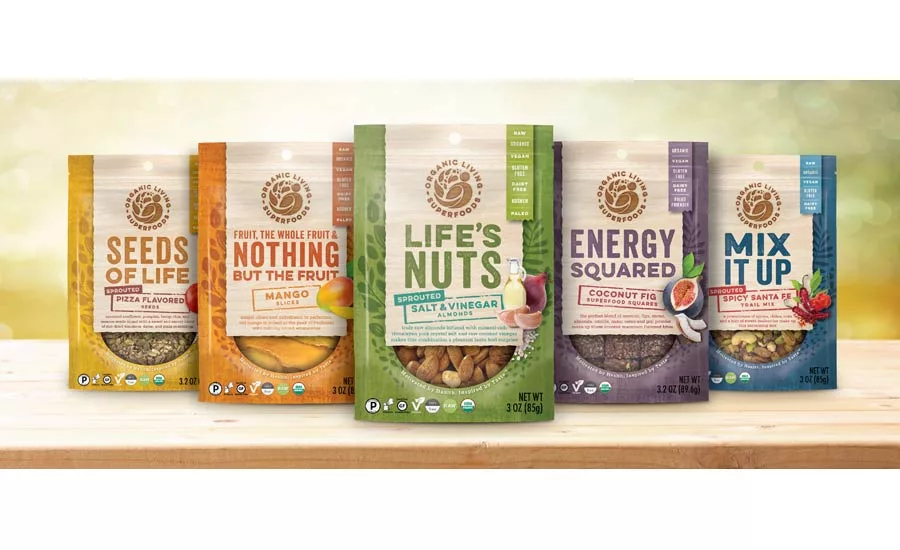
Organic Living Superfoods product line-up
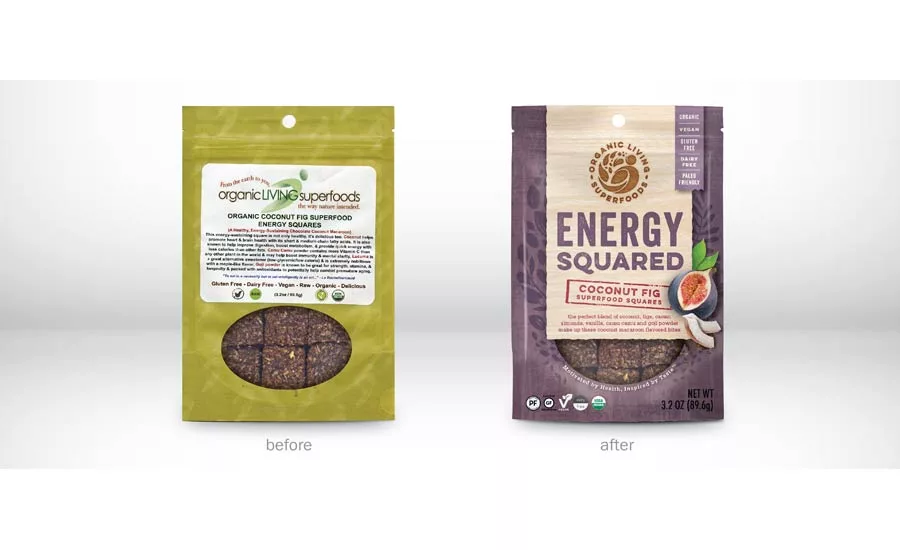
The previous logo (left) and new logo created by Sloat Design Group
Clever copy helps convey the spirit of the brand.
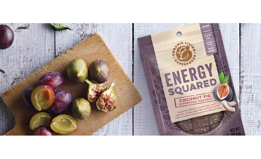
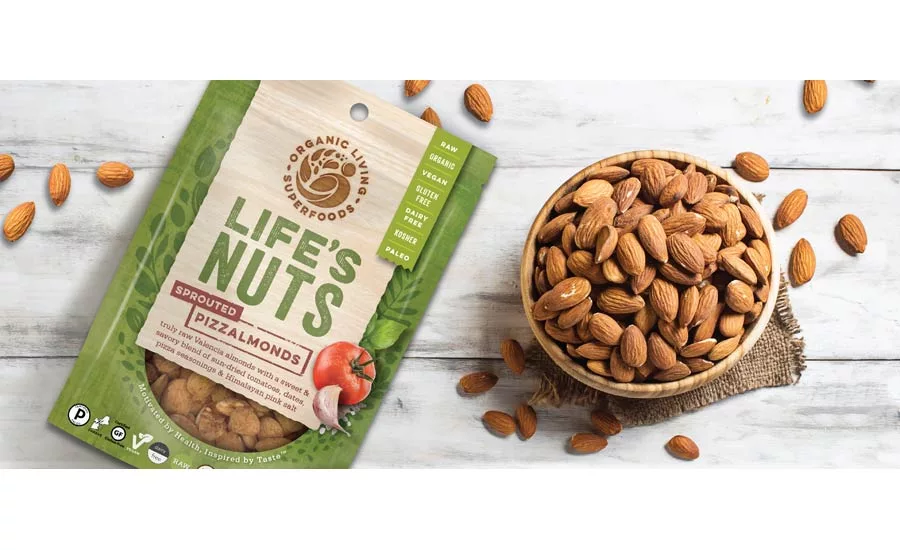
Branding now includes flavor names and accompanying imagery.
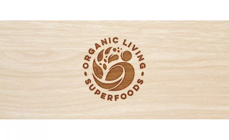
Organic Living Superfoods
Organic Living Superfoods creates delicious snacks using the highest quality ingredients with exceptional nutritional value. The Boston-based company had previously generated a local following but knew that rebranding and repackaging was essential for brand awareness and growth beyond their current distribution.
The new logo needed to incorporate their beloved “peapod man” and clearly display their entire brand name while the packaging graphics needed to convey the quality and benefits supportive of their premium pricing. With several categories and nearly one-hundred SKUs, it also needed a well-organized, consistent system with enough flexibility built in to convey the unique characteristics of each product.
“We presented several distinct designs, showing each across three flavors of two different categories. This gave us a glimpse into how the designs would work across their entire portfolio, not just for one or two flavors,” says Dufour.
Each category is now easily identified by color with names like “Life’s Nuts” for their sprouted nut line, and “Energy Squared” for their superfood squares line. The new category names not only express product attributes, but also bring an engaging spirit and lively tone of voice to the brand. Flavor names are now accompanied by photography and a brief description to communicate the natural flavor profiles, while dietary attributes like “Raw”, and “Gluten Free” are neatly organized in a vertical tab.
The updated brandmark stands prominently at the top of each bag, burnt into the wood background. The new logo leverages the equity of Organic Living Superfoods existing “pea-pod hero” but redrawn and encircled by the brand name for a more succinct, compact design.
The new system greatly improves shop-ability and builds brand awareness with an honest feel that is earthy, bold, and lively - representing a brand that never skimps on health, flavor, or fun.
For more information visit, http://www.sloatdesign.com/
Looking for a reprint of this article?
From high-res PDFs to custom plaques, order your copy today!


