Brigade Partners with Svedka for Killer Halloween Packaging
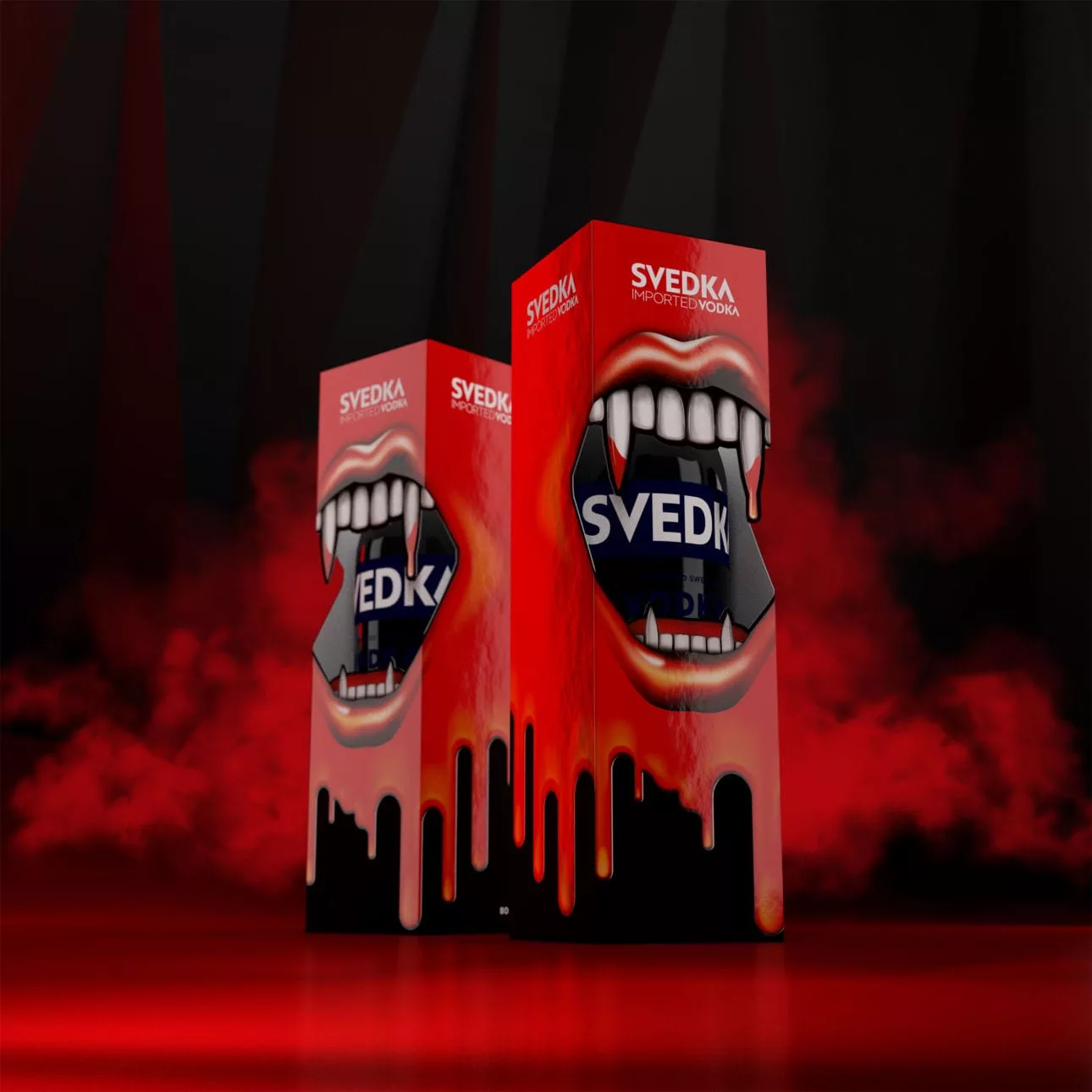
Several production techniques support a design that’s able to break through a busy retail environment. A sharp die-cut in the box forms the mouth’s opening, creating the illusion of dripping fangs overlaying the Svedka bottle. A high gloss printing technique make the blood and mouth appear raised on the box and liquid-esque. In contrast, matte white teeth and debossed logos cut through the blood and provide prominent placement for Svedka branding on the packaging.
“The packaging feels like a permanent object instead of something disposable,” says Dave Grasso, Senior Creative at Brigade. “It elevates the product and encourages consumers to engage.”
Looking for a reprint of this article?
From high-res PDFs to custom plaques, order your copy today!


