Market Trends: Beverage Packaging
A Kiss & A Handshake: Ergonomics in Packaging Design
Ergonomics and haptics—two crucial factors in packaging design—can launch a product romance for beverage consumers.

Creating a tangible and functional connection between a beverage brand and its user involves ergonomic research and a haptic design. To brands, this may seem like a minute detail, but the consumer thinks and feels otherwise. Product design isn’t just about the aesthetics. It’s also about incorporating how the consumer thinks, feels and behaves to create a strong and memorable emotional connection with the brand. Two principal challenges define the human encounter with beverage packaging: the kiss factor—the oral consumption experience, and the handshake—the feel and performance in the hand.
THE MIGHTY CAP
Regardless of the beverage, how a user opens the container and consumes the beverage defines the initial interaction with the brand. Why, then, is the cap the most overlooked opportunity for design innovation? The cap is the keystone of all user drinking experiences, and strongly influences the quality of the kiss factor.
Take a pop-top cap, for example. Its round shape has nothing to do with the shape of the user’s mouth. The shape forces the lips to pucker in an attempt to create a seal around the cap. The user has to forcefully suck the liquid out, and invariably experiences leaks out of the corners of the mouth and dribbles down the chin. The pop-top cap’s small cylindrical shape makes it very difficult to grasp and pull up to open. And very few pop-top caps offer a distinct audible click and a tactile snap when opened or closed, so accidental leaks from improperly closed caps are a common problem. Equally irritating are the cap designs that have tamper-evidence seals that are hard to remove. Meanwhile, most flip caps do not flip back far enough to clear the nose and instead scratch it while the user drinks.
DIFFERENT SIZES, SHAPES
Users’ lips come in different sizes and shapes. Individual consumption patterns and rates vary, and directly inform how to design the beverage container mouth piece shape and orifice size to get the optimum flow rate for the range in size and shape of human lips, mouth volume and posture.
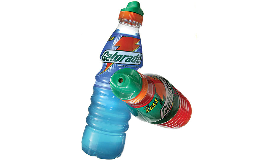
Compare the pop-top cap and flip cap designs to the ergonomically designed Gatorade “cowboy hat” cap. The cowboy hat cap was based on lip ergonomics and designed to provide distinct haptic, acoustic and visual cues to signal if the cap is open or closed. The kiss factors of these three closures are completely different. The ergonomically designed Gatorade cap will always win the consumer satisfaction sweepstakes because it fits and performs best. The cowboy hat cap design was anchored in a study of lip shapes and sizes, bottle flow rate versus user consumption rate, and optimum hand size and strength.
Do not overlook the emotional element of cap design. Consider the user experience of opening a foil-covered, corked wine bottle that creates anticipation with a metal twist cap. Cap design provides a singular opportunity to inextricably wed user experience to brand identity.
THE HANDSHAKE
Let’s look at the factors that drive the handshake. An easy way to reduce cost is to reduce materials used in each cap. So many brands have opted in to a shortened cap height to a point where there is not enough surface area on the cap side walls to grasp and apply the burst of torque needed to open the bottle. But the fun is just beginning, because after a user cracks open the stubby cap, the bottle walls collapse under hand grip, providing a bath, not a handshake! Not a good user experience. Therefore, wall thicknesses should be determined by the wall strength needed to create surface grips and textures that stand up to normal grasp-and-torque action to open the cap and handle the bottle.
Research shows, on average, that seven gulps quenches thirst, and does it in a particular pattern: three sets of back-to-back gulps of successively smaller amounts of fluid, followed by a slight pause before the final sip of one-to-three ounces. It’s this pattern that results in the “Aaah…refreshed” moment.
Consumption research measures the amount of beverage per gulp, the speed of consumption and total consumption, to provide design inputs for package size, container form and cap design. Speed of consumption and total consumption varies across beverage types, depending on if the user sips or gulps. Consumption studies are a key step in ergonomic design, and well worth the investment of time and research funds. Consumption studies provide specific design inputs for orifice size, flow rate and grips, as well as insights on the best size and shape for a cap, especially where the lips engage with the container.
HAPTICS MATTER
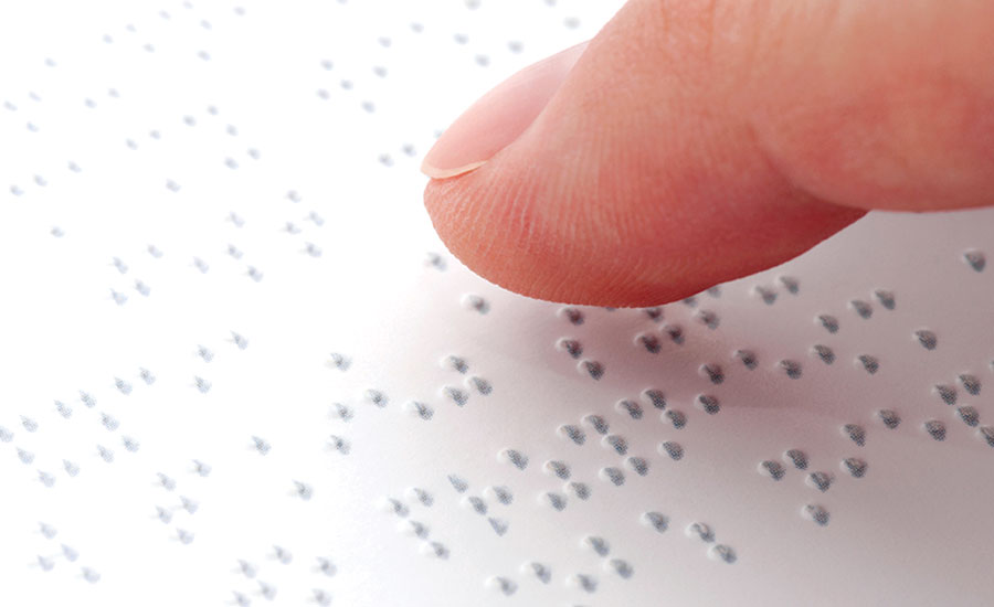
This first touch of the cap sets the impression of brand experience. The user intuitively answers these questions: Does it feel cheap? Does it feel expensive? Does it feel exotic? A user’s 10 fingertips can sense textures as small as 3 microns high, and human palms can sense differences of .009 inch in palm height. So details do matter!
All ergonomic designs accommodate the range from the fifth to 95th percentile in hand size, and consider the best grips for cap operation, removal of the tamper evidence seal and general package handling. As a result, surface textures, control surfaces (the places where fingertips land) and grips need to be thoughtful and at this same resolution.
All touch points and control surfaces need to be designed to fit the shape of fingertips and, wherever possible, provide deliberate haptic feedback. Haptic designs define how the consumer thinks, feels and behaves in relation to the product, to create a strong and memorable emotional connection between user and brand.
DRINKING ON THE RUN
A society in constant motion requires users to routinely drink from coffee cups, water bottles and canned beverages while in motion between the house, car and office. Always being in motion raises some interesting design challenges. First and foremost is spillage, and second is aligning the user’s mouth with the cap’s sip hole.
Research shows that coffee drinkers glance down at the lid to orient the sip hole to their mouths. Commonly, people use their tongue to reach out, find and align their mouth with the sip hole without looking. This wastes time, requiring the user to adjust to package design, rather than the other way around. In good ergonomic design the shape of the cup automatically aligns the lid and sip hole, so the user never has to check for alignment; it flows naturally from the design.
Another drinking-on-the-run design factor is having the ability to easily close the sip hole to prevent splashing, without compromising grip security. The traditional stir stick is a two-handed solution with a loose part that requires disposal. It contributes very little to a great user experience.
Compare this to the ergonomically designed Solo Traveler Plus cap that offers intuitive, easy index finger control to open and close the sip hole, without a grip change on the cup. This user-
centered design solution brings more value to the consumer, builds the brand and delivers superior ergonomic performance that connects with consumers.
THE DESIGN BOTTOM LINE
Successful package design is intuitive, easy-to-use and creates a continuous experience between product and user. How a product feels in the user’s hand, its handshake, combines with the kiss consumption experience, to define the package design and the brand. A design with perfectly shaped and sized grips, fingertip friendly cap design that is 100 percent instinctive allows the user to open and enjoy beverages at the ideal rate of speed and volume. Look for these human factors to find the key to the ergonomics of drinking.
Looking for a reprint of this article?
From high-res PDFs to custom plaques, order your copy today!


