Somersault Adult Soda Gets Visual Boost
Slow-brew soda start-up Somersault spotted a need for a healthy option to appeal to consumers who want to drink less alcohol yet don’t want to increase their sugar consumption. Drinks design specialist Denomination (denomination.com) was asked to create a brand and packaging design that would be aesthetically distinctive and memorable, and that café and bar owners would be happy to display on shelf.
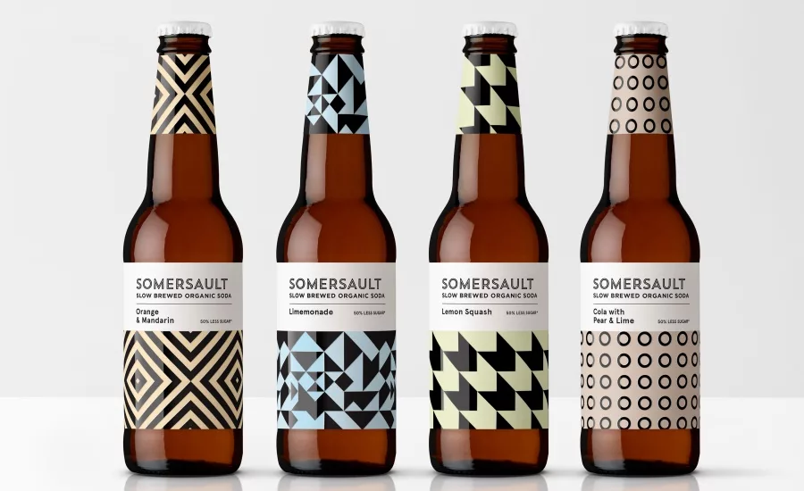
The design team at Denomination came up with a strong graphic approach that creates great stand-out on shelf and provides clear varietal differentiation. The identity also looks to the premium-craft-drinks market to appeal to a discerning target consumer who appreciates hip, healthy options.
Contemporary pastel colors were selected to reflect the brand’s organic ingredients and good-for-you credentials. The designs are also echoed on the bottle necks to further boost stand-out and allow for a more minimalist approach on the main labels. As well, a strong bespoke logotype, uncoated paper stock and embellishments were used to reinforce the premium positioning of the brand.
Looking for a reprint of this article?
From high-res PDFs to custom plaques, order your copy today!


