English Tea Brand Tells a Sustainable Story
English Tea Shop reveals a revitalized brand identity and packaging, created by design and innovation agency Echo. The design delivers a consistent look and feel across the 55 countries it trades in and is an example of how to build a strong, unified brand behind a story of sustainability.
Since 2010, English Tea Shop has been working in collaboration with small organic farms in Sri Lanka and 20 other countries to source ingredients, grown without chemical fertilizers or pesticides, to make teas for tea-lovers all over the world.
The company buys limited, sustainable quantities from each farmer, paying them a premium on top of the Fairtrade price, and works to improve the well being of the farmers and their families. It’s also working towards full organic certification for its entire range of products.
“Our brand has become synonymous with a taste and values that people want. We wanted to create a consistent visual identity across the globe, to help people recognize the products more easily, and during this process we’ve come to recognize that our farm-to-cup story is not simply an ethos we believe — it can become the unifying concept for the brand," said CEO, Suranga Herath.
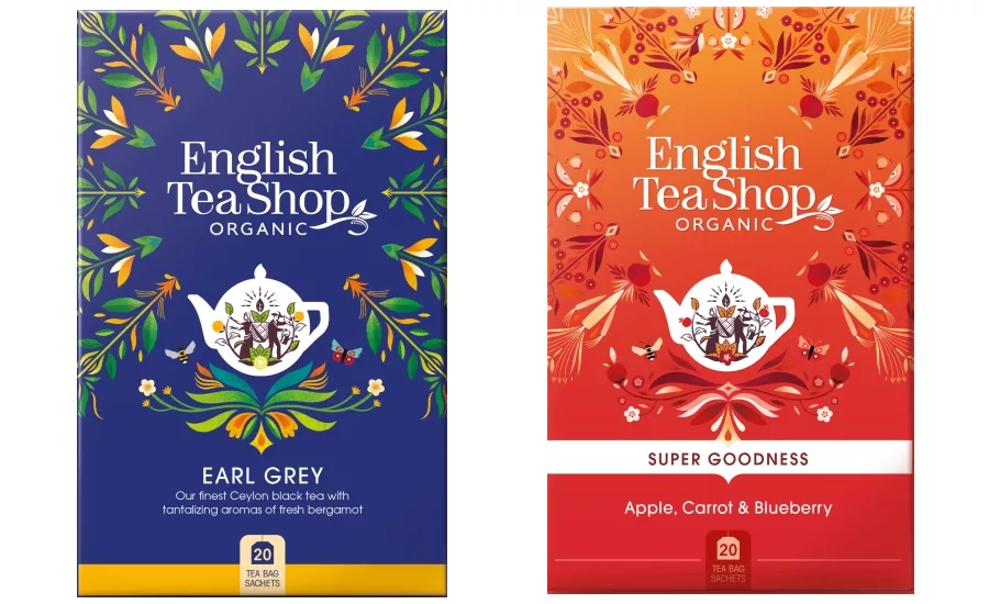
Echo’s new designs tell English Tea Shop’s strong sustainability story through a new brand mark featuring the word ‘organic,' a mandala design celebrating sustainable ingredients, and a new teapot icon and in-pack illustrations telling the brand’s farm-to-cup story.
Immediately, the vibrant, eye-catching colors jump out from the packaging. Together, the new packaging designs form a powerful and seamless design system that celebrates the individuality of English Tea Shop’s blends.
The new teapot icon — a classic round English teapot shape — holds elegant figures of a man and a woman nurturing tea plants, while mandala designs created by French illustrator Margaux Carpentier burst from the center of the packs. The new in-pack illustration shows an ocean connecting a farm and factory on one side, and an English tea shop on the other.
Looking for a reprint of this article?
From high-res PDFs to custom plaques, order your copy today!


