Garnet Teo & Mark Walker > Wild Bunch & Co.

Teo, together with fellow WB&CO co-founder Mark Walker, began their journey two years ago when they started making their own organic vegetable juice for medical reasons. The positive effects on their health and lives was dramatic, and soon the two found they had requests from patients recovering from serious illnesses who wanted to rebuild their body’s immune system naturally.
Before long, the project evolved into WB&CO and the pair began offering a line of cold-pressed 100 percent organic vegetable juices served “fresh off the press” to the public. Initially, the juices were available “made to order” only, but in the fall of 2007, WB&CO opened its first organic shot bar, giving Singapore residents the opportunity to stop by for a quick and healthy shot of freshly pressed juice.
Walker and Teo, both of whom were coming from careers as creative/art directors at various top agencies in
“It’s paramount,” says
With that mission in mind, the two set out to capture their brand’s essence and bring it to life. Walker and Teo enlisted the help of SEED Creative, the design firm they had founded in
“Everyone wants a product that benefits him or her personally, enhances them emotionally and conveniently fits into their daily life,” says
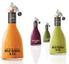
Glass packaging was selected for its ability to let the vibrant colors of the organic vegetable juice naturally communicate the product’s quality with clarity, honesty and simplicity, says
“Aesthetically we wanted to dramatize the product’s contents by applying what we consider to be the timeless principles of packaging design, which is something that is simple, balanced and pure in form,” explains Walker. “The inspiration was the incredibly pure colors of the juice itself.”
Shape was also a critical consideration-another lesson learned from working with cosmetics clients like Shiseido who invest significant time and money into this aspect of their packaging. In addition to their symmetry and charm, the shapes of the bottles have been chosen for their ergonomic quality-the neck fits perfectly into the hand of the barman as he or she shakes the bottle before pouring the shot.
And though the packaging was initially used just for serving shots at the bar, WB&CO recently decided to offer a limited edition of the iconic bottle for sale to its loyal customers. Response has been strong and is evidence of the impact that packaging has had on the brand. Often it is the packaging that challenges the customer’s perception of what organic vegetable juice is (
Being a brand dedicated to the health and wellness of its customers, sustainability is another concept WB&CO holds dear, and in their design brief, Walker and Teo specified that bottles be 100 percent reusable. Toward that end, for example, the closure selected was engineered in such a way that it is separate from the bottle and can be attached and dismantled without the need for permanent fixtures. This clearly illustrates the idea that aesthetics and sustainability can actually reinforce one another, says
“We talk about ‘sustainable consumption’. What will join in that debate in the future is the idea of working towards a ‘sustainable style’-what style, or design philosophy, of packaging or brochure or building will meet the criteria you’ve outlined whilst still making it distinctive, desirable and commercially viable,” he explains. “The trend, therefore, will happen at the corporate level first, with corporations placing more importance on design. This will result in packaging that is driven by clear product planning rather than transparent marketing.” BP
NAME: Mark Walker
Age: 39
Title: Founder, WB&CO
Years in current job: Two
When or where do your best ideas come to you? Walking. Looking. And early mornings in the garden.
What do you consider the ultimate branded package? Boots, Benetton, Bulthaup, Camper, early Olivetti and smart.
NAME: Garnet Teo
Age: 39
Title: Founder, WB&CO
Years in current job: Two
Where or when do your best ideas come to you? The most unexpected of places.
What do you consider the ultimate branded package? Harvey Nichols, Muji and Shiseido.
Looking for a reprint of this article?
From high-res PDFs to custom plaques, order your copy today!


