“Krafting” a Redesign
Kraft Foods uses packaging design to unify a diverse portfolio of brands-and to incorporate new ones.
 by Pan Demetrakakes
EDITOR’S NOTE: Kraft's vice president of design and innovation Jon Denham recently left his post at Kraft Foods, but his track record of bringing relevance to heritage brands-and doing so within a conservative company like Kraft-is one we like to champion.
Jon Denham shows a visitor a row of cubicles at the marketing offices of Kraft Foods in Glenview, Ill. He gestures at the nondescript, beige work cubes and asks rhetorically, “How do you think that encourages creativity?”
Then Denham leads the way to the newly redesigned work space for the creative team that he heads as Kraft Foods’ vice president for package design and brand innovation. The desks are arranged four to a cluster, separated by walls that form an X and are low enough to allow communication while seated. Comfortable, low-slung padded chairs with armrest writing surfaces face a whiteboard wall, with soft couches along another wall. Banks of shelves, open on both sides, showcase a variety of interesting packages, not all of them Kraft products-not all of them even food.
This redesign of the creative team’s work area was an 18-month project that’s emblematic of Kraft’s teamwork approach to packaging operations. When you manage an amazingly diverse product portfolio, including some icons that, like the company itself, are more than 100 years old, communication is critical to achieving goals.
Kraft has done a remarkable job of applying sound principles across its diverse packaging portfolio, and not just in design. In sustainability and technology, Kraft’s packaging stands among the food industry’s best.
To grow in a difficult economy among stiff competition, Kraft is buying new brands and strengthening old ones. Packaging is a vital part of both of these strategies. The former has had a higher profile, with the company’s acquisition of British candy giant Cadbury finalized early in 2010. The approximately $19 billion deal vastly expanded Kraft’s existing candy brands, many of them European, and was financed in part by the sale of Kraft’s profitable domestic frozen pizza business to Nestlé.
“Part of my charge here is really about contemporizing the company, in terms of its design, look and feel,” Denham says. “It’s a tough charge because we have a lot of no. 1 and no. 2 brands. They’re traditional household names, and they have an established look and feel. [So] you have to discuss where you want a brand to go.”
To do that, Denham says his team considers everything from materials and shapes to colors, logos, typography and photography. Finding the right place for an iconic brand to go, however, can be tricky. How do you keep consumers responding to the brand while refreshing it, hopefully attracting new consumers?
Hania Midura, Kraft’s design director for grocery, says “equity planning and equity analysis” is what’s needed. “We don’t ever want to step away too far from the brand and what makes it so beloved by our consumers,” she adds.

One of the immediate challenges in revitalizing Mac & Cheese was dealing with the brand’s disparities. It includes more than 50 SKUs, including the familiar mainstream product, instant Easy Mac and new Deluxe versions. With different (although overlapping) consumer bases, the question became how to unify them.
“From our point of view and from the consumer’s point of view, it’s much easier for us to talk about a ‘Kraft Mac & Cheese’ proposition, as opposed to three or four different brands,” Denham says.
Landor worked with Kraft on the redesign and created a circular packaging “badge” that features the Kraft logo, the words “macaroni & cheese” and, anchoring the bottom, a simple image of a single macaroni noodle in the shape of a smile.
This “noodle smile” badge now unifies the entire Kraft Mac & Cheese line, providing a common frame of reference while still allowing plenty of room to highlight the distinct properties of each variety. The new packaging was supported by an ad campaign that included two giant, two-ton sculptures of the noodle smile, bearing the slogan “You know you love it,” that toured popular locations like Wrigley Field and Navy Pier in Chicago.
Denham admits that Miracle Whip had “a slowing history” up to about a year ago. “I think it’s fair to say that Miracle Whip to some degree had lost its relevancy, because it didn’t have a distinct point of difference,” he said.
To find that distinguishing factor, the design team thought about the most appealing aspect of Miracle Whip: the taste. It’s tangier than most mayonnaise, due, at least in part, to its higher proportion of vinegar to oil.
“It’s got a tang, very different from mayo,” says Carol-Jacqueline Nardi, director of design and innovation for snacks (who had the same position on grocery at the time of the Miracle Whip makeover). “That actually gives it its spark. So as we talk about what’s the right direction to go, that unique difference is something we leverage, not only in product, but in personality.”
The result was a semi-rebranding of Miracle Whip as “MW,” with a distinctive “ambigram” logo that looks the same right side up as it does upside down (which shows consideration of the fact that retailers and consumers often store the bottles upside down on their broad, flat closures.) The logo formed the basis for a more vibrant graphic scheme, which in turn tied into a youth-oriented ad campaign that stressed the product’s edginess.
“It was more focused on a consumer segment [that] arguably [is] much more into something that’s a little extreme,” Denham says. “Once you have that clarity of vision, I think it’s fairly easy to come up with something that lives up to that.”
There are also the brands that Kraft has acquired - the most recent being Cadbury’s stable of candy and other snacks.
Perfecto Perales, Kraft’s senior director of packaging research, is well aware of the challenges involved in a major acquisition. He helped integrate the research, development and quality (RDQ) teams from Nabisco Mexico into Kraft when the company acquired Nabisco in 2000. And it’s a role he’s looking forward to playing for Cadbury.
“Cadbury has a lot of history of innovation in packaging that we’re excited about, [as does] Kraft, moving forward,” Perales says.
As a multinational company, Kraft is used to sharing technical information across a global network of R&D, design and procurement specialists, among others. As an example, Perales points to a new film used to package chocolate pralines under the Milka and Marabou brands. A Kraft packaging team in Europe developed the technology, which cut and scored a “memory film” with lasers in a way that allowed the film to adhere to the curvy surfaces of the bite-size candy, yet remain easy to open.
Perales says his team is in search of “transformational technology” to connect with consumers, offering Kraft’s adoption of resealable film for its Oreo and Chips Ahoy! brands a few years back as an example.
“Through consumer studies, the snacks team learned that our consumers would put all the Oreo cookies into a jar, because they couldn’t keep the cookies fresh,” he says.
The resealable packaging offers a much needed consumer benefit, but it also benefits Kraft because, when the cookies remain in their packaging, the brand and company associations get reinforced each time the consumer reaches for another Oreo.
Figuring out ways to get into consumers’ minds, and stay there, is an ongoing challenge for any packaged goods company. Denham notes that, in 1995, there were some 18,000 brands on US store shelves; in 2005, that had ballooned to 55,000.
“When you’re faced with that kind of competitive environment, how do you give the consumer more than just functionality?” Denham asked.
If Kraft’s string of successful redesigns is any indication, the question is simply rhetorical, because Kraft clearly has the answer.
“You have to give them something emotional to latch onto,” says Denham.
EDITOR'S NOTE:
This feature was excerpted from a story that originally ran in our sister publication Food & Beverage Packaging.
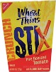
A new variety of Wheat Thins in a paperboard carton is designed to convert into a serving “bowl.” Wheat Thins Stix, a round, thin version of the cracker, is packaged in a carton that tapers toward the bottom. When all four top flaps are folded down, and the carton is squeezed according to the directions on the side, it becomes a wide-mouth, bowl-like package that allows easy product access.
 The
Deli Creations Sandwich Kit now uses less material. The previous rectangular
carton had a separate paperboard tray with a metallized inner surface that
browned the surface of the bread. The new tapered paperboard package retains
the metallized coating on the inside. To use, the consumer removes the
individually packaged components (bread, meat, cheese and condiments), assembles
the sandwich, tears off the top of the carton, places the sandwich in the lower
half (which has the metallized coating) and microwaves it.
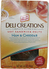
The
Deli Creations Sandwich Kit now uses less material. The previous rectangular
carton had a separate paperboard tray with a metallized inner surface that
browned the surface of the bread. The new tapered paperboard package retains
the metallized coating on the inside. To use, the consumer removes the
individually packaged components (bread, meat, cheese and condiments), assembles
the sandwich, tears off the top of the carton, places the sandwich in the lower
half (which has the metallized coating) and microwaves it.
 Crystal Light has been repackaged in a canister with a
contemporary, more feminine look that
also offers significant material savings.
The previous round canister with single-serve plastic tubs of the
powdered drink mix was replaced with an oblong canister with stick packs.
Crystal Light has been repackaged in a canister with a
contemporary, more feminine look that
also offers significant material savings.
The previous round canister with single-serve plastic tubs of the
powdered drink mix was replaced with an oblong canister with stick packs.
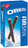 Oreo Fun Stix are long, thin rolled-up wafers lined
internally with Oreo-style crème filling. The filling is hollow, forming a
straw through which milk can be sipped. The product comes in pairs inside a
film stick pouch, with eight such
pouches to a paperboard carton.
Oreo Fun Stix are long, thin rolled-up wafers lined
internally with Oreo-style crème filling. The filling is hollow, forming a
straw through which milk can be sipped. The product comes in pairs inside a
film stick pouch, with eight such
pouches to a paperboard carton.
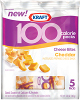 100 Calorie Pack Cheese Bites are small cheese chunks
packaged in a peggable pouch, like most Kraft small-particle cheeses. Inside
are five 1oz single-serve pouches. A window at the bottom shows consumers the
single-serve portions.
100 Calorie Pack Cheese Bites are small cheese chunks
packaged in a peggable pouch, like most Kraft small-particle cheeses. Inside
are five 1oz single-serve pouches. A window at the bottom shows consumers the
single-serve portions.
EDITOR’S NOTE: Kraft's vice president of design and innovation Jon Denham recently left his post at Kraft Foods, but his track record of bringing relevance to heritage brands-and doing so within a conservative company like Kraft-is one we like to champion.
Jon Denham shows a visitor a row of cubicles at the marketing offices of Kraft Foods in Glenview, Ill. He gestures at the nondescript, beige work cubes and asks rhetorically, “How do you think that encourages creativity?”
Then Denham leads the way to the newly redesigned work space for the creative team that he heads as Kraft Foods’ vice president for package design and brand innovation. The desks are arranged four to a cluster, separated by walls that form an X and are low enough to allow communication while seated. Comfortable, low-slung padded chairs with armrest writing surfaces face a whiteboard wall, with soft couches along another wall. Banks of shelves, open on both sides, showcase a variety of interesting packages, not all of them Kraft products-not all of them even food.
This redesign of the creative team’s work area was an 18-month project that’s emblematic of Kraft’s teamwork approach to packaging operations. When you manage an amazingly diverse product portfolio, including some icons that, like the company itself, are more than 100 years old, communication is critical to achieving goals.
Kraft has done a remarkable job of applying sound principles across its diverse packaging portfolio, and not just in design. In sustainability and technology, Kraft’s packaging stands among the food industry’s best.
Squeezed on Both Ends
Packaging is a critical component in Kraft’s future success. The company is fighting through one of the biggest economic challenges in its more than 100 years of existence. Like all branded food companies, it’s being squeezed between increasing ingredient prices and intensifying competition, especially from private label.To grow in a difficult economy among stiff competition, Kraft is buying new brands and strengthening old ones. Packaging is a vital part of both of these strategies. The former has had a higher profile, with the company’s acquisition of British candy giant Cadbury finalized early in 2010. The approximately $19 billion deal vastly expanded Kraft’s existing candy brands, many of them European, and was financed in part by the sale of Kraft’s profitable domestic frozen pizza business to Nestlé.
“Part of my charge here is really about contemporizing the company, in terms of its design, look and feel,” Denham says. “It’s a tough charge because we have a lot of no. 1 and no. 2 brands. They’re traditional household names, and they have an established look and feel. [So] you have to discuss where you want a brand to go.”
To do that, Denham says his team considers everything from materials and shapes to colors, logos, typography and photography. Finding the right place for an iconic brand to go, however, can be tricky. How do you keep consumers responding to the brand while refreshing it, hopefully attracting new consumers?
Hania Midura, Kraft’s design director for grocery, says “equity planning and equity analysis” is what’s needed. “We don’t ever want to step away too far from the brand and what makes it so beloved by our consumers,” she adds.
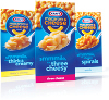
A
redesign unified Kraft’s macaroni & cheese line, while leaving plenty of
room for individual SKU differentiation.
Using Their Noodle
That balance is best exemplified by Kraft’s Macaroni & Cheese, which underwent a makeover that the design team points to as one of its biggest recent triumphs.One of the immediate challenges in revitalizing Mac & Cheese was dealing with the brand’s disparities. It includes more than 50 SKUs, including the familiar mainstream product, instant Easy Mac and new Deluxe versions. With different (although overlapping) consumer bases, the question became how to unify them.
“From our point of view and from the consumer’s point of view, it’s much easier for us to talk about a ‘Kraft Mac & Cheese’ proposition, as opposed to three or four different brands,” Denham says.
Landor worked with Kraft on the redesign and created a circular packaging “badge” that features the Kraft logo, the words “macaroni & cheese” and, anchoring the bottom, a simple image of a single macaroni noodle in the shape of a smile.
This “noodle smile” badge now unifies the entire Kraft Mac & Cheese line, providing a common frame of reference while still allowing plenty of room to highlight the distinct properties of each variety. The new packaging was supported by an ad campaign that included two giant, two-ton sculptures of the noodle smile, bearing the slogan “You know you love it,” that toured popular locations like Wrigley Field and Navy Pier in Chicago.
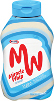
Packaging played a role in making Miracle Whip more edgy and
appealing to younger consumers.
Cracking the Whip
Another design triumph came with a similar commodity product: Miracle Whip salad dressing.Denham admits that Miracle Whip had “a slowing history” up to about a year ago. “I think it’s fair to say that Miracle Whip to some degree had lost its relevancy, because it didn’t have a distinct point of difference,” he said.
To find that distinguishing factor, the design team thought about the most appealing aspect of Miracle Whip: the taste. It’s tangier than most mayonnaise, due, at least in part, to its higher proportion of vinegar to oil.
“It’s got a tang, very different from mayo,” says Carol-Jacqueline Nardi, director of design and innovation for snacks (who had the same position on grocery at the time of the Miracle Whip makeover). “That actually gives it its spark. So as we talk about what’s the right direction to go, that unique difference is something we leverage, not only in product, but in personality.”
The result was a semi-rebranding of Miracle Whip as “MW,” with a distinctive “ambigram” logo that looks the same right side up as it does upside down (which shows consideration of the fact that retailers and consumers often store the bottles upside down on their broad, flat closures.) The logo formed the basis for a more vibrant graphic scheme, which in turn tied into a youth-oriented ad campaign that stressed the product’s edginess.
“It was more focused on a consumer segment [that] arguably [is] much more into something that’s a little extreme,” Denham says. “Once you have that clarity of vision, I think it’s fairly easy to come up with something that lives up to that.”
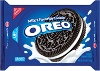
The
Snack and Seal package for Oreos and Chips Ahoy! allows easy access and
reclosability.
Integration Challenges
Brands that have grown up with Kraft, like Mac & Cheese and Miracle Whip, aren’t the only well-established brands the company will seek to revitalize with packaging.There are also the brands that Kraft has acquired - the most recent being Cadbury’s stable of candy and other snacks.
Perfecto Perales, Kraft’s senior director of packaging research, is well aware of the challenges involved in a major acquisition. He helped integrate the research, development and quality (RDQ) teams from Nabisco Mexico into Kraft when the company acquired Nabisco in 2000. And it’s a role he’s looking forward to playing for Cadbury.
“Cadbury has a lot of history of innovation in packaging that we’re excited about, [as does] Kraft, moving forward,” Perales says.
As a multinational company, Kraft is used to sharing technical information across a global network of R&D, design and procurement specialists, among others. As an example, Perales points to a new film used to package chocolate pralines under the Milka and Marabou brands. A Kraft packaging team in Europe developed the technology, which cut and scored a “memory film” with lasers in a way that allowed the film to adhere to the curvy surfaces of the bite-size candy, yet remain easy to open.
Perales says his team is in search of “transformational technology” to connect with consumers, offering Kraft’s adoption of resealable film for its Oreo and Chips Ahoy! brands a few years back as an example.
“Through consumer studies, the snacks team learned that our consumers would put all the Oreo cookies into a jar, because they couldn’t keep the cookies fresh,” he says.
The resealable packaging offers a much needed consumer benefit, but it also benefits Kraft because, when the cookies remain in their packaging, the brand and company associations get reinforced each time the consumer reaches for another Oreo.
Figuring out ways to get into consumers’ minds, and stay there, is an ongoing challenge for any packaged goods company. Denham notes that, in 1995, there were some 18,000 brands on US store shelves; in 2005, that had ballooned to 55,000.
“When you’re faced with that kind of competitive environment, how do you give the consumer more than just functionality?” Denham asked.
If Kraft’s string of successful redesigns is any indication, the question is simply rhetorical, because Kraft clearly has the answer.
“You have to give them something emotional to latch onto,” says Denham.
EDITOR'S NOTE:
This feature was excerpted from a story that originally ran in our sister publication Food & Beverage Packaging.
New Additions to Kraft's Package Portfolio
Some memorable packages and redesigns from Kraft Foods:A new variety of Wheat Thins in a paperboard carton is designed to convert into a serving “bowl.” Wheat Thins Stix, a round, thin version of the cracker, is packaged in a carton that tapers toward the bottom. When all four top flaps are folded down, and the carton is squeezed according to the directions on the side, it becomes a wide-mouth, bowl-like package that allows easy product access.
Looking for a reprint of this article?
From high-res PDFs to custom plaques, order your copy today!


