Unseen is Unsold
Shopper research reveals why Peanut M&M's is the design
to beat in the candy aisle
By Jonathan Asher
Single-serve candy is perhaps the ultimate impulse category. Purchases are rarely pre-planned, and sales are almost entirely driven by what happens during those five to 10 seconds a shopper spends scanning the candy rack at checkout.
In other categories, packaging may be given more opportunity to “tell a story” or convey key claims. But here, it’s about which packages win shoppers’ attention first.
With this in mind, we recently used our eye-tracking methodology to document how shoppers view the candy and gum rack and to determine which packages are successfully breaking through (and which are getting lost) in shelf clutter.
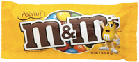
Peanut M&M’s packaging most consistently broke through the clutter to generate purchase consideration, and it most frequently pre-empted competitors at the shelf (these are metrics that we’ve validated as having a direct connection to sales).
Why is Peanut M&M’s packaging so successful? One might be tempted to cite familiarity, given the popularity of the brand. However, our experience suggests that a more accurate answer is contrast. Across studies, we’ve seen that shelf visibility is not a function of what shoppers actively choose or want to look at. Instead, it is primarily a physiological, subconscious process driven by contrast.
In the case of Peanut M&M’s, the obvious drivers of contrast appear to be the yellow color in a sea of brown packs and the strong M&M’s logo. And while this package benefits from favorable shelf positioning (discussed further below), it also outperforms other brands (like Reese’s) with comparable shelf placement and facings.
Though, while Peanut M&M’s has the strongest shelf impact, several other candy packages also “over-performed” relative to competition, including Dove chocolate (perhaps tied to bright branding treatment) and Ferraro Rocher (likely a result of its distinctive packaging structure).
From here, we turned to gum specifically, where we were able to compare different design strategies, such as the color-coding of flavors and color-blocking by brand (a technique used by Wrigley’s “5”, which uses black across SKUs).
Interestingly, we found that the color-coded brands (most notably Stride and Orbit) generated higher levels of attention. This runs counter to our research in larger categories, where we’ve seen that “owning a color” is typically more impactful at the shelf. Our suspicion is that the “wall of black” created by Wrigley’s 5 gum may be far stronger in the context of multi-packs or larger displays than in the smaller shelf allowance for single-serve packs.
To understand the value of extra “real estate,” for instance, we created three versions, which varied the number of facings for 3 Musketeers. Not surprisingly, we found that an additional shelf facing was valuable: A second facing literally doubled overall visibility levels for 3 Musketeers (from 11 percent to 22 percent) and also dramatically increased the percentage of shoppers who saw the brand in their first two seconds at the display (from 2 percent to 11 percent). When a third facing was added, visibility increased further (to 31 percent), but we also began to see signs of diminishing returns, as speed of noting did not improve.
To better gauge the role of placement, we shifted brands within the display and analyzed findings by shelf. These findings reaffirmed the importance of shelf location: approximately half of shoppers’ viewing time was spent on the middle three shelves in the display (eye-level and arm-level), with 50 to 60 percent of shoppers noting products when they were placed on the middle shelves. When the same products were placed on the bottom shelves, they were typically seen by only 30 percent of shoppers.
 The implication is clear: While packaging design is
critical, shelf placement and “real estate” also have a major impact on
visibility. Even the strongest package will have difficulty gaining attention
if it has one facing on the bottom shelf.
The implication is clear: While packaging design is
critical, shelf placement and “real estate” also have a major impact on
visibility. Even the strongest package will have difficulty gaining attention
if it has one facing on the bottom shelf.
Of course, visibility is only one part of the purchasing equation. It’s very possible to create a disruptive design and garner visibility, but then send the wrong message and miss out on closing the sale.
Nonetheless, visibility is a necessary first step or initial hurdle to overcome. If a package isn’t seen, it never creates the opportunity to sell-something that’s already short-lived in cluttered “grab-and-go” categories like candy and gum.
Jonathan Asher is senior vice president of Perception Research Services (www.prsresearch.com), a company that conducts more than 800 consumer research studies annually to help marketers win at retail. Jonathan can be reached at jasher@prsresearch.com or 201.346.1600.
By Jonathan Asher
Single-serve candy is perhaps the ultimate impulse category. Purchases are rarely pre-planned, and sales are almost entirely driven by what happens during those five to 10 seconds a shopper spends scanning the candy rack at checkout.
In other categories, packaging may be given more opportunity to “tell a story” or convey key claims. But here, it’s about which packages win shoppers’ attention first.
With this in mind, we recently used our eye-tracking methodology to document how shoppers view the candy and gum rack and to determine which packages are successfully breaking through (and which are getting lost) in shelf clutter.
Why Peanut M&M's is the Design to Beat
So, who’s doing it well? Our research provided a very clear answer to this question: Peanut M&M’s. Its packaging consistently outperformed all others on two critical dimensions: overall visibility (the percent of shoppers noting the package) and speed of noting (the percent of shoppers noting the package within two seconds).Peanut M&M’s packaging most consistently broke through the clutter to generate purchase consideration, and it most frequently pre-empted competitors at the shelf (these are metrics that we’ve validated as having a direct connection to sales).
Why is Peanut M&M’s packaging so successful? One might be tempted to cite familiarity, given the popularity of the brand. However, our experience suggests that a more accurate answer is contrast. Across studies, we’ve seen that shelf visibility is not a function of what shoppers actively choose or want to look at. Instead, it is primarily a physiological, subconscious process driven by contrast.
In the case of Peanut M&M’s, the obvious drivers of contrast appear to be the yellow color in a sea of brown packs and the strong M&M’s logo. And while this package benefits from favorable shelf positioning (discussed further below), it also outperforms other brands (like Reese’s) with comparable shelf placement and facings.
Though, while Peanut M&M’s has the strongest shelf impact, several other candy packages also “over-performed” relative to competition, including Dove chocolate (perhaps tied to bright branding treatment) and Ferraro Rocher (likely a result of its distinctive packaging structure).
From here, we turned to gum specifically, where we were able to compare different design strategies, such as the color-coding of flavors and color-blocking by brand (a technique used by Wrigley’s “5”, which uses black across SKUs).
Interestingly, we found that the color-coded brands (most notably Stride and Orbit) generated higher levels of attention. This runs counter to our research in larger categories, where we’ve seen that “owning a color” is typically more impactful at the shelf. Our suspicion is that the “wall of black” created by Wrigley’s 5 gum may be far stronger in the context of multi-packs or larger displays than in the smaller shelf allowance for single-serve packs.
Shelf Impact
By creating alternative versions of the candy rack displays, we were able to better understand the impact shelf facings and positioning have on visibility.To understand the value of extra “real estate,” for instance, we created three versions, which varied the number of facings for 3 Musketeers. Not surprisingly, we found that an additional shelf facing was valuable: A second facing literally doubled overall visibility levels for 3 Musketeers (from 11 percent to 22 percent) and also dramatically increased the percentage of shoppers who saw the brand in their first two seconds at the display (from 2 percent to 11 percent). When a third facing was added, visibility increased further (to 31 percent), but we also began to see signs of diminishing returns, as speed of noting did not improve.
To better gauge the role of placement, we shifted brands within the display and analyzed findings by shelf. These findings reaffirmed the importance of shelf location: approximately half of shoppers’ viewing time was spent on the middle three shelves in the display (eye-level and arm-level), with 50 to 60 percent of shoppers noting products when they were placed on the middle shelves. When the same products were placed on the bottom shelves, they were typically seen by only 30 percent of shoppers.
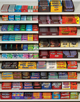
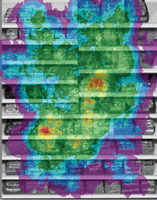
A candy display (top left) and an eye-tracking heatmap of the
same (bottom left). With the yellow and red areas representing the most-viewed
areas, the heatmap reveals M&M's and Dove as the strongest performers.
Of course, visibility is only one part of the purchasing equation. It’s very possible to create a disruptive design and garner visibility, but then send the wrong message and miss out on closing the sale.
Nonetheless, visibility is a necessary first step or initial hurdle to overcome. If a package isn’t seen, it never creates the opportunity to sell-something that’s already short-lived in cluttered “grab-and-go” categories like candy and gum.
Jonathan Asher is senior vice president of Perception Research Services (www.prsresearch.com), a company that conducts more than 800 consumer research studies annually to help marketers win at retail. Jonathan can be reached at jasher@prsresearch.com or 201.346.1600.
Looking for a reprint of this article?
From high-res PDFs to custom plaques, order your copy today!


