Innocently Addictive
Our makeover column features dramatic rebranding initiatives where packaging is central to the strategy. This month, we look at a Wisconsin confection company.
The story: Nutorious Nut Confections was founded by Jennifer and Carrie, two entrepreneurs who were passionate about their product, but understood that it also had to become a strong brand to succeed. The pair went back to basics when creating their gourmet nut snacks, and took a similar tact when recently launching Top it Off, a line of chopped nut toppings.
The challenge: Nutorious was a regional brand with limited distribution. The tagline, “Decadently made in Wisconsin”, was relevant to a local audience only and didn’t fit the brand’s goal of national expansion. The package design was also uninspiring and failed to communicate brand benefits or personality. The old packaging was too subtle and didn’t express the boldness of the flavors or the excitement of the brand. Old serif fonts and scripted type and logo gave the brand a traditional but safe look and feel.
The goal: The goal was to elevate Nutorious to national brand caliber with a new logo, tagline, package design, web site and sales collateral. The company enlisted burnham richards to rebrand Nutorious, and the firm set out to unearth the one truth that made the brand different from all of the other nut snacks on the market.
The solution: Through a proprietary branding process, a brand position was developed with the new tagline, “Innocently addictive”. “Innocently” evokes pure and all natural flavors, while “addictive” comes from taste tests where Nutorious bags were the first ones to be emptied. “We found that other brands were trying too hard to over-complicate flavor combinations and confused the brain,” says burnham richards’ Nicole Jensky. “With Nutorious, the flavors are simple and easily recognizable.”
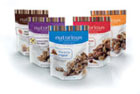
Old versus new packaging changes included:
- The old logo and tagline were small and hard to read, so a new logo/tagline was developed to clearly represent the fun and entertaining quality of the product.
- The old brown bag seemed dense and heavy, so a clean white bag with simple imagery was created to communicate the all-natural purity of the nuts. The color brown is now minimally used in the stripes to bring uniformity to the product line.
- Thin color borders were too subtle, so bolder color coding was introduced to easily identify flavors.
- A die-cut window in the orignal packaging didn’t properly present the nuts, so it was removed and replaced with inviting product photography.
- Traditional typefaces and centered type were uninspiring, so modern type and fun flavor names were added to set the brand’s personality.
- Nothing on the old bags sold excitement, so symmetrical icons were created to represent a burst of all natural flavors.
- Clever “warning labels” (“Nutorious may cause squirrel-like hoarding tendencies.”) were also introduced to make the brand more personable.
Looking for a reprint of this article?
From high-res PDFs to custom plaques, order your copy today!


