BRANDS TO WATCH!
As recent as the 80s, certain shows made Thursdays “Must-See TV” nights. But there are simply too many choices these days for any one to earn that moniker. Brands are in the same position; their sheer numbers make it difficult to grab our attention longer than a moment. That's why we consider these five independents--and their respective packaging strategies--exceptional for making it onto our schedule of Brands to Watch.
Five Independents Earn "MUST SEE" Status
As recent as the 80s, television programming was something to be anticipated. Thursday nights, for instance, were “Must-See TV” nights, with Seinfeld, Frasier and Friends dominating the ratings. Today, though, there are simply too many choices and media outlets for any one to earn that moniker.
It’s much the same situation for brands. Their sheer numbers make it difficult for any one to grab our attention for any longer than a fleeting moment. And for upstarts and independents, and their typically miniscule marketing budgets, it’s an even steeper challenge to make meaningful connections.
That marks the following five brands even more exceptional for making it onto our radar. Yes, they each have strong product concepts, smart positioning and visionary leadership. But it’s their instinct for making the most of limited resources with relevant, well-designed and innovative packaging that puts them on our schedule of “Brands to Watch”. On any night of the week.
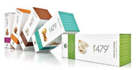
479° POPCORN
Success has come quickly for 479° Popcorn, with revenues tripling each month since the heirloom organic popcorn brand launched in September 2008.
Starting with a high-end candy boutique in San Francisco called Sweet Dish, the artisan brand has swiftly expanded distribution in the Bay Area and across California and built an equally viable online corporate and consumer gift business.
Founder Jean Arnold says that, in developing the brand identity with its San Francisco design firm The Engine Room, it was clear the focus had to be on the popcorn. Using a close-up of popping kernels as the iconic graphic, the minimalist packaging communicates a “made in small batches” quality message and also translates what might be perceived as an old-fashioned product into a modern offering that appeals to foodies, the brand’s target audience.
“What I learned in the process is that it’s hard to be very streamlined and simplified,” says Jean. “But we stuck to it. Anyone who picks up our packaging can get a sense of our attention to detail, and our focus on quality and perfection.”
That’s not to say the paperboard cartons and canisters are stripped of character. Color bands and textile patterns add personality and play up each of the brand’s eight varieties-a tactic meant to help shoppers identify 479’s adventurous flavors and distinguish them from the boring, basic assortment typical of mass brands.
It was also important for the packaging to stand up to the demands of mail order, another strong channel for the brand. Orders for 479’s five-box sampler packs and the larger canister collections ship out in a master carton that’s designed as gift packaging, with a UV coating that helps withstand the rigors of distribution.
Arnold makes a point to say that all of the detail that went into the packaging is also indicative of the work that went into the premium popping corn itself. She spent more than a year and a half in the test kitchen, sourcing heirloom popcorn varieties, developing flavor profiles and certifying the brand organic.
“It’s essential that your product meets the expectations and delivers the promises you make on the packaging,” she explains. The most important thing, she says, “is that the two work together.”
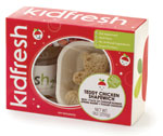
Kidfresh
Matt Cohen had one of those “aha” moments preparing his son’s lunch one day. “It dawned on me that, with all the healthy take-out offerings [for adults], there was nothing specifically geared toward kids,” he said.
Partnering with Gilles Deloux, a former Dannon food marketer, Cohen launched Kidfresh in January 2007 as a child-oriented food store with pint-sized shopping carts and prepared lunchboxes, dinners and snacks for babies and kids.
Berkeley, Calif.-based Addis Creson developed a bold brand identity for the concept, and it was translated by Brooklyn, N.Y.-based Landers Miller across every touchpoint: the web site, collateral, store interior graphics and signage and, of course, the packaging, where a color-coded system helped parents navigate the age-group-specific selections and details like a custom die-cut window (revealing fun-shaped sandwiches) offered kids an unexpected thrill.
Cohen soon realized there was greater potential for the Kidfresh line, so he embarked on a strategy to launch the collection in new channels. He first partnered with Cibo Market stores to open Kidfresh kiosks in airport terminals and, soon after, announced an agreement to test the line in New York-area Whole Foods stores. There was obvious success, and Cohen recently decided to shut the Kidfresh flagship store to focus on these new channels.
Now, the prepared foods collection is exclusively distributed in airport terminals and, after successful testing with Whole Foods, in the organic retailer’s stores across the Northeast and Midwest. “For now, our distribution is limited, by design,” he says. “But we are coming up with new products that are more scalable and affordable without compromising [our] quality standards.”
It’s likely a smart strategy. Research pinpoints the children’s packaged foods sector as a hot growth area. And even with a slew of new competitors entering the fold, Cohen is passionate, explaining that Kidfresh has an identity that will prove it a winner. “Kidfresh has a very strong brand name, design and identity,” he says. “Our packaging leverages this brand asset in ways that makes it easily stand against other brands out there.”

Oral Fixation Mints
At what point did packaging come into play for Oral Fixation Mints?
“The second moment after we thought of the name,” says founder Henry Rich, who dreamed up the idea for a mint company when a friend excused himself for a cigarette break with the parting words, “I’m off to serve my oral fixation.”
“We wanted our product to be beautiful, but affordable, which immediately determined the high-end metallic look we were going for,” he says.
Rich partnered with some friends and set up shop in a historic chocolate factory in Hopewell, N.J., in 2004. The group purchased a WWII-era tableting machine, coaxed a former flavor specialist out of retirement and set to work designing packaging that would embody the philosophy of beauty in the everyday.
The result was a sleek, brushed metal tin that called to mind a 1920s cigarette case. Just slim enough to house a single layer of their hand-pressed mints, the embossed tins slid open to reveal a sheet of wax paper printed with colorful graphics and illustrations designed by one of the co-founders Jonathan Harris.
“[The] wax paper is an element of our commitment to thoroughness in design,” says Rich.
Even the mints weren’t overlooked. The Mojito mint flavor, for instance, is imprinted with a Cuban star, while classical peppermint receives a treble clef music note. Each variety is imprinted with a unique symbol.
“We wanted to put many different access points to the personality of each flavor,” says Rich. “The wax paper, the mint, the package, the colors and the words around a flavor.”
The feedback on that strategy has been explosive. Oral Fixation mints are currently found in more than 5,000 retail and hospitality locations on five continents. And the tins have taken on a life of their own as coveted accessories, frequently repurposed to house cash, credit cards and other essentials.
Going forward, Rich says the company is looking to do more business in the gift market and to develop packaging concepts that might extend the brand. But whatever comes next, he says, will be on par with Oral Fixation’s commitment to beauty and quality.
“One thing we’re not interested in is a low-end version of our product,” he says. “That defeats the entire point of our brand.”
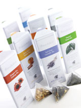
Revolution Tea
When the product you’re selling is thousands of years old, you might be tempted to dress your packaging with historic trappings. Not Revolution Tea, which selected a simple, modern identity to signal its non-conforming nature.
“The trade dress on the packaging is one of several factors that allowed us to achieve retail distribution, including the recent launch in Safeway and Publix stores,” says the brand’s creative director Jeff Irish. "Our clean, modern approach separates [our] brand from competitors on the shelf.”
Since its 1998 founding, Revolution has used that contemporary identity in combination with convenient packaging to pursue a mission of making premium, full-leaf teas more widely available to a broader range of consumers.
A unique tea infuser served as the launching pad. The clear, nylon tea bag showcased the colorful fruits, herbs and spices comingled with the tea, while the roomy, pyramid shape better replicated the proper brewing method for the whole leaves Revolution uses (conventional bags typically hold “fannings,” or tea dust).
“It’s the combination of the brand look and feel, the unique flow-through infuser and the high-quality full-leaf tea and herbs,” says Irish. “Revolution was the first to offer this level of quality in a complete experience.”
The tea infuser also inspired other packaging successes. From the three-sided T-Pot Revolution tin designed for countertop display (because out of sight is out of mind) to the T-Mini travel tins that make tea conveniently mobile, Revolution’s packaging innovations are designed to make tea an “anytime, anywhere” drink-a far cry from the exclusive, aspirational tone and occasion-based positioning of many premium tea brands.
“Revolution’s brand represents change,” says Irish.
Judging by the company’s successful distribution in the retail, restaurant and hospitality segments across the United States and in the EU, it is change that consumers are, well, believing in.
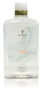
Thymes
A pioneer in the bath and body sector, Thymes launched in 1982 as a line of home-made soaps and bath salts inspired by art, nature and the desire to promote restorative rituals.
It was markedly different from anything in the marketplace at the time, which rallied on “conspicuous consumption” and the elevation of brands and labels as status symbols. Thymes-with a quieter, more thoughtful attitude than most-garnered a loyal, though small, base of specialty retailers.
But it wasn’t until the brand showed at the New York Gift Show that it truly got its legs. Generating $30,000+ in orders, greater than the two prior years combined, Thymes was able to move its operations from the founder’s Minneapolis basement into a 500-square-foot production facility in city’s Warehouse District.
As Thymes grew, so did the category and the threat posed by new competitors. And, ultimately, in 2005, the company experienced a plateau.
The stall turned out to be brief, though, because it came as Thymes was launching Kimono Rose-a collection with colorful paperboard cartons that folded in unexpected ways and heralded a new aesthetic direction for the company.
“We broke the mold of previous brand iconography and allowed Kimono Rose to have [its] own distinct personality,” says Christiana Kippels, Thymes’ chief marketing and strategic officer.
The delightful details earned the line a significant customer base that Kippels credits for breathing new life into the company, and impacting the way subsequent collections would come to be. Thymes earmarks packaging funds for each line and pairs an in-house engineer with the Minneapolis-based branding firm Zeus Jones to develop new concepts.
It’s an approach that’s clearly working, with Thymes now boasting a 50,000 square foot facility and 4,000+ retail customers in the United States, Canada and overseas. And, even in these rocky economic times, as Thymes boldly unveils a spring 2009 collection, Kippels says the company will maintain its commitments to packaging and innovation.
“We recently interviewed our consumers and [learned that], together with our custom fragrances, our packaging and aesthetic are truly why people are drawn to our brand.” BP
The author, Pauline Hammerbeck, is senior editor of BRANDPACKAGING. Reach her at hammerbeckp@bnpmedia.com
Looking for a reprint of this article?
From high-res PDFs to custom plaques, order your copy today!


