Packaging Strategies logo
search
cart
facebook twitter linkedin youtube
  • Sign In
  • Create Account
  • Sign Out
  • My Account
Packaging Strategies logo
  • FEATURED
    • Brand Packaging
    • Extended Producer Responsibility
    • New Products & Materials
      • Featured Products
    • Packaging News
    • Packaging Perspectives Podcasts
    • Steve Fairfield Innovation Award
    • Supply Side
    • Top 100 Food & Beverage Packaging Companies
      • Submit Your Company
  • FLEXIBLE PACKAGING
  • VERTICAL MARKETS
    • Beer / Wine / Spirits Packaging
    • Beverage Packaging
    • Candy / Confectionery
    • Dairy Food Packaging
    • FoodService Packaging
    • Household Packaging
    • Meat / Seafood Packaging
    • Personal Care Packaging
    • Pet Food Packaging
    • Pharma / Medical Packaging
    • Produce Packaging
    • Snack Food Packaging
  • MATERIALS
    • Adhesives / Sealants
    • Beverage Multipacks
    • Blister Packaging
    • Cans & Bottles
    • Closures/Lids
    • Films & Coatings
    • Labels
    • Material Converting
    • Paperboard / Corrugated / Cartons
    • Rigid Containers
    • Sustainable Packaging
  • MACHINERY
    • Automation / Controls
    • Case Forming / Packing / Sealing
    • Cartoning
    • Coding / Marking / Printing
    • Conveyors
    • Form-Fill-Seal / Filling & Closing
    • Inspection / Detection / Vision
    • Labeling
    • Unitizing / Palletizing
    • Robotics
    • Track & Trace / Serialization
  • DIRECTORIES
    • Packaging Strategies Resource Guide
    • Flexible Packaging Buyer's Guide
  • EVENTS
    • Converters Expo
    • Converters Expo South
    • Global Pouch Forum
    • Industry Events
    • Webinars
  • MORE
    • Videos
    • Book Store
    • Classifieds
    • Custom Content & Marketing Services
    • eXTRA Newsletter
    • Market Research
    • PACKSTRAT Wordplay
    • PS Resource Guide
    • Sponsor Insights
  • EMAG
    • eMagazines
    • Archived Issues
    • Contact Us
    • Advertise
  • SIGN UP!
Brand Packaging

Brands to Watch

BrandFeat
March 20, 2012

From simple remedies for simple problems to a boon for the modern parent with style and sensibility, this year’s Brands to Watch caught our attention because they solve problems-and isn’t that what good design is all about?


From simple remedies for simple problems to a boon for the modern parent with style and sensibility, this year’s Brands to Watch caught our attention because they solve problems-and isn’t that what good design is all about? Using imaginative packaging and memorable messaging, these “challenger” brands are showing they might not have much to prove at all.


Help Remedies

The pharmaceutical sector of CPGs is becoming much more design-conscious when it comes to packaging, and Help Remedies is one brand to watch.


“Help is just a small part of the massive rethink of the healthcare industry that is underway,” says Richard Fine, Co-Founder and CEO of Help Remedies.
“We believe that medicine is miraculous, but it has been cluttered and obscured by the language of healthcare companies: ‘Bigger, extra, super and maximum.’ Healthcare needs a restart,” says Nathan Frank, Co-Founder and Creative Director.
The brand feels it is important to have the simplest, cleanest design in healthcare packaging. So Help has undergone three packaging redesigns.
“When Help was initially introduced in 2008, we had just two products, and the packaging laid flat on the shelf, which was okay for our initial retailers, who were mostly boutiques or design shops,” says Frank.
“As we caught the attention of more traditional retailers, we had to change the packaging so that it would work in the drug aisle, without losing the tactile quality and simplicity that is the essence of Help.
 
Hence, package size was reduced and the shape changed so that the packs could stand up and face out on shelves, and more could be displayed to reduce the need for restocking. Colored borders made from Plastarch, a biodegradable resin, were added to the recycled paper pulp clamshells to increase impact on shelf and to differentiate each product.
“We have been committed to using as much sustainable material as we can, beginning with the recycled paper pulp that has made up our packaging since the start, and the bio-corn plastic composite that was added in the first redesign,” says Frank.
This was the start of a packaging system that could grow as the brand continued to introduce new products.
“Our retailers drove (other) changes in the internal packaging as well,” explains Fine. “Initially, we had printed pithy sayings over the full blister card, which graphically had the most appeal. Requests from retailers convinced us to switch to printing just the basic company and active ingredient information on the back of each individual dose.

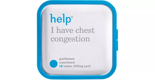
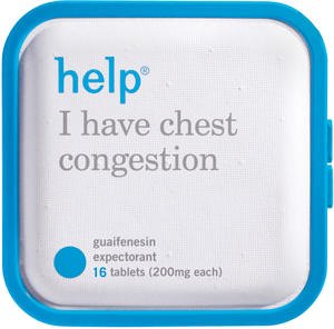
“We didn’t let go of the help messaging entirely, but moved to just one saying (for example, ‘Don’t cough on the ones you love,’ for help I have chest congestion) on the unused ‘handle’ area of the blister pack.”

During its most recent redesign, Help worked with brand identity firm Pearlfisher on the graphics. “They made the Help logo and product names bolder to enhance legibility and on-shelf presence,” says Fine.
“To reduce our need for product-specific tooling and to make inventory management simpler, we also wanted to retire the previous iterations’ debossed product outlines and asked Pearlfisher to come up with another solution. They suggested the product outline printed on the surface of the clamshell, which carries over from the past design and reduces cost.”

While Pearlfisher was working on the graphics, Dale Trigger, Help’s director of product development, re-engineered the color-keyed border to reduce material use and make the latch more intuitive for users.

Fine and Frank also considered the feel of the packaging. “While it isn’t something that’s articulated to our customers, texture is an important aspect of Help’s approach to packaging.”
Instead of the cold, hard plastic prevalent in the OTC drug category, Help’s paper pulp clamshell is soft, tactile, and non-threatening. The rounded edges contribute to the inviting nature of the packaging. Help is meant to be comforting, with textures that people instinctively respond to when they aren’t feeling well.

“Some health problems are large, complicated and frightening, but most are not so bad,” says Fine. “Help was made to solve simple health problems simply. By removing some of the excess, and some of the nonsense, from the healthcare industry, we hope we can make medicine friendlier and more accessible.” - Erin J. Wolford


Packaging graphics: Pearlfisher (www.pearlfisher.com)
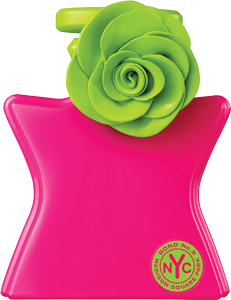

Bond No. 9

Founded in 2001, by French artist and perfumer, Laurice Rahmé, Bond No. 9 is the first fragrance collection launched as an homage to a city, New York City to be exact. The name of this fragrance collection is also the address of its headquarters boutique at 9 Bond Street in Manhattan.
Rahmé studied art at The Louvre and worked as an antiques dealer before joining the Lancôme-Paris company in 1973. When she left Lancôme, she helped introduce Creed, a Parisian perfume brand, to the U.S. Then in 2001, the French artist (and New York resident) brought a new fragrance line to life.
Rahmé’s fragrance collection has a dual mission, to restore artistry to perfumery and to mark every New York neighborhood with a scent of its own. Each bottle represents a specific downtown, midtown, or uptown locale or a city-wide sensibility, like Madison Square Park, West Side, Gramercy Park and Hamptons. Encompassing the city’s charm, even the Bond No. 9 logo was designed to look like a subway token.
The intricate bottle has a five-point shape that resembles the silhouette of a person, with a high, elegant neck and side seams, created so that each bottle can be “dressed up”. Each design is creative, fun and a downright work of art, which isn’t surprising as Rahmé is still personally involved in each and every Bond No. 9 design.
Bond No. 9 stands out from other bottles of perfume because of its unique design, eye-catching graphics and New York-themed packaging. But it’s not just what’s on the outside that counts. The company has set out to restore “the grand art of perfume blending,” using only high, 18 to 22% concentrations of pure eaux de parfums-the long-lasting concentrations of the legendary vintage scents of the 1920s and 1930s. What’s more, each fragrance has been blended in New York, by hand-picked French perfumers who, like Rahmé, have gravitated here to what has become the world capital of beauty and fragrance.
Committed to building a better planet and determined to prove that even the most tantalizing luxury goods exquisite packaging can be good for the planet, Bond No. 9 is helping its customers recycle with the first incentive recycling program in the fragrance industry. Back in 2007, Bond No. 9 embarked on the effort, inviting everyone to bring any and all empty perfume bottles (not just Bond No. 9 bottles) to Bond No. 9 stores or fragrance counters for recycling and, in return, receive a free purse spray with purchase. So successful were these initial recycling efforts that now, in time for Earth Day 2012, the company now wants the packaging-box, corrugated liners and inserts-too.

Bond No. 9 is an exciting brand that is surely here to stay. With artistic designs, New York flair and quality perfume inside each cleverly packaged bottle, the Bond No. 9 scents are fulfilling their mission of bringing artistry back to perfume, one spray at a time. -Elisabeth Cuneo


Boon

The dictionary will tell you that Boon (noun) is a benefit bestowed to somebody, especially one given in response to a request. The way founders Rebecca Finell and Ryan Fernandez see it, the brand’s modern infant and toddler products are a boon to parents and children.


Founded 2004, Boon is headquartered in Chandler, AZ, and boasts 59 products and 144 SKUs across product categories including bathing, feeding, organization and décor. The Boon brand has a name for innovation that began with the debut of its first product, the Frog Pod. A drainable frog-shaped scoop, the Frog Pod gathers and rinses bath toys in a single pass (and then mounts on the wall until it's time for the next bath).
Boon’s beginnings are the classic entrepreneur’s story. A mom of two small children, Finell was working to complete an industrial design degree at Arizona State University. As part of a class project, Finell devised a way to tackle the mess of the toddler bath, and the Frog Pod was born. Finell entered her creation in the Juvenile Product Manufacturers Association’s Student Design Competition and she won-the grand prize.
While she considered licensing the Frog Pod, Finell never felt her vision for new baby products was a good fit with any of the brands she researched. So when a buyer from a major retailer asked her when the Frog Pod would be available for purchase, the idea for Boon emerged.

Finell turned to co-founder and former Intel Corp. sales executive Ryan Fernandez for the help she needed in running a successful business. Fernandez, who had been looking for a venture to satisfy his entrepreneurial urge, would focus on the business side, leaving Finell free to design more products.


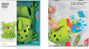
The brand was equally ahead of the curve with its first-generation packaging, but it knew that, to remain an innovator, it had to redesign. The challenge was to develop packaging for an extremely broad portfolio of products that range from not much bigger than a pen to-like the Frog Pod-larger than a breadbox. The new design combines full-bleed lifestyle photography and a “shadow-box” construction that showcases the products and grabs shoppers’ attention at the shelf.
 
The Frog Pod hit stores in October of 2005 and remains a top baby registry item today, available at specialty retailers like Land of Nod and at chic discounters like Target. Boon has since developed more than 100 modern infant and toddler products designed to help simplify parent’s lives while retaining their personal style. In just less than seven years, Boon has shaken up the juvenile products industry, setting new standards for innovation and design in products and packaging. -Jennifer Acevedo

Package Design: Boon Inc (www.booninc.com)

Photography: Sara Wert, for Boon
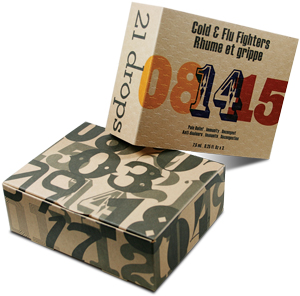


21 Drops

Challenger brand 21 Drops recently disrupted the aromatherapy category with its line of 100% natural, pre-blended modern essential oils. Self-proclaimed “aromatherapy in a little black dress”, the products contrast the time-honored healing properties of plants with bold, modern design cues. Stated upfront on every bottle are the brand’s intentions: to invigorate, strengthen, support, uplift, decongest, or simply balance and sooth.

Positioned as a 21st century approach to health, cousins Cary Caster and Amy Ilyse Rosenthal founded 21 Drops to introduce essential oils to a new audience.
 
From a childhood spent climbing orange trees to her graduate studies and work at the Fairchild Tropical Botanic Garden in Coral Gables, FL, Caster says she has been connected to plants for as long as she can remember. For 20 years of raising kids and advancing studies, she shared her custom-blended essential oils with family, friends and neighbors.

When the time came to make her dream of expanding a reality, Caster turned to Rosenthal, an award-winning creative director well versed in leading strategy, design, development and marketing efforts.

The pair knew that building a brand is no easy business. Their challenge would be to create an authentic, passionate brand-while reaching past stereotypes and preconceived notions in an already crowded market.
The company decided from the start that it would let the packaging help define the brand, focused on three design principles: being accessible, being contemporary, and being authentic.
Paperboard packaging breaks with category norms in bold, modern packaging that is also made from responsible materials. In keeping with the brand’s ethical values, kraft paper for secondary packaging is sourced from Sustainable Forestry Initiative approved paper and recyclable materials like silicone, glass and metal are used for the vials. - Jennifer Acevedo

Package design: Purpose-Built NYC (www.purpose-builtnyc.com)

Printer: Prestone Printing (www.prestoneprinting.com) 

Share This Story

Looking for a reprint of this article?
From high-res PDFs to custom plaques, order your copy today!

Recommended Content

JOIN TODAY
to unlock your recommendations.

Already have an account? Sign In

  • Golden award trophy in the shape of a star. Text: 2026 Top 100 Food and Beverage Companies

    Top 100 Food and Beverage Packaging Companies of 2026

    Celebrating 30 years as a B2B journalist, I’ve revisited...
    Top 100 Food and Beverage Packaging Companies
    By: Brad Addington
  • Women In Packaging 2025 homepage hero

    Women in Packaging: Seizing Opportunities, Pushing Boundaries

    Seven women share their personal journeys in the...
    Material Converting
    By: Brad Addington
  • Image of the Spyder Pick and Place Joint Robot sorting pre-rolls.

    Cannabis Packaging Goes High-Tech

    Packaging Strategies doesn't often cover cannabis...
    Robotics
    By: Brad Addington
Subscription Center
  • eMagazine Subscription
  • Manage My Preferences
  • Newsletters
  • Subscription Customer Service
  • Online Registration

More Videos

Sponsored Content

Sponsored Content is a special paid section where industry companies provide high quality, objective, non-commercial content around topics of interest to the Packaging Strategies audience. All Sponsored Content is supplied by the advertising company and any opinions expressed in this article are those of the author and not necessarily reflect the views of Packaging Strategies or its parent company, BNP Media. Interested in participating in our Sponsored Content section? Contact your local rep!

close
  • Hand Holding Various Semaglutide and Insulin Injection Pens for different stages of the treatment.
    Sponsored byInline Plastics

    How GLP-1 Is Reshaping Food Packaging, and Why It Matters More Than You Think

  • A stack of clear plastic containers, the bottom full of mixed fruit
    Sponsored byInline Plastics

    Packaging Trends Shaping 2026: Where Trust Is Won

Popular Stories

Logo for New Earth Ventures

Atlantic Packaging Launches New Earth Ventures to Accelerate Packaging Technology

Image of persimmons fruit in plastic packaging

IFPA Issues Position on EPR as Compliance Deadlines Hit Fresh Produce Industry

FPA President and CEO Dan Felton moderates a panel discussion at Global Pouch Forum with Rebecca Mick (Association of Plastic Recyclers), Adam S. Peer (American Chemistry Council) and Gregory Melkonian (Serlin Haley).

Key Takeaways from Global Pouch Forum

See the Top 100 Food and Beverage Packaging Companies of 2026

Products

Advances in Sustainable Food Packaging Technology

Advances in Sustainable Food Packaging Technology

See More Products

Packaging Perspectives Podcast

Play Packaging Strategies' captivating WordPlay game, PackStrat! There's a new word every Tuesday.

Related Articles

  • BRANDS TO WATCH!

    See More
  • Brands To Watch

    See More
  • Brands To Watch

    See More

Related Products

See More Products
  • BADB_Front_EPub.jpg

    Beloved and Dominant Brands...

  • creating-value.jpg

    Creating Value Through Packaging: Unlocking a New Business and Management Strategy

See More Products
×

Keep the info flowing with our Newsletters!

Get the latest industry updates tailored your way.

JOIN TODAY!
  • RESOURCES
    • Advertise
    • Contact Us
    • Directories
    • Store
    • Want More
  • SIGN UP TODAY
    • Create Account
    • eMagazine
    • Newsletter
    • Customer Service
    • Manage Preferences
  • SERVICES
    • Marketing Services
    • Reprints
    • Market Research
    • List Rental
    • Survey/Respondent Access
  • STAY CONNECTED
    • LinkedIn
    • Facebook
    • YouTube
    • X (Twitter)
  • PRIVACY
    • PRIVACY POLICY
    • TERMS & CONDITIONS
    • DO NOT SELL MY PERSONAL INFORMATION
    • PRIVACY REQUEST
    • ACCESSIBILITY

Copyright ©2026. All Rights Reserved BNP Media, Inc. and BNP Media II, LLC.

Design, CMS, Hosting & Web Development :: ePublishing