BrandInnovators 2010 > Christine Mau, Kimberly-Clark

Ever feel like you’ve got a mountain to climb at work, and you’re wearing flip-flops? For Christine Mau, brand design director of family care brands at Kimberly-Clark, it’s a bit chillier, and, rather than flip-flops, she’ll likely be armed with a box of Kleenex brand facial tissue.
“It’s like standing with my ice pick at the base of an iceberg,” she says of the vast opportunity she sees to make an impact through package design. “I have to continually force myself to prioritize what I take on, and not get caught up in the immediate and often smaller projects in lieu of the longer-lead design strategy.”
It’s this philosophy that has guided Mau throughout her career, which launched with her own Milwaukee-based design firm MauHaus Inc. and then-client Kimberly-Clark. After a few years employed as a senior designer in-house at Kimberly-Clark, then a few more years back in her studio as an independent contractor, Kimberly-Clark execs dangled a “carrot” Mau says she couldn’t refuse.
In 2001, she went to work in K-C’s design management department, overseeing the packaging graphics team for K-C’s North American family care consumer brands. Some career-development moves and restructuring landed Mau in her current position as brand design director, managing a team-four in-house people and the agencies she considers “an extension of our team”-and the Cottonelle, Viva and Scott brands, as well as Kleenex, Mau’s “carrot.”
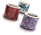
Mau’s oval-shaped Kleenex Expressions carton rocked the traditionally-cube-shaped facial tissue category.
Nothing to Sneeze at
As an established, reliable and well-known brand, Kleenex branding and package development had been supported for decades already, Mau says, emphasizing her role to now “build on the strong design leadership the brand has established.”
So as the tissue category started to decline, she found the “motivation and permission to do things differently,” she says. Market research supported Mau’s gut instinct to use new approaches to graphics-and packaging-to get better results, she says, and so came the task to think outside the box, literally.
And for Mau, somewhere on the side of the iceberg, there actually was an “a-ha” moment.
“Pure frustration,” she says was the impetus for the oval-shaped Kleenex Expressions carton that has since rocked the traditionally four-sided tissue category. Mau says she knew that graphics alone wouldn’t interrupt the busy shopper that had grown to trust the Kleenex brand, but who also had become too familiar with it and the product. And then, “Out of sheer frustration, I drew an oval on my tissue pad and declared the project done,” she says.
Though, of course, it wasn’t quite done with only a doodle. After 18 months of work with cross-functional teams, Mau says K-C realized “the true potential of the carton innovation.” She earned the right to own the patent to the oval-shaped carton, securing patents in the United States, Europe, Korea, Mexico, Australia and Brazil (that’s in addition to 12 patents on other projects) and she says she learned a lot in the process.
“That experience allowed me to see beyond packaging design, through the supply chain to the shelf, and truly understand how design decisions impact everything down to how many cases fit onto the trucks, and how that affects the bottom line,” she explains.
The oval-shaped carton has proven revolutionary, but Mau has made an impression in less radical, but still dramatic, branding initiatives as well. Looking to “provide the playground where the design and marketing teams can experiment,” the Kleenex brand has featured a number of limited-edition programs including summer wedge-shaped packaging in bright colors and fruit-inspired graphics, and a European initiative that dropped the Kleenex brand icon altogether to play up the softness of the product with “Feel Me” emblazoned on the box. Projects like these, Mau says, “keep the brand relevant, fresh and exciting.”
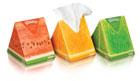
Summer 2009 brought Kleenex’s wedge-shaped cartons into the fold.
Getting to know you
As brand marketers, you’re always setting out to know your consumers, but often it’s the people a little closer to the project that should get a bit more attention. And for Mau, managing the potential strain between marketing, design and other disciplines is as easy as getting to know you-over dinner.
“It’s not always immediate or magic, but I’ve seen the opportunity for social interaction early in the process minimize the tug of war we’ve all experienced,” she says. “So dinner, and truly listening to everyone’s voice and then validating and responding directly to their concerns” is Mau’s approach to getting past “professional territorialism” and becoming a “highly functioning team.”
Corporate support, she adds, of course benefits all projects from inception to execution at the shelf. “Major design initiatives receive a great deal of interest from all levels, which I view as a positive,” she says. “K-C recognizes the impact of strategic brand and packaging design, and believes both have the potential to help drive brand growth when done well, or possibly erode sales if not done well.”
Past, present and future
And while the oval-shaped Kleenex facial tissue carton has been called Mau’s “claim to fame,” she certainly has made an impact outside Kleenex, working on a number of high-profile brands, including Kotex, Poise, Depend, Huggies, Pull-Ups, GoodNites and Poise.
With all of these icebergs conquered, how could Mau capture what she’s most proud of in her career, so far? Well, seems she functions best in the now, while still learning from her accomplishments.
The project she’s most proud of: “The last one. I believe you’re only as good as your last project,” she says. And as for what’s next: She’s currently working on “expanding my horizons.” BP
NAME: Christine Mau
TITLE: brand design director
TITLE: brand design director
YEARS IN CURRENT JOB: 1 (11 years at K-C, 21 total working on K-C brands)
BEST ADVICE YOU EVER RECEIVED? “Be true to who you are.”
WHAT BRANDS DO YOU ADMIRE? At the risk of sounding cliché… Apple, Method & Infiniti because you can recognize their products without seeing the brand logo. They stand for something that sets them apart from the pack.
WHAT’S ON YOUR NIGHTSTAND? A Kleenex oval carton- of course! Change by Design by Tim Brown, The Bridge by David Remnick, Reborn by Susan Sontag, Harvard Business Review, MIX from Global Color Research and more…
Looking for a reprint of this article?
From high-res PDFs to custom plaques, order your copy today!


