Pringles, Rebranded for Today
Three design firms show us how they'd change the look and feel of this classic brand.
Pringles has been a household name for more than 40 years. Yet, despite the brand’s longevity, many consumers view the famous stacked chips as outdated - a brand in need of a drastic overhaul. In light of the recent announcement that Proctor & Gamble is selling Pringles to Diamond Foods (the transaction will be completed by the end of 2011), we asked three design firms how they would change the look and feel of the brand. Their responses mark the debut of The White Space, a new department where we’ll explore packaging concepts to help you seize the white space - the unmet needs and untapped opportunities - in the marketplace.
 The new clamshell features an interlocking freshness seal
snap and internal rib pattern, which provides protection and easy access to
every crisp. The oval shape also reinforces the chip shape while minimizing the
package size and reducing material, shipping and merchandising volume. Each
flavor SKU is color-coded with translucent material, allowing for an internal
view. In addition, by including hang-holes for peg display, the new package can
stand up for on-shelf merchandising, further increasing merchandising options.
The new clamshell features an interlocking freshness seal
snap and internal rib pattern, which provides protection and easy access to
every crisp. The oval shape also reinforces the chip shape while minimizing the
package size and reducing material, shipping and merchandising volume. Each
flavor SKU is color-coded with translucent material, allowing for an internal
view. In addition, by including hang-holes for peg display, the new package can
stand up for on-shelf merchandising, further increasing merchandising options.
When rebranding Pringles, it was also important to acknowledge the direct connection that social media offers. Rather than just focusing on the change, a social media campaign can create an interactive experience for the consumer to explore the new appearance. Pringles’ consumers and brand targets can participate in social activities, like sharing or gaming, which further strengthen consumers’ connection to the product.
Credits
Package design: Terri Goldstein, Strategic Director and Darcy Bolker, Creative Director, The Goldstein Group, www.thegoldsteingroup.net; Social Media: Piehead Productions, www.piehead.com; Structure: Carson Ahlman Design, www.carsonahlmandesign.com
Next, we refreshed key iconic design elements of the brand on the canister. The Julius character is highly recognizable, but he is dated and does not reinforce the brand’s essence, taste appeal or general happiness for snacking. By contemporizing his character, the visual persona is more animated and youthful. The dual face panel allows two containers, when merchandised side by side, to create a dominant brand block that is visually arresting. We further recommend developing him into an animated character that comes alive on promotional and advertising materials.
Julius now visually embodies the personality and character associated with the brand, and he has become a much more approachable spokesperson that exudes the idea of snacking enjoyment.
Contact
Jackie Delise, vice president, Zunda Group, www.zundagroup.com
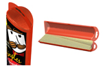
 For the structure, we developed a sugar-cane frame, which
requires low mold investments with a process similar to thermoforming. The
duo-part lid is injection molded PETG or polypropylene, and the seal strip is
broken prior to flipping each section.
Side tabs also make separation convenient.
For the structure, we developed a sugar-cane frame, which
requires low mold investments with a process similar to thermoforming. The
duo-part lid is injection molded PETG or polypropylene, and the seal strip is
broken prior to flipping each section.
Side tabs also make separation convenient.
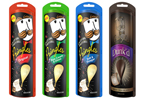
New graphics preserve the strong color coding, but with an added “pub chip” feel. The logo lockup maintains the similar rounded head, while the mustache and bow tie have been combined into a ‘stashe’ that has more equity. The logotype is quirky like the chip, and the chip shape can be seen throughout the design. All elements work synergistically, maintaining the brand’s sporty convenience and sense of humor.
Credits
Package design: Little Big Brands, www.littlebigbrands.com; Structure: Charge ID, www.chargedesign.com
The Goldstein Group's proposed redesign for Pringles.
Pringles has been a household name for more than 40 years. Yet, despite the brand’s longevity, many consumers view the famous stacked chips as outdated - a brand in need of a drastic overhaul. In light of the recent announcement that Proctor & Gamble is selling Pringles to Diamond Foods (the transaction will be completed by the end of 2011), we asked three design firms how they would change the look and feel of the brand. Their responses mark the debut of The White Space, a new department where we’ll explore packaging concepts to help you seize the white space - the unmet needs and untapped opportunities - in the marketplace.
The Goldstein Group
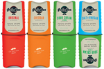
We designed an indulgent black billboard, which allows flavor colors to pop and provides a backdrop for the brand’s attributes of structure, chip form and flavor. This approach also sets the stage for a new sub-brand, harnessing consumers’ desire for sweet and salty snack-ability.When rebranding Pringles, it was also important to acknowledge the direct connection that social media offers. Rather than just focusing on the change, a social media campaign can create an interactive experience for the consumer to explore the new appearance. Pringles’ consumers and brand targets can participate in social activities, like sharing or gaming, which further strengthen consumers’ connection to the product.
Credits
Package design: Terri Goldstein, Strategic Director and Darcy Bolker, Creative Director, The Goldstein Group, www.thegoldsteingroup.net; Social Media: Piehead Productions, www.piehead.com; Structure: Carson Ahlman Design, www.carsonahlmandesign.com
Zunda Group
The current Pringles structure, while iconic, makes the chips almost impossible to access half-way through. Since the majority of consumers eat them straight out of the can, this can inhibit enjoyment. Our new proposed structure is more ergonomic and functions with a simple twist of the bottom, which raises the chips to the top. This also eliminates the need to tilt or force your hand inside. We added a lid as well, allowing it to double as a serving cup. Consumers can now experience “hassle free” snacking and enjoy Pringles all the more, having removed the structural barriers.Next, we refreshed key iconic design elements of the brand on the canister. The Julius character is highly recognizable, but he is dated and does not reinforce the brand’s essence, taste appeal or general happiness for snacking. By contemporizing his character, the visual persona is more animated and youthful. The dual face panel allows two containers, when merchandised side by side, to create a dominant brand block that is visually arresting. We further recommend developing him into an animated character that comes alive on promotional and advertising materials.
Julius now visually embodies the personality and character associated with the brand, and he has become a much more approachable spokesperson that exudes the idea of snacking enjoyment.
Contact
Jackie Delise, vice president, Zunda Group, www.zundagroup.com
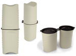
Little Big Brands
Our goal was to give Pringles a fresh look while maintaining its heritage and firmly positioning the brand as a category innovator. To do so, we retained the cylinder shape but split it in two, which is more intuitive to the snacking experience, allows for flavor innovation (half and half or complimentary flavors) and potentially reduces breakage. We also chose smarter materials for resource reduction and audience appeal.New graphics preserve the strong color coding, but with an added “pub chip” feel. The logo lockup maintains the similar rounded head, while the mustache and bow tie have been combined into a ‘stashe’ that has more equity. The logotype is quirky like the chip, and the chip shape can be seen throughout the design. All elements work synergistically, maintaining the brand’s sporty convenience and sense of humor.
Credits
Package design: Little Big Brands, www.littlebigbrands.com; Structure: Charge ID, www.chargedesign.com
Looking for a reprint of this article?
From high-res PDFs to custom plaques, order your copy today!


