UK > Brylcreem haircare
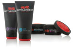
Aimed at an exclusively male audience between the ages of 16 and 25, Brylcreem hair care products have been redesigned. The packaging was designed to protect the product while making it easy to use. Colored text also helps customers to differentiate between the varieties, while the black background unifies the brand. Along with the packaging, the lion brand mark was redesigned to better capture the brand’s heritage while representing key aspects of the brand personality. “Combining visual cues that are modern yet classic, and arresting, masculine structural innovation has given this British icon renewed presence and relevance both on shelf and in use,” says Andrew Capper, creative director, Echo Brand Design. Ten products in the Brylcreem range will be in stores by October 2009. (Package design: Echo Brand Design, www.echobranddesign.co.uk)
Looking for a reprint of this article?
From high-res PDFs to custom plaques, order your copy today!


