Canada > Silver Hills
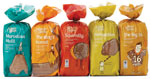
After more than 10 years with the same packaging, Silver Hills Bakery opted for a redesign. Because it offers a healthful bread product, the company wanted its packaging to reflect the brand’s wholesome benefits while possessing shelf presence. To do so, the packaging was redesigned to tell “bread-time stories.” Exhibiting solid, matte colors, the biodegradable bags feature witty illustrations and include clear windows for consumers to view the product. Additionally, each variety of bread was renamed, collaborating with the illustrations. Silver Hills bread appeared in its new packaging in various Canadian and U.S. grocery stores at the end of April. (Package design: Karacters Design Group, www.karacters.com; Illustrations: Robert Hanson)
Looking for a reprint of this article?
From high-res PDFs to custom plaques, order your copy today!


