USA > Nature's Agave
Nature’s Agave uses packaging design to stand out from the homespun, earthy sensibilities that dominate the sector.
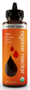
Though it uses agave nectar, a natural sweetener growing in popularity among natural foods makers, Nature’s Agave uses packaging design to stand out from the homespun, earthy sensibilities that dominate the sector. The organic line of blue agave beverages features a convenient pop-up pour spout and a modern identity centered on color, with a drop-shaped brandmark featured as a die cut in each label. As it’s used, the brandmark identifies flavor variants and reinforces the idea of “nectar.” But it was also designed to be flexible enough to deploy across food and beverage brand extensions, which are in the works.
LAUNCH DATE
March 2010
BRANDMARK AND PACKAGE DESIGN
The Engine Room, www.theengineroom.cc
Looking for a reprint of this article?
From high-res PDFs to custom plaques, order your copy today!


