A 'renu'ed competitive edge

AFTER
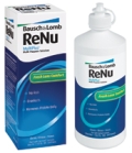
BEFORE
The challenge: The renu brand was already recognizable on shelf, but featured similar graphics to many other lens care products in the market. With the development of a new corporate identity for Bausch + Lomb, it was as good a time as any to revisit and refresh the renu brand.
The goal: Renu turned to Pentagram to create new packaging designed to stand apart from the competition. It needed to clearly articulate product benefits to meet consumer and eye care professional needs, while being innovative and current – all without losing brand recognition.
“When you look at the lens care category, it’s a confusing category to shop,” says Amy Kiss, marketing director, US lens care for Bausch + Lomb. “Brands say a number of things on their packaging and we really wanted to clearly iterate to our consumers what the benefits of our product are.”
The solution: Designers found equity in the wave graphic separating the top white part of the renu fresh box from the bottom blue part. From there, they tried to determine the purpose of the swirling graphic. The team realized that much of the packaging in the lens care category features swirling or curving graphics to allude to water.
To make the renu brand more modern and clear, designers ditched the swirling graphic and instead featured an actual wave on the new packaging. The updated visual allows for the same separation of white and blue (or green in the case of renu sensitive), retaining brand recognition and variety differentiation. Simple typography also clearly points out the variety name and benefits. To make the brand name more noticeable, the logo was redesigned. Now, “renu” is stacked on two lines and hyphenated with a water drop. The type size is about three times larger than the previous logo.
Taking an innovative step forward, the brand replaced the old, opaque bottles with translucent bottles. Currently, renu is the only clear bottle in the lens care category, according to Kiss. The new bottle provides a functional and convenient benefit to consumers, allowing them to see when they’re running low on solution. The designers also intended for it to be more aesthetically pleasing than the previous bottle, so, if consumers like, they can leave it out on their bathroom counters.
“And importantly,” Kiss points out, “it’s more environmentally friendly…because of the colorant that’s not in there and the concentration. Removing the colorant allows the bottle to go up a grade in the class of recyclability.”
The results: Renu fresh and renu sensitive launched in January and continue to roll out on shelves through March. In the first few weeks they’ve been in stores, four out of five calls to Bausch + Lomb’s consumer affairs department were positive comments about the brand, Kiss says. Retailers have also reacted positively to the packaging.
“I think it’s a sign for retailers in [their] expression of Bausch + Lomb lens care in general, that we’re back playing the game again,” Kiss says.
The renu redesign is also supported with a multifaceted national marketing campaign. BP
Stephanie Hildebrandt is the associate editor of BRANDPACKAGING. Contact her at hildebrandts@bnpmedia.com.
Where to go for more information…
PACKAGE DESIGN
Pentagram (212.683.7000, www.pentagram.com)
BOTTLE
Amcor Rigid Plastics (734.428.9741, www.amcor.com)
R&D/Leverage (816.525.0353, www.rdleverage.com)
Looking for a reprint of this article?
From high-res PDFs to custom plaques, order your copy today!


